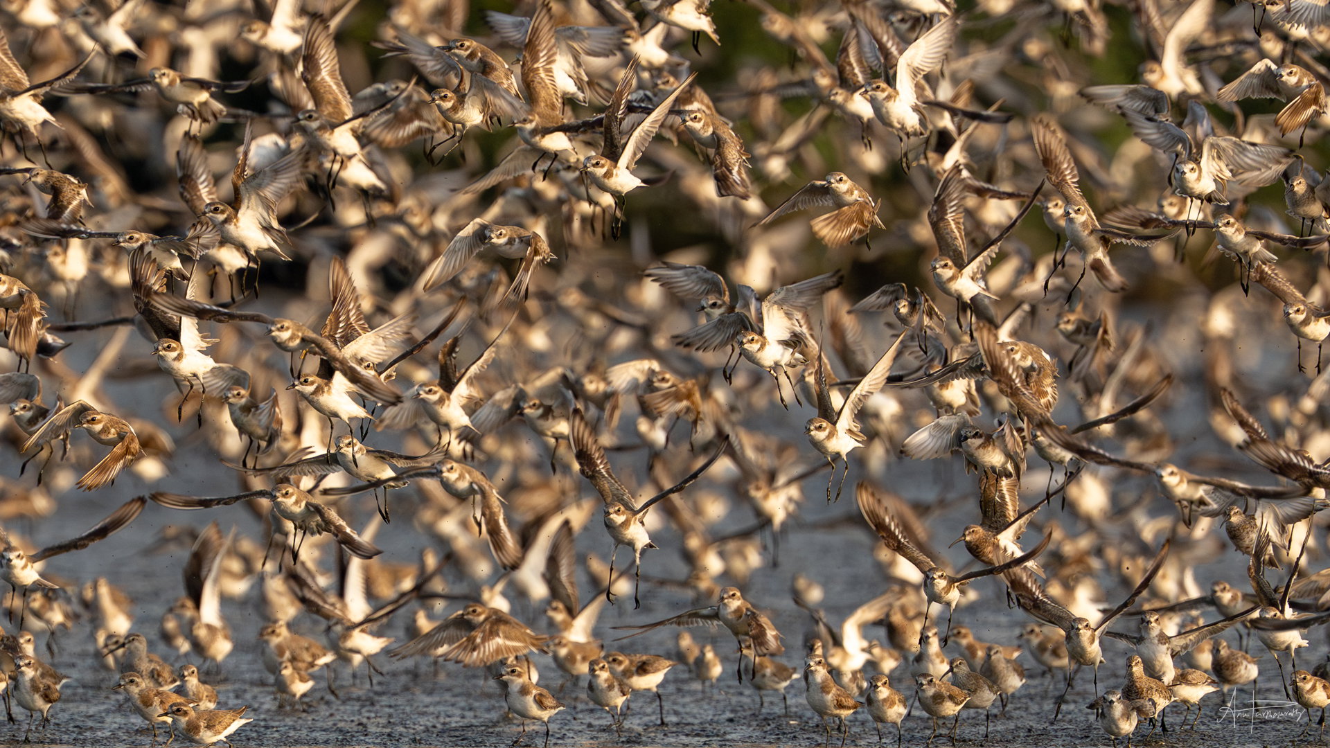
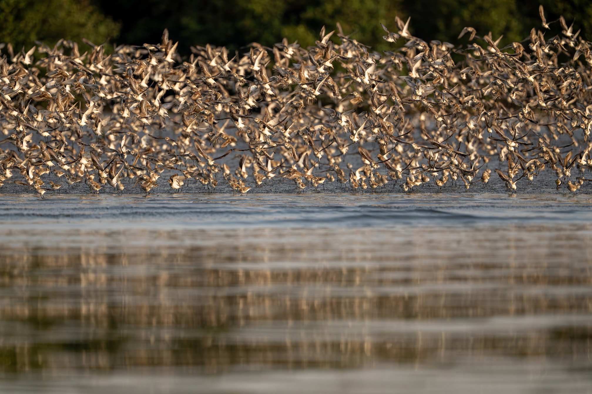
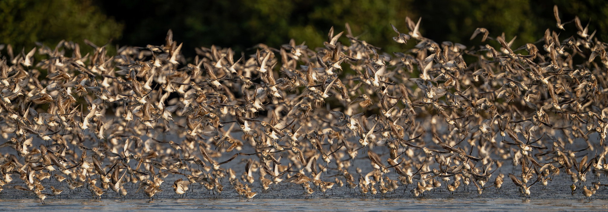
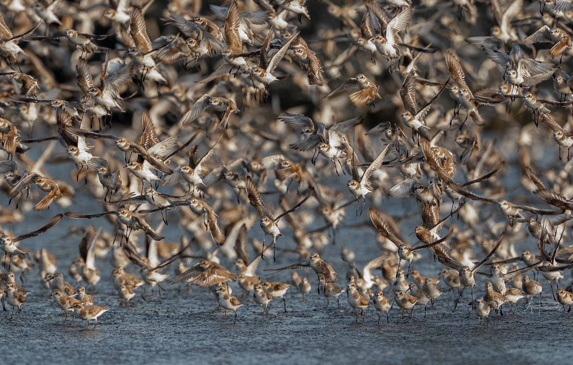
The photographer is looking for generalized feedback about the aesthetic and technical qualities of their image.
Description
I found it very interesting when thousands of plovers took off towards me. I was seated on a boat and these plovers and other waders were flying in huge flocks all over the place.
Specific Feedback
I wanted to frame it with the intent of showing the patterns in what seems like chaotic groups and also emphasise the large number of birds. Not sure how to compose and crop to convey that idea. Please share our ideas and I’ve uploaded my cropped version and the full image
I struggle with this type of image, Anuradha. They can be chaotic and somewhat abstract, but I think you did a good job here. I tend to prefer the cropped version as it is easier to see what is happening and is easier to see the “story” of the birds on the ground taking off. And it’s easier to see the nice detail you captured. Well done.
I too prefer the cropped version, Anuradha. If the reflection were perfect, all that water in front might have worked very well, but ass is, I don’t think it adds anything. I would suggest a slightly cooler color temperature, though this might very well be accurate. I’d also pull the highlights down a bit as the brightest parts of the birds feel just a bit overpowering.
Just for fun, I downloaded your image and did a pano crop, just eliminating most of the water. I also made the temperature and highlights adjustments, I mentioned, though I did it in PS and I think your raw processor would work better. I actually think your crop works better than this because it makes the birds on the ground getting ready to take off more apparent, which I think is part of what makes this image really good.
I love what you have captured here. I definitely feel the chaos of this large group in flight. And I find the chaos and energy of the birds very interesting juxtaposed with the calmness of the water. I also like the colours in the water. I would have either on my wall. For the wider version I would consider removing the top dark background at the back, which I found to be distracting. I think both versions provide both an abstract quality to the viewer and very realistic which is wonderful. Which one would you want on your wall? I hope this is useful.
In this world of digital photography and seeing mostly through a screen, I barely think of the images going up on the wall to think about what might I like. Great tip for me to begin to see the frames in that perspective. Thank you
@anuradha , these are both great images! It must have been a real treat to witness this.
I 'm leaning toward the cropped image as a favourite, mainly because I can see the cheeky little faces of the birds. It’s always hard knowing where to crop on this sort of scene. If the image were mine, and I wish it was, I’d be tempted to lose the small amount of green in the background and keep the gorgeous colour combination of blues and browns. Taking down the brighter highlights is a good idea. I would also be tempted to add a little canvas to the foreground.
@anuradha , In the image above, I’ve just expanded the crop by way of “Content Aware”. It’s given the little birds a bit more breathing room on the bottom..and no cut off legs.