I have recently purchased an external monitor and calibrated it. Therefore it has it’s own color profile. However when PS exports this image to jpg and converts it to sRGB (it was in Adobe RGB) the colors go crazy unless the jpg file embeds the color profile. So, I’m curious to see what I end up with posting this new jpg file on NPN.
Preview seems to have the desired colors. Now, I’m curious to know what you think of this. I shot numerous captures of these moss, some closer and some farther, but this seems to have come out best so far.
The image has been reworked to a color profile that was intended instead what was originally posted. Below is what I originally had in mind. The color profile confusion led to colors that were too warm and the oranges were too saturated.
Igor
D810 24-70@52mm, f/18, 2.5 secs, iso 64
It looks good to me, Igor. I have a Dell monitor, calibrated at the factory, so usually everything looks good on here.
I like your comp here Igor. The colours look good on an iPhone.
Igor,
I love this. First, the color/saturation look perfect here on my Spyder Pro4 calibrated monitor… Processing looks spot on to me.
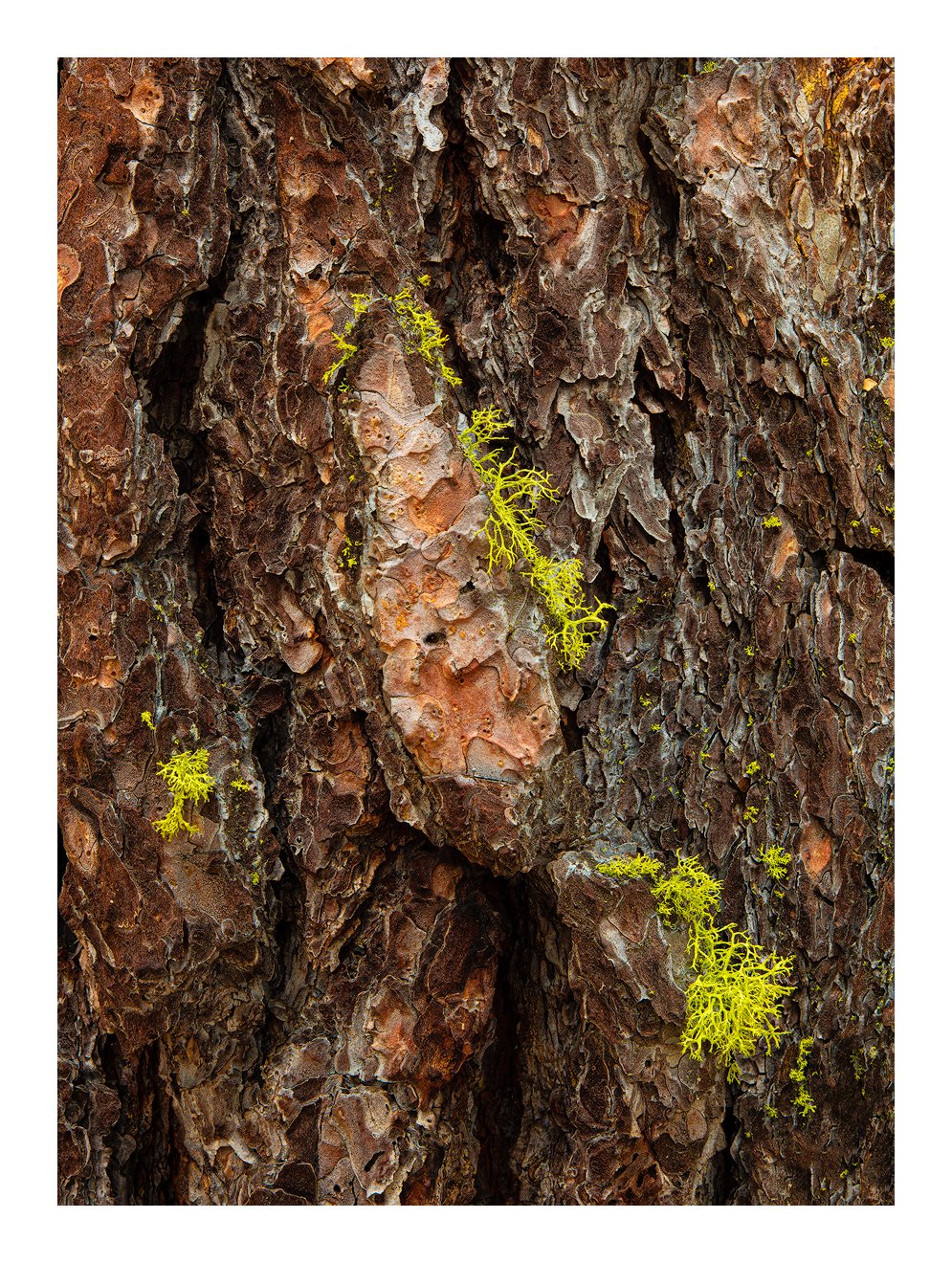
I’ve always been attracted to these little bark details and this one is exceptional. The sprigs of moss are placed and balanced wonderfully and the detail in the bark is terrific.
You know me, I’m a stickler for nitpicky details and darn-it if I can’t find anything to even clone…
Ok, ok, burn down the URC a smidge and call this done.
Beautifully seen, captured and processed.
Lon
Igor, the colors look great on my calibrated monitor. The colors are rich and saturated, which works well for this subject. I assume that the bark and moss are wet here, enhancing the saturation. While the color and textures of this bark are nice, I don’t think this image works without the moss. It’s obvious to me that you paid very careful attention to the frame edges here, and how lines and shapes interact with the edges. I especially like the dark vertical lines at the bottom that “point” up to the moss. This image would like really nice as a print…
Ed, the colors weren’t meant to be rich and saturated. I’ll have to rework this one.
Thank you @Shirley_Freeman, @Nathan_Klein, @Lon_Overacker, @Ed_McGuirk for looking at this. It was very hard for you to comment on this because you can’t see my screen and know what I had in mind.
Briefly, I had noticed that the Adobe RGB profile on my mac gave very similar colors to the Benq profile I had calibrated when both were viewed on the Mac. So, being the lazy person I am, I post processed my image on the laptop using the Adobe RGB profile. Lo and behold the reworked image didn’t look the same on the Benq as it had on the laptop using the Benq profile. It came out more saturated and warmer, as the original post. That’s because the Benq profile looks different on a Benq monitor than it does on the laptop screen. So I reprocessed the image to look on the Benq screen as I had wanted to and now when I look at the same image on the laptop screen with the Apple profile they look very close. Confused? I’m not surprised.
In short, this is what I had in mind. You may prefer the original saturations but to me this is the look I prefer. I also placed it next to the OP so you could scroll between the two.
Really nice intimate, Igor. Color-wise, I would like the third post warmed up just a touch (not like the first), but that is strictly a personal taste thing. Nice work.
1 Like
When I saw the original post I though to myself that it had more saturated colors than seen in most of your work. But I thought you might just be experimenting outside your usual comfort zone. Like I said, I assumed this tree was wet, and thus the colors were more naturally saturated. I do think the original saturation works, but the re-post definitely is more in line with your style. I think the rework is fine too, but I agree with @Harley_Goldman that warming up the bark would restore some vitality without increasing saturation (leave the moss as is though).
1 Like
I think the keyword is vitality. I lost some of it by dropping the brightness a tad. The result was just a bit more drabness. I raised the brightness and it seemed to add a touch of color as well. Again, I’m working on the laptop so who knows what it will look like on the Benq monitor. Working with the laptop on my chest is just so much easier …
1 Like
Igor, I really like the view. The details in the bark stand out well with the good looking lichen scattered well throughout the frame. To me, the first version looks like what I call the “typical Adobe extra saturation”, with extra orange, yellow and green. I often reduce the yellow sat. and green sat. in raw to get something more like your second post. The differences really stand out (especially the orange) as I switch back and forth between the two large versions. After spending some time, I find that I prefer the second version.
1 Like
I think this could be an example of the epitome of the “in the realm of personal choice…” I loved the original… it may not have been your intention, but within the realm of “believability” - many could praise your original, “unintentional” post… Having said that, the rework looks great too! The browns are darker, less red, which may reflect the actual scene. Can’t go wrong either way.
2 Likes
@Mark_Seaver, @Lon_Overacker
That’s the thing about color. It’s so subjective. I will change my preference from day to day, sometimes within the same day. I find it easier to come to a conclusion with composition and tonality. BTW, I’m not all that happy with this composition. I’ll look for stronger subjects.