A neat group of sapsucker images, David.
I’ll try to comment on them in order to keep it fairly logical:
I like the first image a lot. It works quite well. The composition is nice and and the sapsucker gave you a pretty good pose. The only thing I could see changing is the bright white patch of something )(probably lichen) right at the top of the image. I’m not sure what software you’re using for processing these days, but in PS, the healing brush would probably work well on that area.
The second image is also very nice with an even better head turn than the first and excellent detail in the plumage. I don’t know what you cropped from, but a tad more room on top would be nice for my taste.
Number 3 would be the best of the first three except for two minor details: I think it could use more room on top and there’s a processing anomaly out in the background (the lighter streak). Those can appear if you’ve edited on one layer, then either moved layers around or deleted a layer above it. It’s pretty easy to fix.
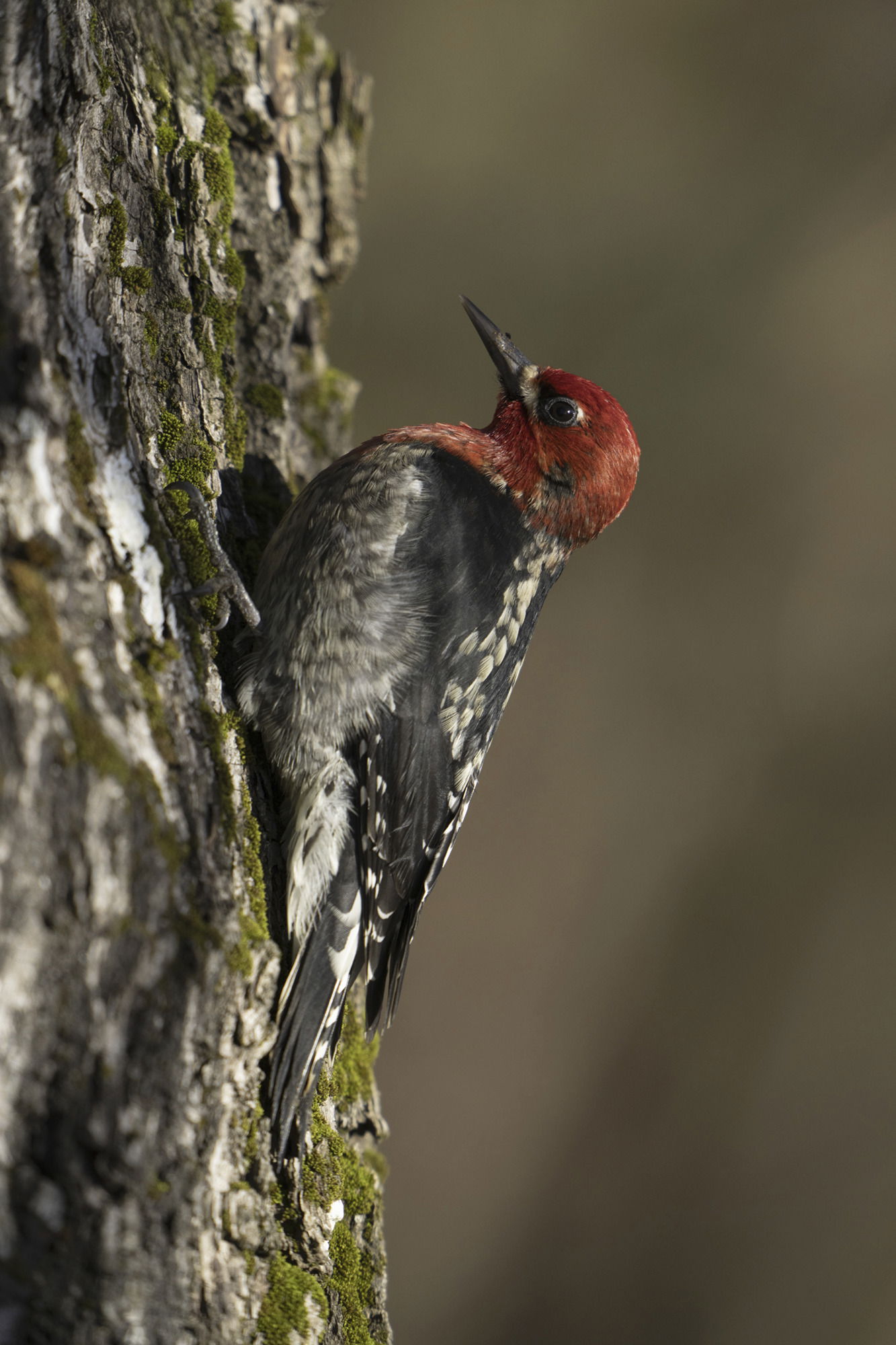
You actually did a pretty decent job cleaning up the background on the 4th image, though it is pretty obvious that you cleaned up the area around the bird, but not the area between it and the perch and the lower right corner. The brightness and saturation of the green might be what’s throwing you off a bit. One technique I’ve used that works reasonably well for my taste, is to select the bird and perch and copy them to a new layer on top of the layer stack, so I don’t screw them up. I’ll then use the color picker to choose one of the colors in the background, use a 30-50% opacity brush with a soft edge and just spatter it around the background, changing the diameter of the brush now and then. I’ll then pick another color from the background that I like and do the same thing. Eventually you can end up with a nicely varied, but unobtrusive background with no hard edges. @Diane_Miller does something similar with a 50% opacity cloning brush, but I think your subject is too large in the frame for that to work easily-it’s very easy to pick up frame edges with a soft cloning brush.
The 4 image limit: This doesn’t really exist. The software only provides for four images at a time, but once you post, you can go into the edit mode on your post by clicking on the pencil icon at the bottom of the original post:
Once you’re in the edit mode, just go to the images you’ve uploaded (the weird character strings at the top of the edit screen. Put your cursor below the last one and use the

in the menu bar at the top of the edit screen to upload the next image you want in the post. For the Weekly challenge at the end of the year on our ten favorite images of the year we used this technique to upload ten images without a problem.