The photographer is looking for generalized feedback about the aesthetic and technical qualities of their image.
Description
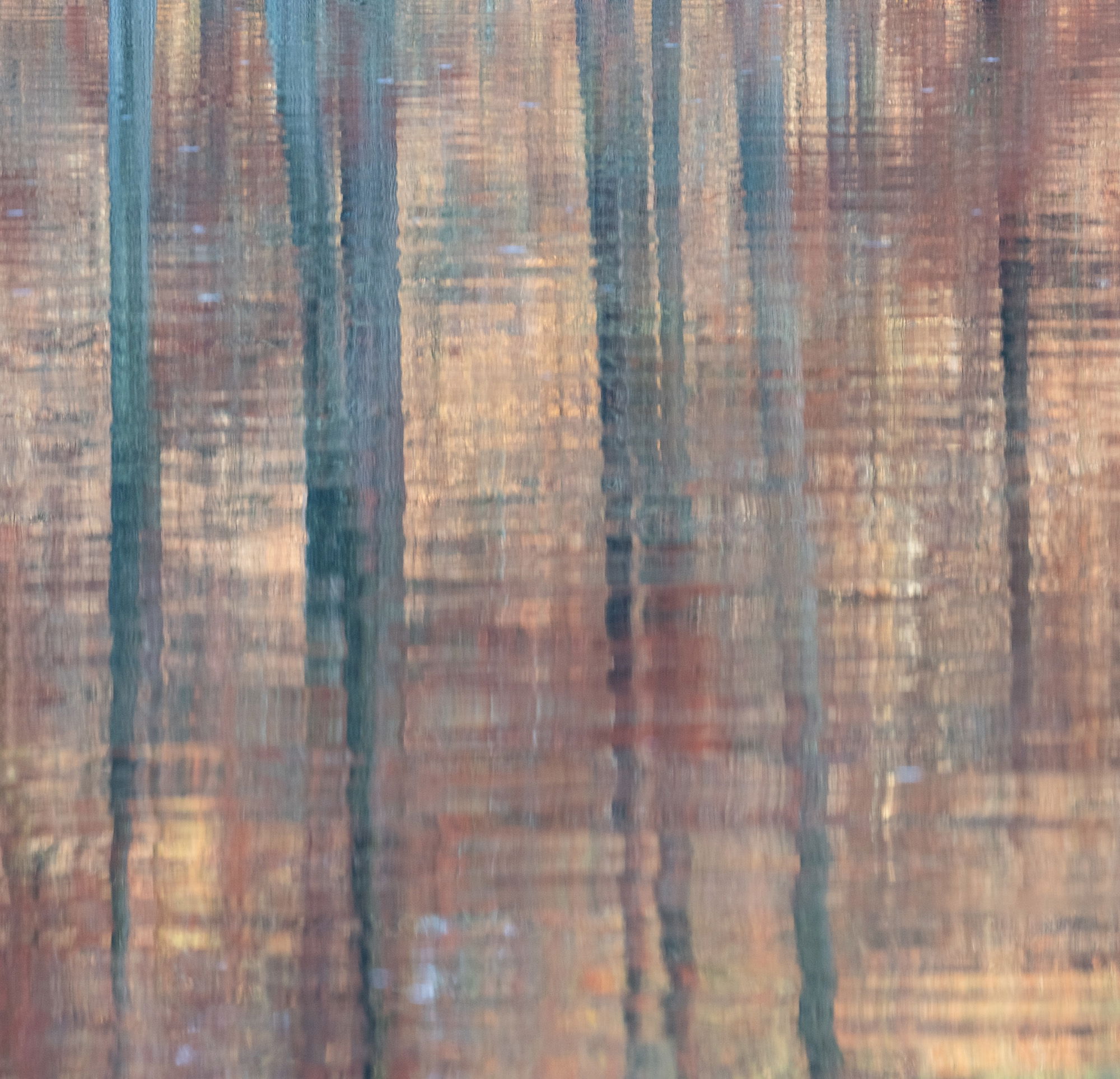
This is another intimate landscape from Trap Pond SP, DE. As sunset approaches Mike and I make our way to a couple of locations so that we have the sun at our backs as it lights up the opposite shoreline with this warm glow. This particular evening it was getting close to sunset when these lovely reflected colors and patterns caught my eye.
Specific Feedback
Does the square crop work for you? I liked the layout of the trees and colors better with a crop from the left and right sides. Anything else you notice please feel free to mention it.
Technical Details
Nikon Z 7, Nikon 100-400 @ 400 mm, f 11 @ 1/40 sec, ISO 800, Kase magnetic CPL, cable release & tripod
Critique Template
Use of the template is optional, but it can help spark ideas.
Vision and Purpose:
Conceptual:
Emotional Impact and Mood:
Composition:
Balance and Visual Weight:
Depth and Dimension:
Color:
Lighting:
Processing:
Technical:
Gorgeous!!! I love how the reflection becomes more broken up from top to bottom. Colors are subtle and beautiful – just excellent!! No suggestions for improvement!
To me, this is more an impressionist photo, not pictorial and is something I enjoy. In my opinion, this photo could be orientated in any direction because it it square and has both vertical lines and horizontal waves (lines) . The short horizontal and vertical dabs of tone variation remind me of the Australian Impressionists - in particular the Australian colour palette as sometimes used by Tom Roberts. I cannot critique this further without seeing the full frame.
I definitely like the square crop, Ed. For me, abstracts often work well in square as we are not reading a scene so much as sitting with a pattern.
There is a bit of sky reflection in the bottom, middle that could be healed with some of the other hues if that’s within your practice. Otherwise, this is a lovely abstract. I’m really enjoying the soft, warm colors and gentle sense of movement.
To me, the square crop works well. This image is interesting, I think, because it balances between abstraction and recognizable reality. The title helps me to see it as reality, reflections in water as we know it from sense perception. However, the capture and processing points towards abstraction: The Tonalities fall in the midtones (Z3-7) and they are just about equally dispositioned all over the frame, all of which dissolves a sense of depth. The image is slightly sharper at the top than at the bottom, even though the top part is further away than the bottom part, and this too also dissolves a sense of depth. Finally, the complementing colours (the blue and green hues of the trunks vs the red and orange hues of the water) and the grid pattern created by reflected vertical trunks and horizontal ripples give me a sense of abstract pattern. The square crop and the continuation of the elements beyond the frame completes the sense of an abstract pattern that continues infinitely. So, when I look at the image, it oscillates between recognizable reality and abstraction. It is two images in one.
This does look like an impressionist painting. It gives me a sense of peace like the best of that genre. The colors are stunning–the almost teal of the trees and the rust and tan–perhaps of foliage?–is such a great combination. I do love the square format. The horizontal ripples against the vertical reflections of the trees is striking.
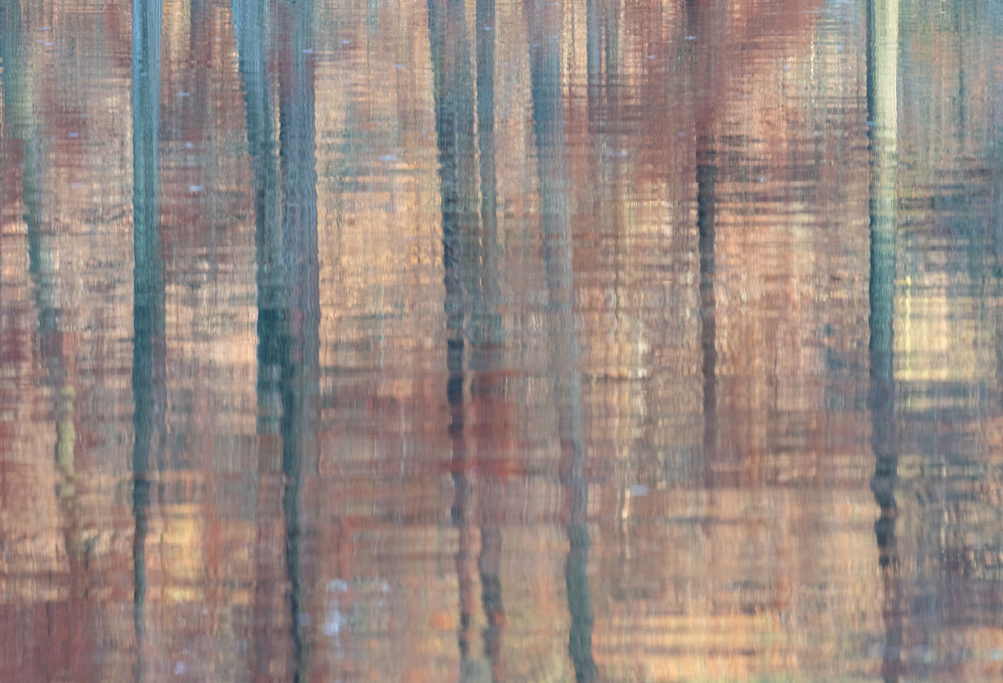
Many thanks everyone @Michael_Lowe, @Diane_Miller, @Rob_Sykes, @Marylynne_Diggs, @Leo_Catana and @elizabeth3 for taking a moment and leaving your thoughts on this image as it is always appreciated. As soon as I noticed the harmony of colors I knew that I was going to try and capture them. @Marylynne_Diggs : I almost removed the little sky reflection, but at the last minute I decided to leave it. Since you noticed it as well I am now leaning towards removing it. @Rob_Sykes : Here is the full frame version . I went with the crop as I was unsure about the lighter tree on the right side.
I’m a fan of square crops, but I know many folks like a more traditional aspect ratio. If you go with the full frame, I think the sky reflection might help balance the lighter right side.
The full frame version. I agree about the lighter tree and light areas on the right hand side, however if those areas were reduced in exposure to match the remainder of the photo, I think you would have a competitor for your square cropped version. This would also have the advantage of making the brighter blue spots (that I do not mind) elsewhere a smaller proportion of the photo.
Ed, I agree with the others that this is a fine looking and nicely painterly abstraction. I think your crop works well because it removes the color shift along the right side. You could probably go to 4x5 on the left and get the same removal. Yes, the sky reflection is another color shift, so it does get attention. While cloning would work, you might also try a local blue desaturation or even burning in, so it matches better the other bits of blue scattered throughout the frame.
Thanks everyone @Marylynne_Diggs, @Rob_Sykes, @John_Williams and @Mark_Seaver for your thoughts on this image as it is always appreciated. I will play around with toning down those areas on the right side and see what I come up with, although I do very much like the square crop.