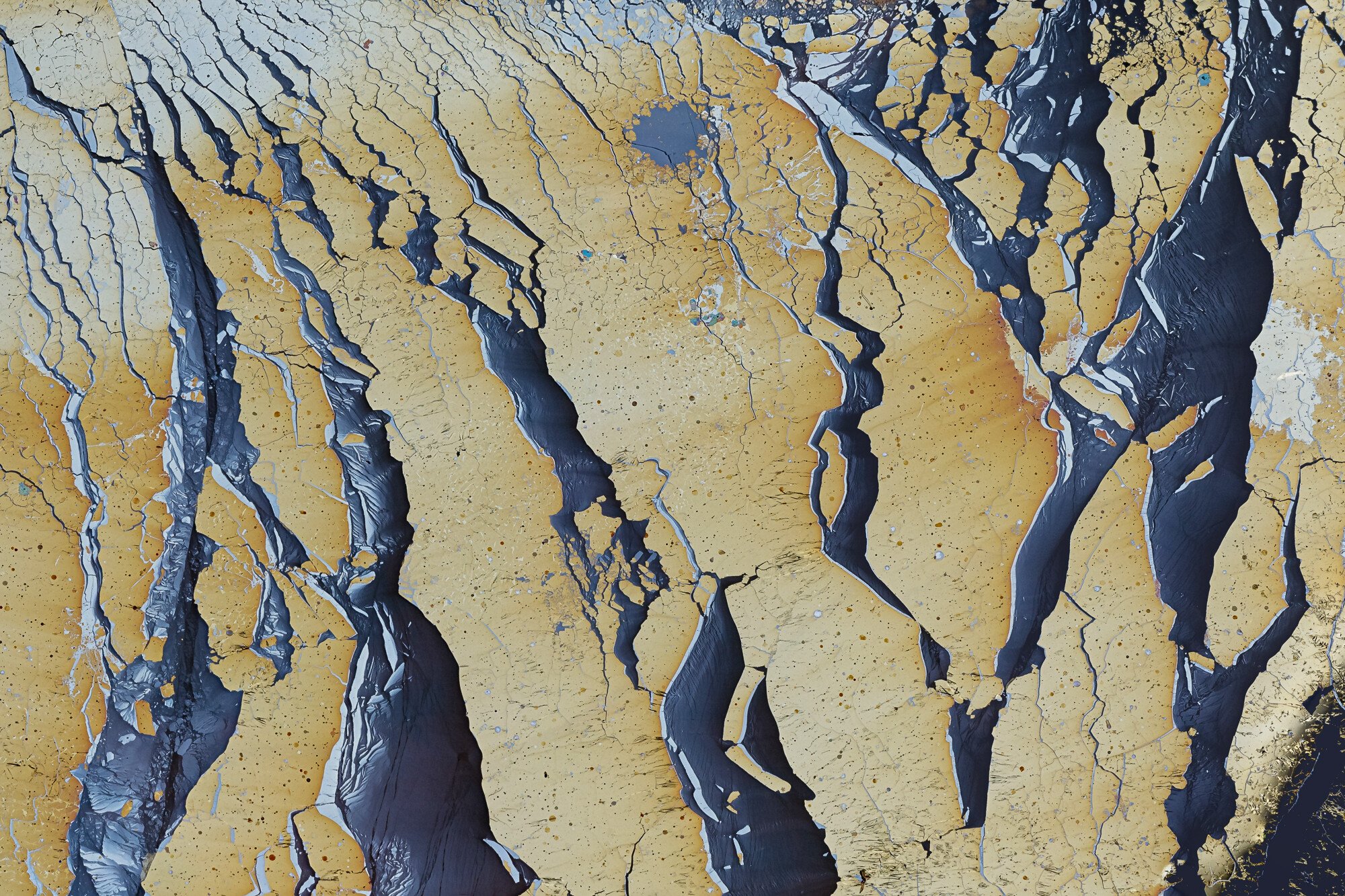
This is an image of a biofilm on groundwater close to the source. Usually the colours (due to colour shifting) in these extremely thin films are red, blue and green. Om this spot only yellow and blue were visible, perhaps partly due to the viewing direction. I liked the unusual colour combination, together with the wild shapes. I am not very happy with the LRC. Tried different crops only to find that they spoiled the shapes and forms. Iso 800 (see techs) is not ideal but I wanted a short exposure time because of vibrations due to wind and water flow.
Specific Feedback Requested
All comments and suggestions are very welcome.
Technical Details
Canon 5d4, iso 800, 1/160 sec; Sigma 150 mm, f/11; CPL, tripod, cable release; processing order: 1) LR adjustments, 2) combined 10 images with Zerene Stacker, 3) TK masks in PS
Wow - this is very, very cool! The colors are really interesting, with the yellow/gold combined with that slaty blue-black. I don’t think the higher ISO mattered at all because there’s so much texture. As far as a crop, that LRC is somewhat of a distraction. I tried a 4:5 ratio, and rather liked it. It cuts off that wider “river” on the right, but I think it enhances the river-like nature of the narrower bands. Here’s what I was thinking:
@Bonnie_Lampley, thanks for your comments. I forgot to mention the main reason why I kept that challenging LRC. In the crop as posted there is a point reflection symmetry. Not exact of course: three rivers flowing down from the upper right and three rivers flowing up from the lower left. The crop you suggested is certainly more balanced colour wise and preserving the idea of rivers flowing. But the symmetry… Anyway, thanks very much for your time.
Hi Igor – This photo deserves to be viewed full size since all those little details are full of magic. I think this is a successful abstract with a fascinating subject.
The composition overall works for me, as does the processing (you could maybe go a tiny bit darker with the darkest tones for just a bit more contrast). In terms of the lower right corner, have you tried cloning out all the yellow bits so that it is dark like the other rivers? By cloning those details, you could keep the aspect ratio intact while eliminating those little visual distractions. I think that is what I would try in terms of addressing that section of the photo because I think the rest of the photo works best at the full aspect ratio. If that doesn’t work to your liking, I think I would keep it as is and accept that the rest of the photo works really nicely so it isn’t a big deal. You could also consider cleaning up some of the edges to remove a few visual distractions and tighten up the scene.
I have seen a lot of biofilm photos but nothing like this. There are definitely some visual tricks going on here and it adds a lot of visual interest. A great abstract!
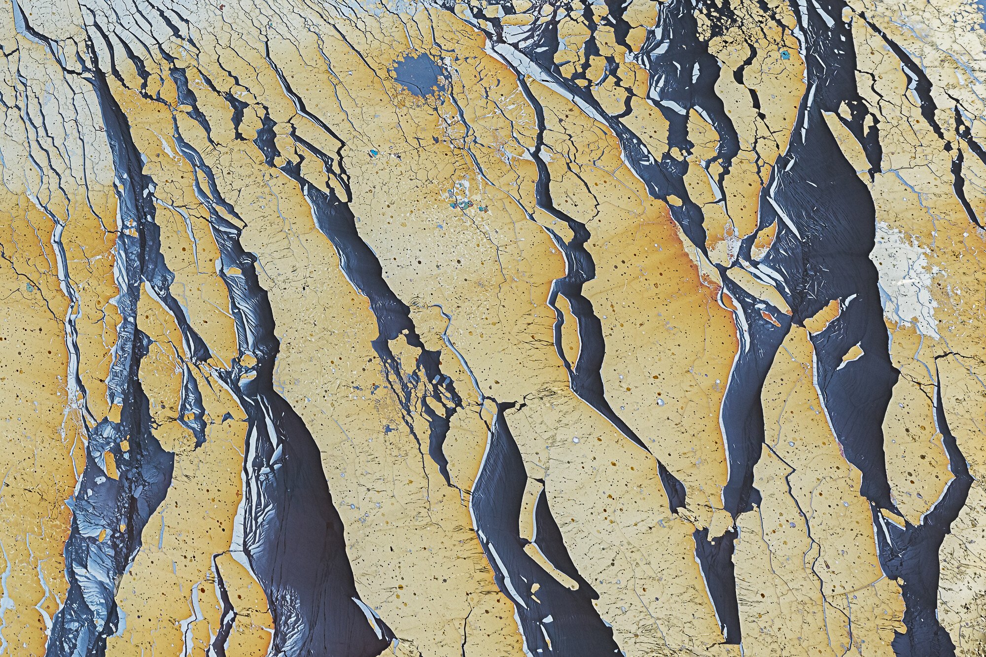
@Martha_Montiel, thanks for your comments. @Bonnie_Lampley, the LRC kept annoying me. Your crop suggestion convinced me that it had to go, some way or another. Only today I realised that a non-rectangular crop might get it out of the way in two steps. Indeed by first applying a guided transformation in LR on the original image I distorted the image a bit so that afterwards this ‘fremdkorper’ disappeared in a regular crop. There are still some issues at the frame edges, but I will deal with those later. @Sarah_Marino, thanks very much for your critique. You definitively made me more conscious about what happens at frame edges, I have a tendency to overlook that. I’ve read many of your critiques on other images, these were very instructive. Thanks a lot.
I’ll post the new crop.