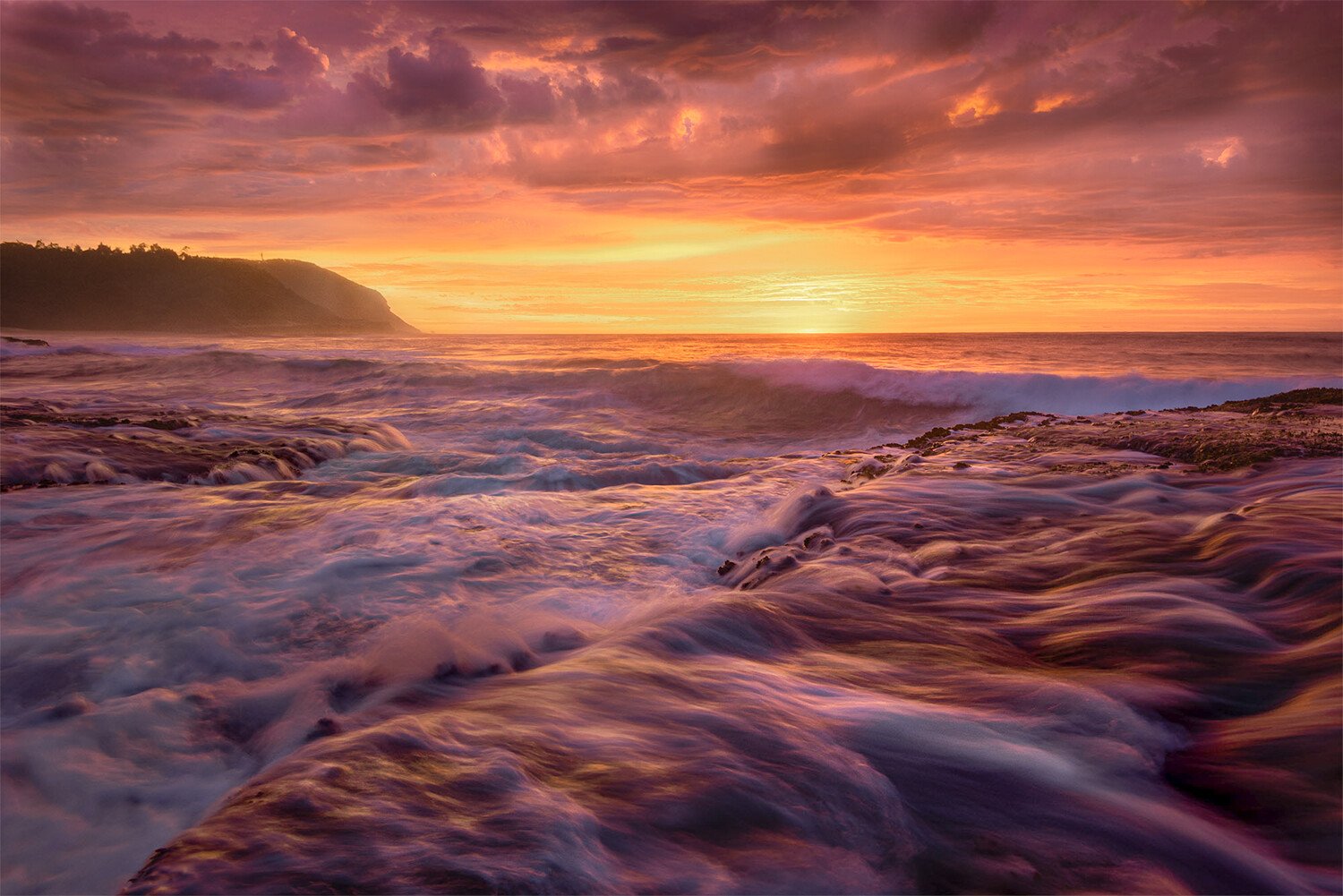
This image is one I’ve gone back to a number of times since it was taken trying to get the edit right
For the composition, the idea was to use the water in the foreground bottom right to lead the eye into the frame & the channel to lead the eye back out to where the sun was rising
The sunrise was so bright, so intense & so saturated in colour I’m having a hard time trying to work with it - would love some input
Specific Feedback Requested
How does the composition look - does it work?
The foreground seems to be a saturated pink with blue dominent highlights - I’m wondering if maybe I should change this & if yes how - I’ve tried the HSL slider method as well as trying to select it with luminosity masks (no luck)
Man that’s a hard one to PP. The saturated sunrise appears so warm that any adjustment can make it go over the line.
The light on the clouds is very engaging and interesting, a great part of the image for sure.
To me, i would crank back the saturation a bit, globally. Its not over the line as it is, and the one that can say if is to much or not is you who were there.
Maybe a solution to tone down the saturation overall could be use the calibration yellow channel on CR or LR. It lowers “gain” value of the yellow pixels of the sensor, so in theory its lowers the amount of yellow your camera saw, if i’m not mistaken.
Still its a great image with a lot of interest and a very balanced composition with that left side piece of land and the right side rock.
You have some spectacular sunsets there, for sure! If you want to use the light bits in the water to direct the viewers eye, it might be good to brighten the water overall. It has tons of interesting details, but they’re hard to make out. I took a crack at that idea - increased overall exposure a bit, added a gradient filter to the water, bringing up the shadows and highlights, added a gradient filter to the sky, desaturating it a bit (all in ACR). Not sure about my sky adjustment, though, it looks a bit weird.
Great composition, and epic weather conditions, what a dramatic seascape. I love the diagonal line that the rock shelf creates in the foreground, and also how the water flows from right to left in the right half of the image, and from left to right in the left half.
I like having strong saturation in epic grand landscapes. When the light and weather are like this, it can work well. What doesn’t work as well for me is when saturation is this strong in shadow areas. The sky saturation here looks dramatic, but believable. But the foreground is both dark and very saturated, and it just looks un-natural to me. If you choose to process the scene dark overall, it can add drama, but then you need to dial back shadow saturation. I also agree with @Bonnie_Lampley that teh water has lots of interesting details that get subdued by the dark processing. I think you would have even more drama here if that dynamic wave action was more visible.
Here is a rework, using TK luminosity masks Darks 2 - Darks 5 subtracted masks to lift shadows without losing contrast. I then used a Lights 1 selection to dodge the water highlights. I also used a PS Color Balance adjustment to reduce magenta slightly.
There’s a lot to like about this image. The Composition works well for me. There is plenty of interest in the water with plenty of texture retained - so good shutter speed choice. There is also a lot of detail retailed in the sky/ horizon. The headland on the left looks like it’s catching some light/ sea spray. I can see why you’ve gone back to it as the conditions look spectacular and the file looks sharp and clean.
My personal preference for scenes like this is to keep the processing very subtle and understated as a little can go a long way with natural contrast and colour like this.
The pink foreground may be be originating from a white balance issue. It appears to me as a strong magenta cast. The saturation of the cast may have been enhanced by any contrast work in the sky and foreground. I’d recommend watching Alex Nail’s “Mastering White Balance” video on Youtube which is excellent on this. All of his recent processing videos are excellent actually and I think an image like this would benefit from his simple approach to processing (with excellent results).
I’ve had a very crude play with it in Lightroom to see if I could remove the cast. Basically, I’ve added a lot of green tint - too much as the highlights in the foreground are now a bit cyan.
For the sky I added a massive cooling WB shift to make it more uniform colour wise then desaturated it substantially - I’ve done this very crudely but it can be effective at removing odd colour mixes particularly in the sky.
I’ve also brightened the foreground highlights in the waves with a gradient, range mask, + exposure adjustment. This can probably be done more effectively in Photoshop with more sophisticated masks or a well refined curve painted in.
To clarify, I haven’t done a good job at all re-processing this - it’s just an example of how you might go about resolving the colour cast (but it’s almost definitely something which should be addressed in the RAW file at the outset).