The photographer is looking for generalized feedback about the aesthetic and technical qualities of their image.
Description
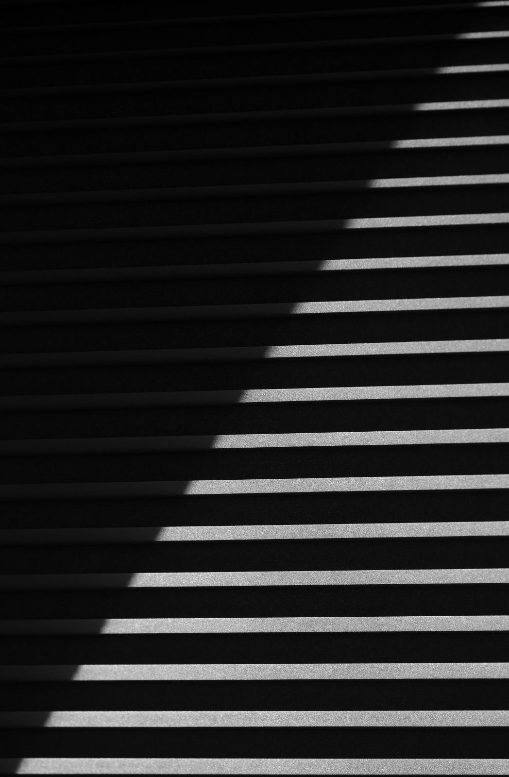
We recently had some window shades installed. I think the light from the skylight above them makes an interesting subject.
Specific Feedback
Having recently read the two articles submitted by Igor, I wonder if this photo to some small degree fit the Japanese style discussed in those articles. I did not take it with those in mind.
Technical Details
Canon R5; 100/400 at 400; ISO2000; 9.0; 1/3200; exp. comp. -3; daylight WB; Slight cropping top and right side.
Critique Template
Use of the template is optional, but it can help spark ideas.
This is very cool, Jim. You have an excellent eye for this sort of thing. Did you try jacking up the whites and bringing down the shadows to go solid black and white? Just curious as to what it might look like.
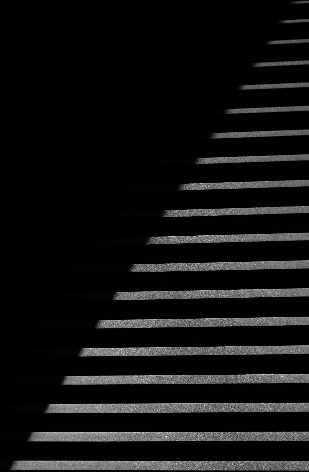
OK. After suggesting taking it to pure black and white, I had to try it: not to my taste at all. However, while I had it in PS I tried running it through the TK luminosity masks to see if something interesting showed up. This is your post with a lights 2 mask applied and exported as a pixel layer. To me, it increases the mystery a bit.
Dennis, I came to the same conclusion with a pure b/w version. I do like what you have done, but I also like that in my image the creases (not sure what to call them) are slightly visible. Thank you. Your comments are very much appreciated.
Hi Jim! I love this image! At first I though it must be a set of stairs. I have pleated shades but would never have ‘seen’ this. I like Dennis’s version a lot, but I prefer your original. It gives me almost a 3 D impression. Well done!
I missed this earlier but have to say how much I love it! I find it very appealing that the shades at the bottom are exactly parallel to the frame edge. The placement of the shadow line is also somehow just right! I was wondering about a tiny bit brighter in the shade, but maybe not. One thing I see (or think I see) in @Dennis_Plank’s version is that the lower lighter areas are a bit brighter toward the left, which adds another touch of geometric interest. Excellent any way you decide on!
I have looked at this several times and my first thought was a stairway. This is a fine take on a common object.
The tonal values in the original post look the best to me. One thing I also like is the diagonal of the blinds does not start or end at the corners which is a great design choice.