The photographer is looking for generalized feedback about the aesthetic and technical qualities of their image.
Description
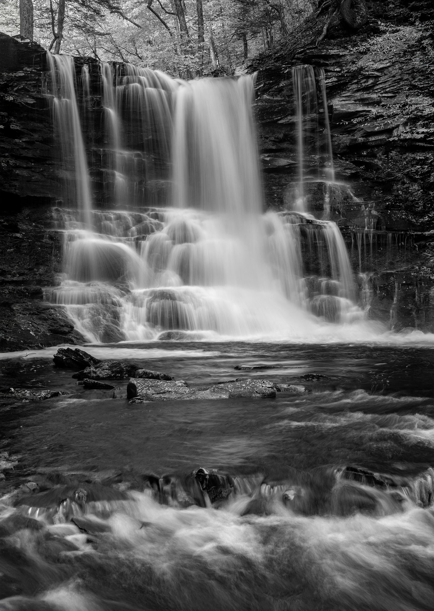
This image is of Sheldon Reynolds Falls in Ricketts Glen SP in PA. For whatever reason the color version just wasn’t working for me so I decided to convert to B&W with Nik 6 Silver Efex and I liked the result much better. Ricketts Glen SP is a waterfall photographers paradise with it’s 21 waterfalls ranging in height from the 11’ Cayuga Falls to the 94’ Ganoga Falls. Sheldon Reynolds is 36’ in height. Looking back I wish I had gotten the 80-200 out and captured some tighter compositions.
Specific Feedback
How do the highlights look? Also interested in the overall balance of the image. Wondering if I should add a little canvas to the left side of the frame. There is less rock face over there, but I don’t want to throw the falls to far to the right. Anything else you notice please feel free to mention it.
Technical Details
Nikon D800, 35-70 @ 48 mm, f 11 @ o.6 sec, ISO 400, cable release & tripod
Critique Template
Use of the template is optional, but it can help spark ideas.
It’s a very nice composition with a good choice of shutter speed for the falls. The highlights look good to me, though if you want to print, you might need to tone the very brightest spots down, and perhaps bring the very darkest parts of the rock face up
Rickets Glen is definitely on my short term list of places to visit.
This is really nice, Ed. The composition works very well as-is for me. No need to add canvas. The shutter speed was perfect.
I do agree with @WillR regarding the very brightest and darkest spots if you plan to print this one. For the Web, it looks great. If I had one nit, it would be that large tree trunk on top of the rock on the left: It grabs my eye.
That’s a gorgeous spot. I’d have gone nuts there given my love for waterfalls and cascades.
-P
Where you been keeping this gem, Ed? The B&W looks great. Perfect SS and this looks like the perfect amount of water flow for this falls. You had the zoom and didn’t get it out? Shame, shame. Looks like plenty of intimate compositions around the base of the fall. No nits from me.
This is beyond gorgeous!! The falling water is so dreamy and arranged in such lovely ribbons, and then it bounces off the rock ledges – are there terms for the “parts” of a waterfall, like there are for flowers? The balance left and right feels just right to me and the tonalities are wonderful.
For me, the main interest is the falls and I’m a little conflicted by the water at the base. It is lovely on its own but that’s what makes it a little distracting – I want to look at both of them and keep jumping back and forth. But it does give a wonderful base and a very nice sense of depth.
I’m with the others Ed. That’s a beautiful waterfall, well captured.
I don’t think you need more canvas on the left, in fact a little more of the flow out on the right would be what I would look at if adding. The highlights look fine to me.
I can see @Diane_Miller’s point about that foreground. I wonder if you dropped the luminosity of them some if they would compete a little less?
Ed-Looks like you’ve done a fine job handling the lights and darks in this image, and I believe the B&W version works very well. The waterfall itself stands out and is the star of the show, as it should be.
Beautiful composition. The rushing water throughout leads the eye right up to the falls. The various ribbons of water falling, especially the two ribbons on the right adds so much character to the whole photo. The brightness of the BG above the falls, works well as it pulls the eye up there where the photo needs to end. Good work.
Ed, this overall cascade is one of the best waterfalls for being naturally photogenic if you will. Even the two main BG drops alone are excellent as a crop from the bottom. Adding the third FG cascade takes it to another dynamic.
I don’t find a need to add any canvas to the left. I feel the composition is excellent as presented here.
Wonderful image…
The cascades in the waterfall are enchanting and I like the woods at the very top. I agree with @Diane_Miller that the whitewater at the bottom hurts the composition for the reason she gives. I would crop just above those bright whites.
Splendid waterfall image, works very well in B&W, and the shutter speed is just right to generate the flowing water lines without destroying the texture… I tend to agree with Diane and Igor, the water in the FG is nice but somehow distracts from the overall mood of the scene? I would also crop it going to a more “squared” composition…
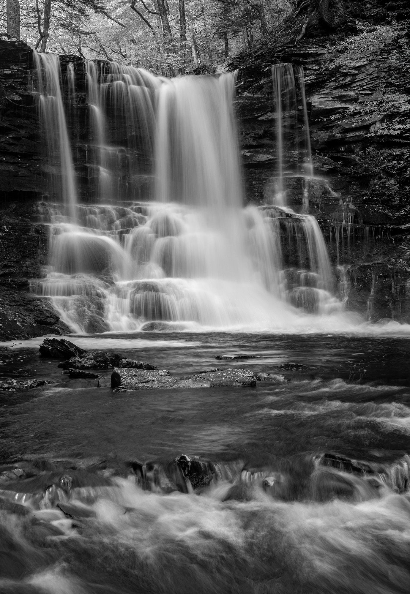
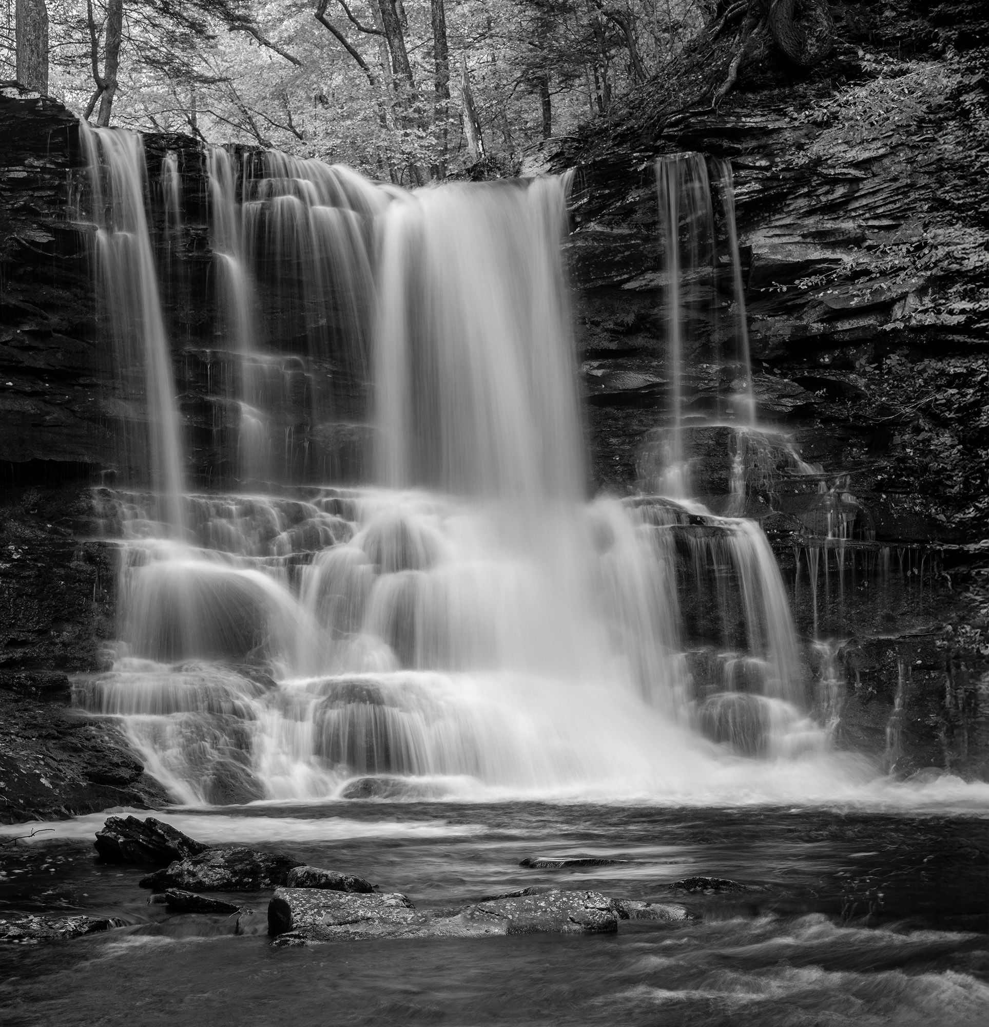
Ed, both work as presented here very nicely. I’ll say the original is my first choice with a minor change. The small whitewater in the lower left FG cascade cloned out to just clean that spot from eye draw. Otherwise, both are very nice.