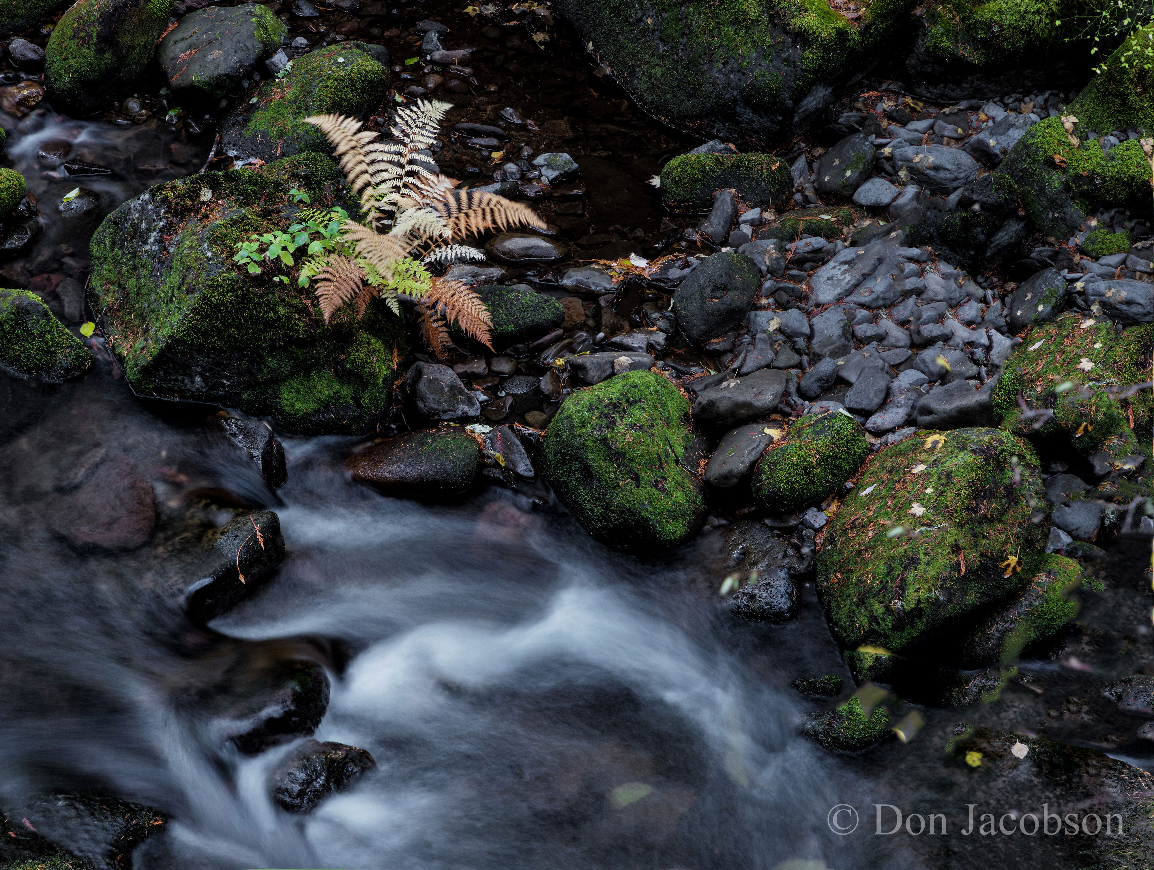
To me it feels like the water takes me out of the scene, as the flow only bisects a small part of the image - less than a third. The natural direction of water flow shows it entering on the bottom left and leaving the frame near the bottom middle and that flow is what carries my eyes around and out of the scene. I understand the small fern bush was being used as an anchor and that works, but the I feel the water competes with it.
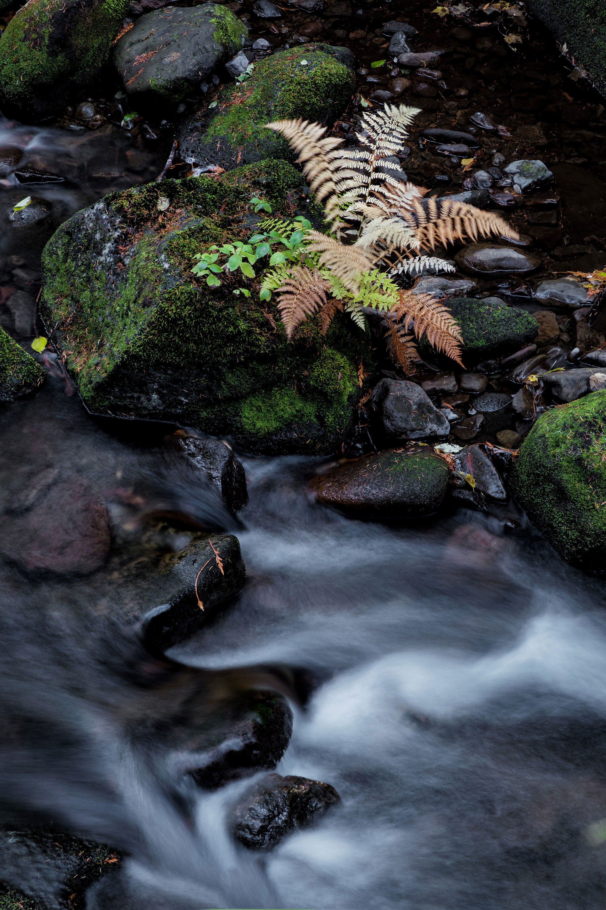
As far as simplicity goes I think simple is great! Less is often more with compositions so I like your idea of moving towards simplicity. Do you have any other angles of this scene?
I don’t know, this seems a lot more than a simple comp to me. There’s a lot of different elements and a lot going on and too look at. I find it interesting and nicely balanced. The saturation looks natural, which means is looks a little be flat in this processed version. Popping the greens and yellows would makes some of the elements maybe separate a little better.
Don, to me this image needs fewer items of interest and not more. In scenes like this, I ask myself which elements are the most important, and what can I do composition-ally to emphasize them. I think the yellow ferns and waterfall are the most important elements, with the green moss on the rocks as a nice secondary element. A viewers eyes are drawn to the brightest parts of an image, such as the falls and ferns. But in your composition you also have bright elements in the right half of the image that draw the viewers eye away from the falls/fern area (such as the light grey rocks in the upper right quadrant, and the very bright green leaves in the far upper right corner). to reduce this complexity, I would consider a vertical crop to pick up only the left half of the image, like this
Thank you for our comments. After considering the suggestions, I thought the water flow was too high contrast and tamed it down a bit and simplified with Ed’s crop.
I like the comp as presented and don’t find this overly simple - in fact it’s quite the opposite. Perhaps simply in design and concept, but there are more than enough interesting elements coming together that make this much more than simple.
In fact, I quite like this as presented. The most minor of nitpicks would be some edge cleanup. I would crop/clone some of the things along the bottom and right edges (the grass/moss in the LLC and the yellows along the right edge) Minor, but clean up to take the image to the next level.
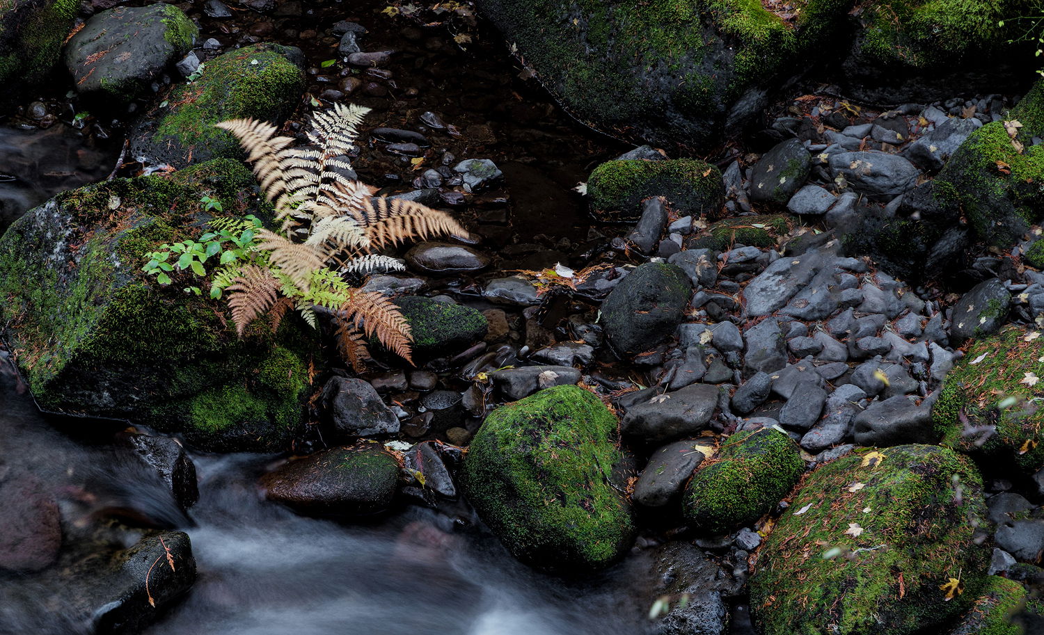
The last rework looks pretty good to me. However, I didn’t really care for the lower half of the image with the water and liked the patch of small rocks on the right. I tend to favor complex compositions and feel that the fern is so strong that other elements don’t really encroach on it’s dominance but add some relief from it’s power. Here’s how I would have handled this composition.
One other nitpick: when photographing moving water at slower shutter speeds (knowing there will be blur), make several exposures at different shutter speeds. I find it hard to predict what the results will be. I think your exposure blurred the water too much instead of just softening it. If the water was a little more distinct, I would like to see more of it. As is, I think Igor’s crop might make for a better comp.
Given that there are so many elements, the could do some dodging/burning to emphasize/deemphasize as per your own vision.