What technical feedback would you like if any?
Any comments welcome…
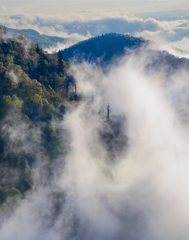
What artistic feedback would you like if any?
Does the composition work…is the primary subject matter/element lost as a forest for the trees?
Pertinent technical details or techniques:
2-shot hand-blended composite for dynamic range.
If you would like your image to be eligible for a feature on the NPN Instagram (@NaturePhotoNet), add the tag ‘ig’ and leave your Instagram username below.
@jim_mcgovern_photography
You may only download this image to demonstrate post-processing techniques.
I really like the forest and fog, especially the lone tree surrounded by fog, but feel like the sky competes with those elements. I am hard pressed to figure out a fix for the sky. It does add a nice element of depth and place, but I prefer it cropped out (in lieu of something else to do with it). That is my take, anyway.
Jim,
What a wonderful moment you’ve captured. Love the title and the “forest for the trees” reference is perfect too. For me, of course the lone snag enshrouded by the swirling fog is main story. I think there are some options that would maintain and even enhance that “singled out” story.
Agree with Harley about the sky. In playing around I think a slight crop down to the top of the clouds, basically eliminating the blank sky, but retaining the clouds/fog works pretty well. I also think there’s a lot of real estate on the left. Yeah, the forest looks good and I like the fog in the LL, but I’m thinking of a squarish crop.
Cropped top and left. For the upper clouds I reduced the brightness with a masked Lights Levels layer, burn tool and then to reduce the color(blue) I added a b&w layer, masked it out then painted back about 20% opacity just to tone down the color and keep the top from competing with the swirling fog.
It looks to me like the green/yellows of the trees are coming through the thin parts of the fog making it a little yellow. I desaturated the colors just a little bit in the area around the snag and then ever so slightly cooled the color balance with a Selective color layer.
Just some thoughts. May not fit your vision though.
I like the suggestions that have been made so far. I agree with the overall cooling of the image. There is still a discrepancy between the color of the mist in the fg and that in the greater distance. I would reconcile that in the image because it looks odd this way.
Here is yet another composition which I worked on this morning than abandoned it only to resurrect it again. It’s a sloppy job but the idea is there. I cooled the fg and kept the back as is. Then I felt that the intense foliage colors were taking attention away from the dead tree so I desaturated slightly the yellows and greens and made the greens a bit yellower. Oh, and I believe I burned in the sky a bit as well.
1 Like
Thanks so much for your thoughtful responses…super helpful. @Harley_Goldman, it’s funny…when I first saw this image, I rejected it because of the competing sky. Then, I got tunnel vision because the swirling fog (I thought) would carry the image. At the end of the day, all three of you brought forth excellent points about the very issue that struck me initially. I guess those first gut impressions should be honored and not overruled or overthought…something I’m certainly prone to doing!
@Lon_Overacker and @Igor_Doncov, you both have taught me that despite my efforts to learn better color management in an image, I still have more to learn. I guess that’s what I love about this website/community. I’ve been hungry for this type of feedback for a long time and am grateful for the learning! I agree that the blue in the shadows of the distant clouds are in distinct constrast with the shadows of the rest of the image. Also, agree with the issue of yellow color casting with the highlights. I made an error in post-processing and was color dodging rather than just white dodging.
Thanks again everyone.
Jim, with insanely good weather conditions like this, your image has all the ingredients needed to be very dramatic. I think you have got great comments from both Lon and Igor, I think they are right on the money regarding changing the composition to emphasize that one tree encircled by the fog, and with cooling the white balance. I think both of their suggested compositions work well, but subjectively I would prefer a white balance that is somewhere in between Lon’s and Igor’s reworks.
Here is my take on WB, starting from Lon’s comp for illustration…
.
Color and white balance are some of the easiest things to lose a sense of perspective on when processing. You make a change, then another small change, until a series of incremental changes unwittingly take you further than you’d like. For me I find it helps to repeatedly compare my processing steps to the original raw file to make sure that I keep that sense of perspective.
1 Like
I guess it’s like the story of Goldilocks. Papa’s bed was too hard. Mama’s bed was too soft. But baby’s bed was just right.
Thanks @Ed_McGuirk for your advice on processing and keeping a copy of the original handy for reference. Looking again at my original image, I can see that the negative space on the left upper part of the image is actually dead space.
The light that morning was warm, so it’s always a matter of taste as to how far to encourage that process, but in the end still agree that it was overdone. Thanks again everyone for their help/perspective.
Jim, I sometimes use color dodging myself to create warm highlights via processing. My experience has been that a little can go a long way, and it can be easy to overdo. It is also easy to get tricked by making a series of changes that eventually take you too far, but your eyes grow accustomed to each intermediate step, until you lose perspective. That’s why I force myself to compare works in progress to the original raw several times as I go.
@Lon_Overacker and I had an interesting conversation offline about white balance and processing whites in an image, after I commented on Lon’s Merced River image and said that I thought his whites in the water were too warm. We discussed your image as a good example of how “white” clouds and fog can be semi-transparent and the color of background stuff beneath can affect the clouds color, and their color can also be influenced by warm light sources. In the end there is a trade-off between having warm highlights, and achieving color contrast/separation. In the end there is no “correct” white balance, a lot can be done for creative effect, as you see from the three reworks of color/WB that you got here.
Thanks again @Ed_McGuirk…the conversation is very helpful. Excellent points on the nuances of highlight color. It’s funny you mention wb in water as I tend to neutralize the wb in whitewater but haven’t applied the same logic in this case. Anyway, thanks again for the guidance.