The photographer is looking for generalized feedback about the aesthetic and technical qualities of their image.
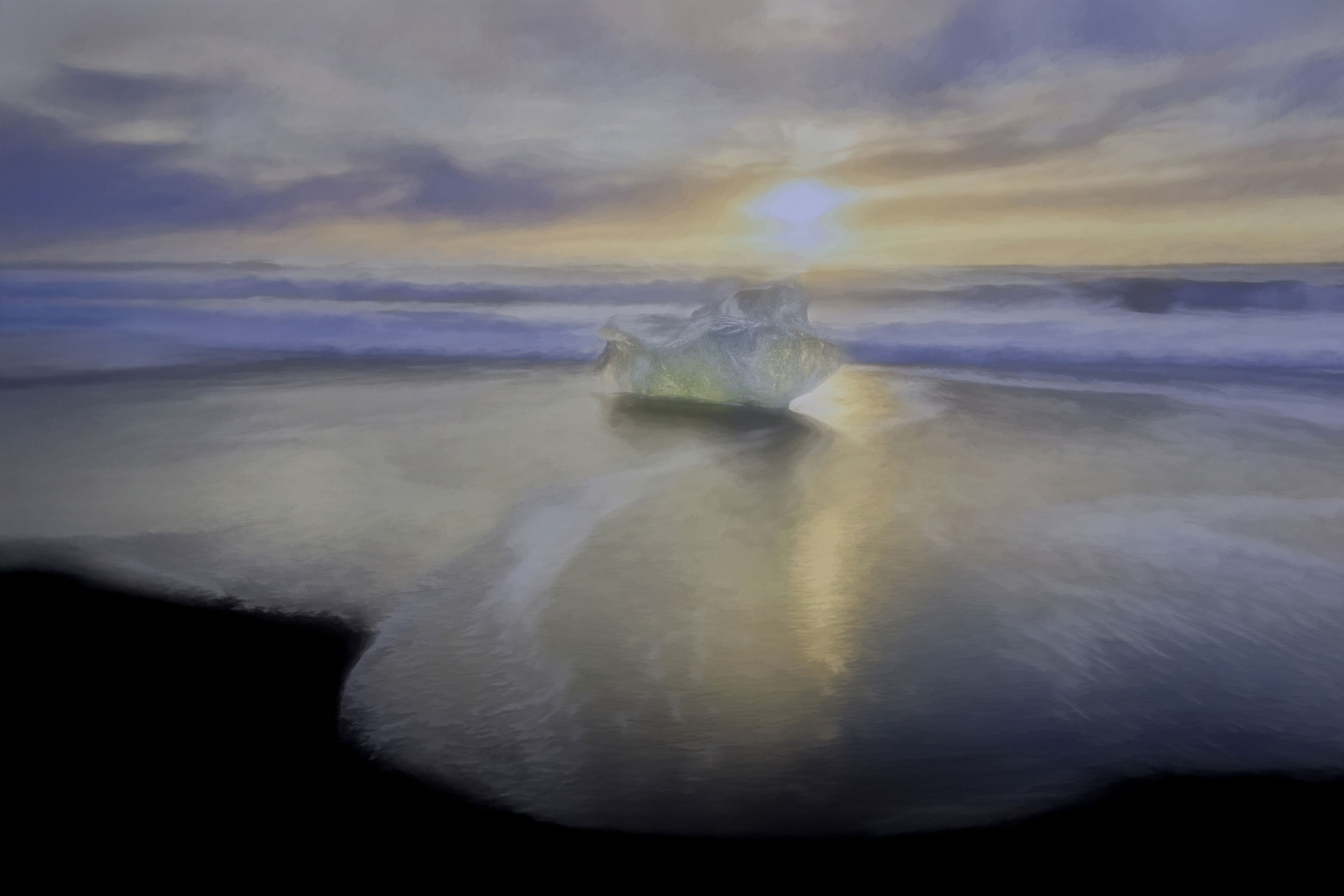
Description
This is a photo from Diamond Beach in Iceland. I processed it using combination of lightroom, photoshop, topaz, and NIK. I am interested in making some of my photos painting like but have not had much success.
Specific Feedback
Any feedback and constructive criticism would be appreciated. I have tried to make some of my photos look painting like before but have not had much success. This was taken in the winter, but Iceland had some very pastel colors in the sky in the winter which gave me the idea.
Technical Details
This was done with multiple filters in Topaz and Nik as well as some processing in lightroom and photoshop.
Critique Template
Use of the template is optional, but it can help spark ideas.
I really enjoy the light dreamy feeling of this image. For me, the beach and clouds are as transparent as the ice sculpture with light emitting from everything. I like the centre composition in alignment with the setting sun.
I think that you have achieved your aim Elizabeth, to me the shot has a wonderful watercolour feel to it. The colours in the sky and in the sky reflections are soft and pastel and the iceberg is backlit in a way that makes it looks like a huge discarded diamond (a nice find!).
I’m not sure about the foreground on the bottom left of the frame, maybe try it slightly reduced in size.
Wonderful dream-like feel in this photo. I especially love how the ice is translucent. But I was confused why this was posted in the Abstract category.
Thank you for your feedback. I email the moderator and asked, he thought it was appropriate. I used multiple topaz filters to achieve the effect, I’ve attached the original.
It’s interesting to see your three shots (almost) together. It shows your intentions very well.
To be honest i’m still with the first one you posted (not the original). For me the latest one is a bit too soft.
I 'm not sure which order to view the images in, Elizabeth, but my preference is definitely for the second at the top with the very dreamy look and the super transparency of the iceberg. The lighting feels much better as the original was rather harsh.
The second one (with the wider view) is my choice of the two. It feels softer and more ethereal. I don’t know how NIK and Topaz filters work, but I think it would be interesting if you could lessen the filter effect from the iceberg. My eye wants a bit more detail there, but just a bit.
Elizabeth, this is a nicely dreamy view where your manipulations (especially in the first view) look good and fit your vision of making it painterly. I do prefer the first post, but wonder about toning down the sun portion to something more like in the second view. As I flip back and forth, I find that the clearer view of the iceberg is what attracts me the most. I am curious about how a version leaving the iceberg as in V1 but more manipulation of the surroundings (as in V2) would look?
This is gorgeous! Mostly definitely I think you have acheived your goal of making the photograph look like a painting. That was my reaction to both of the original posts. And IMHO very fitting for this Abstract category simply because of how the beach/surf/sky/clouds were treated. I think you did a fantastic job with this! Congrats!
Of the two originals, I like the treatment of the original very much in both; they are slightly different from each other. My only feedback/comment is that in the first image, the ice stands out so much it almost looks placed, like a composite, and I think detracts somewhat from your goal of a painting. The good news is that a treatment of the ice closer to that of the 2nd post, a more “dreamy” and less detailed version of the ice would be quite the bonus.
You’ve got a beautiful image and should be printed large!