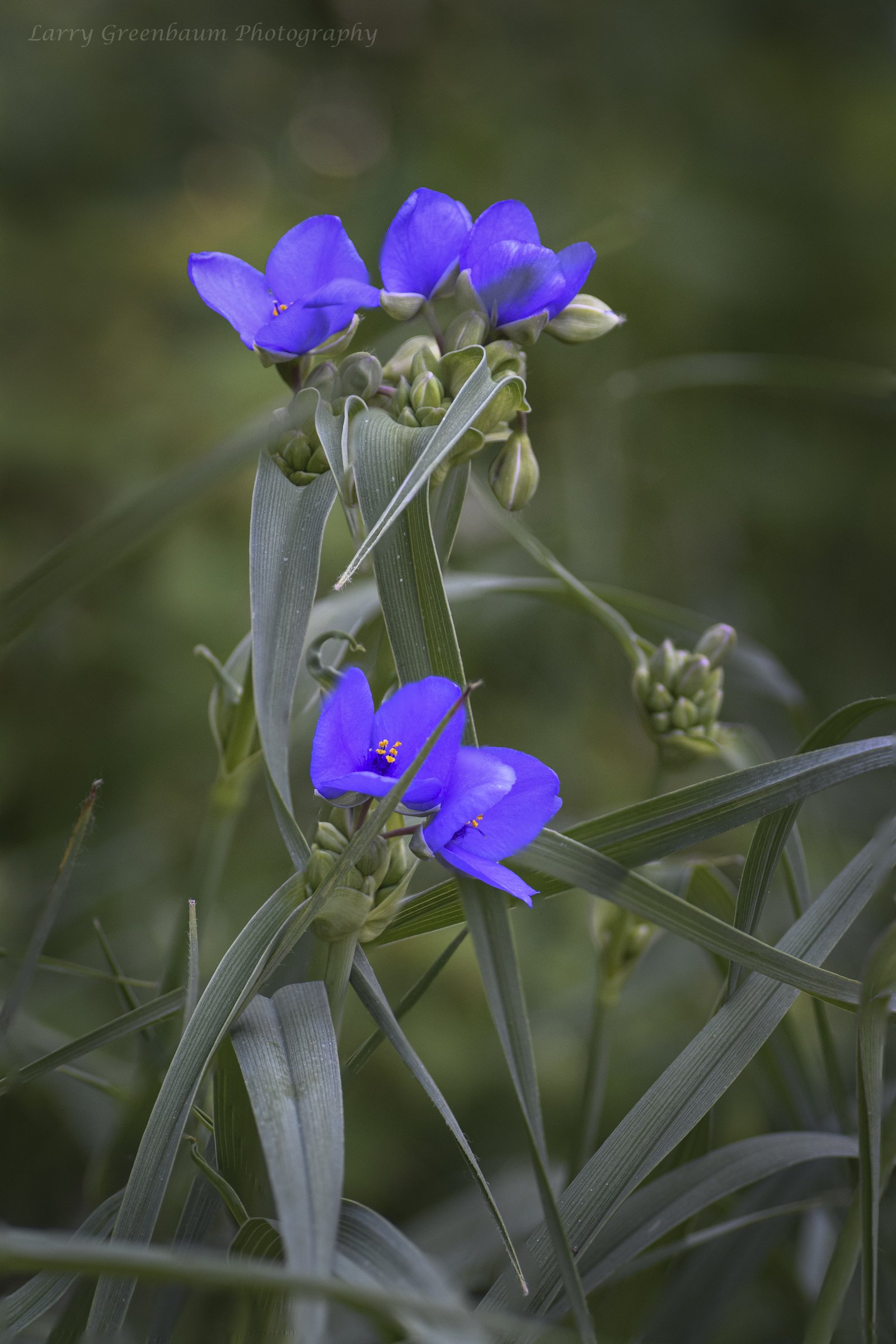
I’m interested in how crazy y’all think the B&W version of this image strikes you. I used a blue filter preset. I am including both the B&W and color versions. Thanks.
(If the background has been replaced, etc. please be honest with your techniques to help others learn)
If you would like your image to be eligible for a feature on the NPN Instagram (@NaturePhotoNet), add the tag ‘ig’ and leave your Instagram username below.
I think I prefer the color version, Larry. there doesn’t seem to be quite enough structure/contrast/texture to support a really cool black and white image for my taste. What structure there is (mostly the leaves) is rather chaotic and doesn’t form any really compelling lines and shapes that might support a B&W interpretation.
I do like the color version. the multiple blossoms are tastefully arranged and the leaves go in interesting angles to keep me occupies and absorbed in the image.
I like the color version better for the same reasons as Dennis. I think the color draws your attention to flowers, whereas in B&W, the flow is not smooth. One thing that can improve the color version is a crop just above the transverse leaf in left bottom part of the frame. That seems to take my attention away.
Definitely prefer the color version. There is a lack of detail in the flowers in the b&w version and a very complicated structure to the plant/leaves. The colored image is pleasing to view.