The photographer is looking for generalized feedback about the aesthetic and technical qualities of their image.
Description
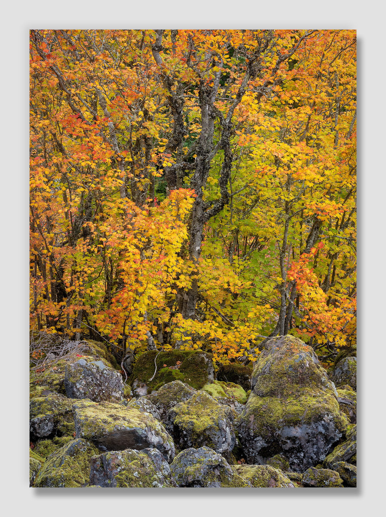
Mount Hood has boulder fields on its approaches that tend to discourage larger trees, but Vine Maple takes advantage of that to sprinkle in nice color.
Specific Feedback
This is a pretty simple composition, trying to capture the mix that the maple and boulders create. Is it interesting enough to carry the color?
As always, any thoughts and suggestions appreciated.
Technical Details
NIKON Z 7II
NIKKOR Z 24-200 f/4-6.3 VR at 99 mm
1/3 sec. at f/16.0 and ISO 64
2 images stacked for depth-of-field using Helicon Focus
Critique Template
Use of the template is optional, but it can help spark ideas.
Vision and Purpose:
Conceptual:
Emotional Impact and Mood:
Composition:
Balance and Visual Weight:
Depth and Dimension:
Color:
Lighting:
Processing:
Technical:
Very nice image. Those of us who live in Oregon will recognize how characteristic this scene is of the Cascades. I, myself, have tried numerous times to come up with a composition of dark boulders and saturated leaves, but on a smaller scale than this. So I think you have captured well the spirit of the Cascades in the fall.
This is beautiful. The green tones in the rocks is linked nicely with the colors peaking through in the BG behind the maples. I like the intricate details in moss covered rocks coupled with the intricate detail of the leaves in the trees, as well as the details in exposed trunks. The muted colors of the rocks make a great foundation to the more colorful leaves. Its a really nice photograph.
Hi John,
The details and warm colors in the large version are definitely eye candy and those moss covered boulders make for the perfect foundation for those trees decked out in their autumn colors. No suggestions from me as this is beautifully done!
John, the colorful leaves are outstanding. In fact you’d have a fine fall leaves view by cropping most of the boulders, but that’s not the story that you want to tell… The contrast between the colorful leaves and the more muted tones of the boulders lets the boulders play a larger role in the view.
This is sensational John. You certainly found Fall colors at their peak and your concept of trying to capture the mix of maples and foreground boulders is very interesting. I’d say mission accomplished. As far as the composition I have no recommendations. The green lichen on the rocks ties in nicely with all of the color of the maples. I also like the three heavy branches in the middle of the maples and their rough texture and zig zagging lines.
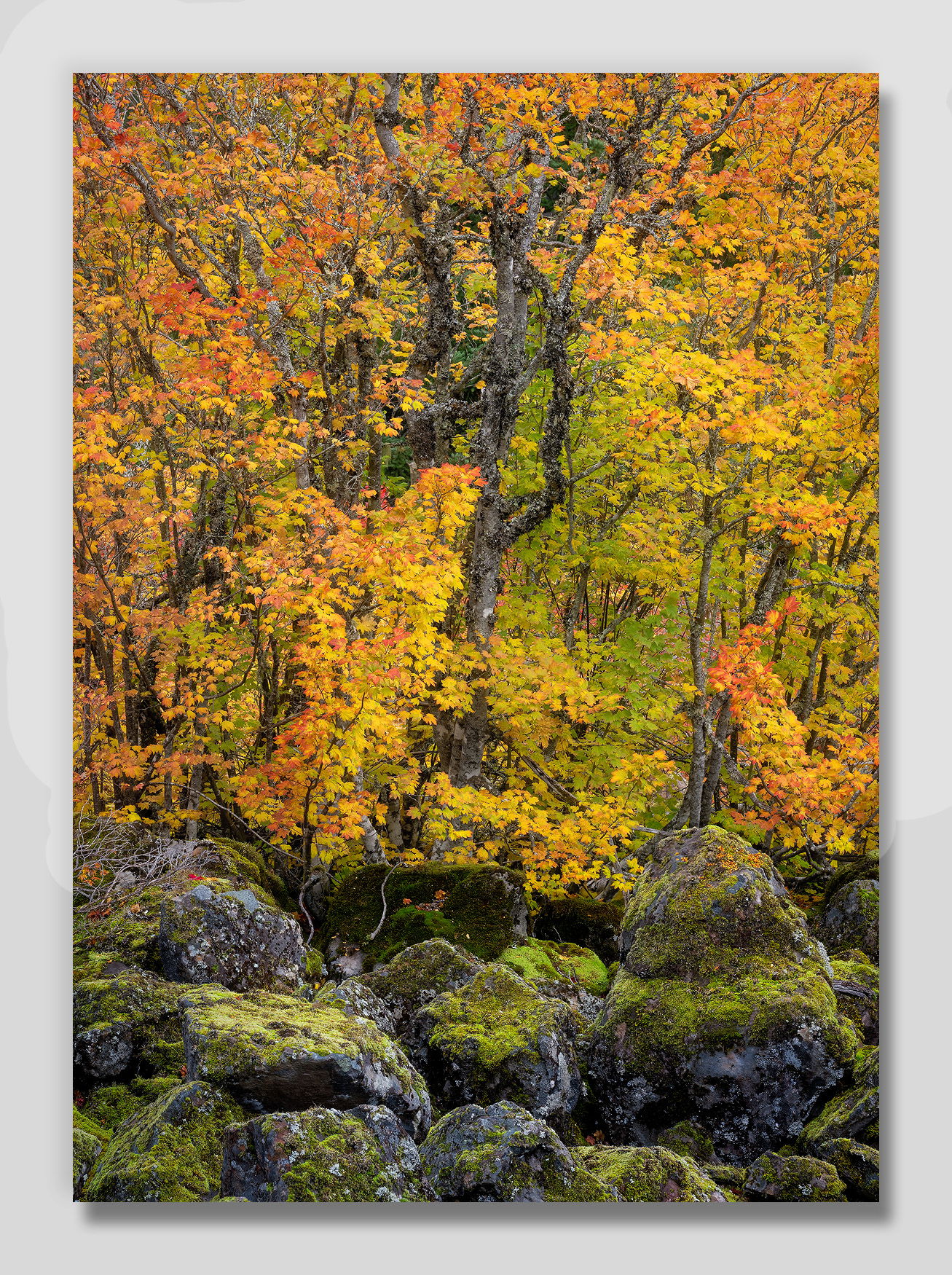
I must admit that I think I prefer the darker and more contrasty boulders in @Igor_Doncov’s repost/revision. The greens tie in so beautifully in his rework. Other than that, I have no recommendations for improving this one. Gorgeous!
I think that IS better Igor. Thanks for the suggestion! I tried to add your version to my original for easy comparison, but I’m getting an error message. I’ll work on that, and if I can I’ll make that change later so we can see them side-by-side. Regardless, I think your version is an improvement.
Edit: David Kingham helped me figure out why I couldn’t edit the original post correctly, so I’ve gone ahead and added Igor’s version to compare to the original.