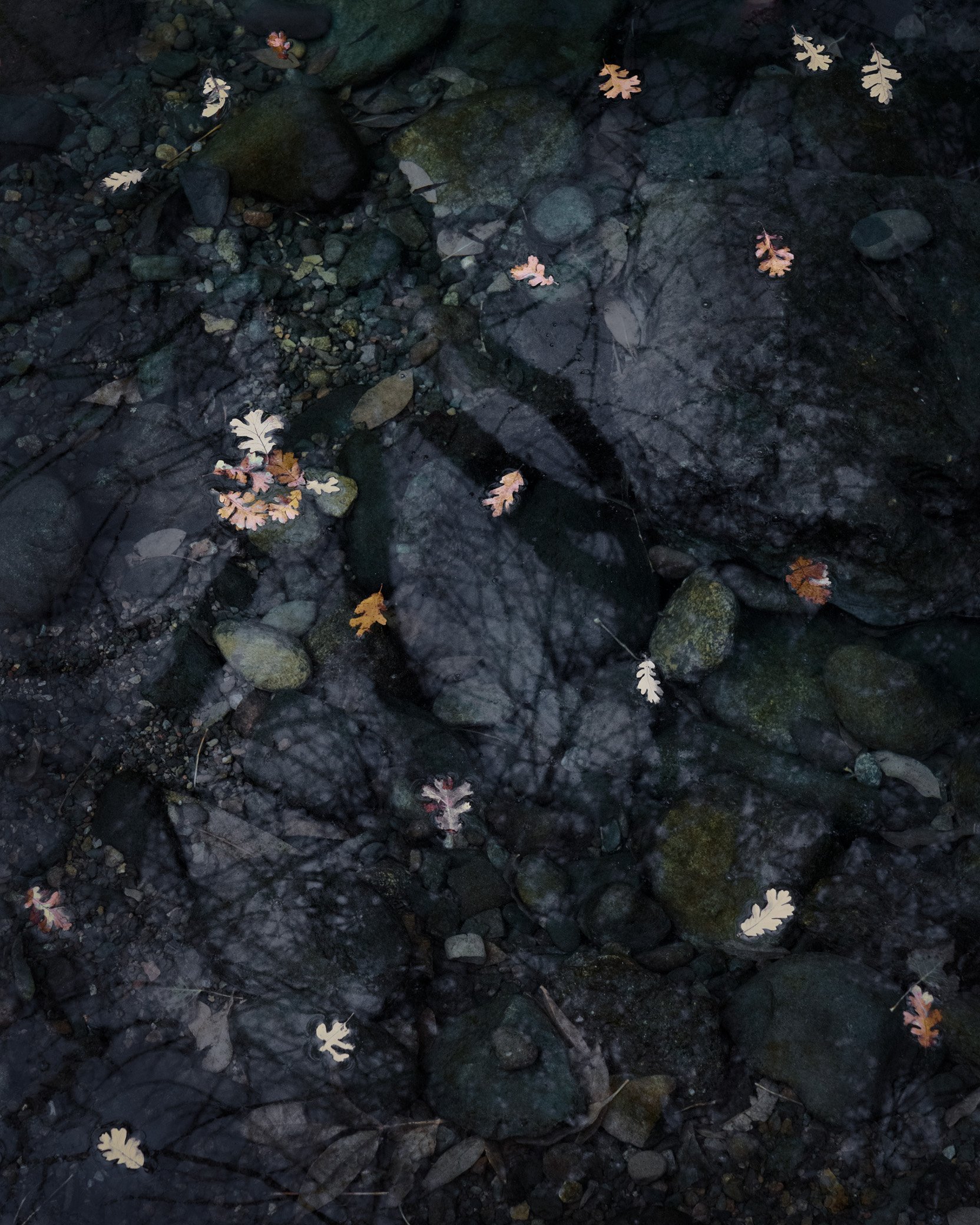
Today was the first day it’s felt like winter might actually come this year - dark and overcast, drizzling rain. The oak leaves floating in the creek near our house caught my eye, against the dark pool.
Specific Feedback Requested
Is there enough detail in the darks? I tried increasing the dark details, but it just got too crunchy for my taste. But maybe it needs a bit of that. Any other comments welcome.
Technical Details
Is this a composite: No
a7r3, 55mm, f/8, 1/60s, ISO 1600. With a CP.
Hi Bonnie … I like the mix of the reflection of the overhanging tree with the leaves floating in the water - I don’t think the shadows need more detail. My suggestion would be to crop in tighter to remove the bright leaves in the corners which lead my eye away from the central reflection … this will also make more of the reflection.
Hi Bonnie. I love the dark backgound. More details I think that you will get not increasing the light but lowering it specialli on the leave and the surface of the water. This is a proto that will benefit af a polarize filter.
Wow Bonnie, you’ve done it again. Just enough reflection to add a whole new dimension to an otherwise straightforward image. The scattering of leaves is pretty perfect against the dark streambed. Not too dark there I think. I can see fish there. You could play with the Transition tool to see if you can tilt the image to be more square, but that’s not essential. It’s a little on the cyan side to me, too, but overall it’s really tremendous. You just keep knocking it out of the park!
Oh and winter is here in northern Wisconsin. -8 here this morning. I think it might be up to 0 now.
Lovely subtle reflections in the water, Bonnie. Great how the spacing of the leaves worked out. . .not too many or too few. I wouldn’t darken it anymore, I am enjoying how I must stop and look to see all the wonderful shapes. Love this image, wouldn’t change a thing. Very nicely captured.
The bright leaves towards the corners didn’t bother me, but I was on the fence about the crop. I’ve done a rework with a tighter crop and removed a couple leaves that were now really near the edges.
It did benefit from a polarizer. The leaves really popped out when I put on the CP.
Ha ha - I didn’t even see the fish when I processed it. The color was another thing I was on the fence about. The color was pretty much as it looked IRL, but the greenish tinge is a bit off-putting, I think. For the rework, I tried to eliminate the green color cast, making it more blue. I have to say that adjusting colors is my least favorite thing in processing - I find it difficult to get just the right adjustment.
My first reaction was that the rework is significantly better. But now I feel that each is good in it’s own way. The less well defined original has an appeal that the rework does not. I think I liked the green hue in the original. But the added detail in the rework is beautiful and adds more richness. Richness vs mystery, which do you choose?
I missed this post, Bonnie. I agree with @Igor_Doncov that both work well and give us a different feel. I too, like the green hue in the original. The original is more serene, the rework is more dramatic. Both are awesome.
Can’t I have both? I deliberately dodged a bit of the midtones in the rework, but wondered about the decrease in mystery, as you put it. I’ve added a 2nd rework, with some of that dodging eliminated.
Bonnie, I think the luminosity in the latest version looks perfect, nice details in the darks and good (but not too much) contrast with the leaves. I feel like the color changes add too much magenta/purple, but we all see color differently. The entire scene is very well seen and both the cropped and uncropped versions are excellent.
I’m late here, but have to chime in with a thumbs up for a lovely image! I think you have hit a home run with the last version. The subject is so engaging and well rendered! The leaves (Oregon white oaks?) are such interesting shapes.
Just seeing this for the first time, and after studying it for a while now, I think I like the Original processing best but with the crop and cloning of the later versions. I love this type of image, and the original offers the best clarity and color IMHO. Good eye, Bonnie!