Please share your immediate response to the image before reading the photographer’s intent (obscured text below) or other comments. The photographer seeks a genuinely unbiased first impression.
Questions to guide your feedback
The idea here may be relatively clear, but I’d love to hear what your reaction is to this.
Other Information
Please leave your feedback before viewing the blurred information below, once you have replied, click to reveal the text and see if your assessment aligns with the photographer. Remember, this if for their benefit to learn what your unbiased reaction is.
Technical Details
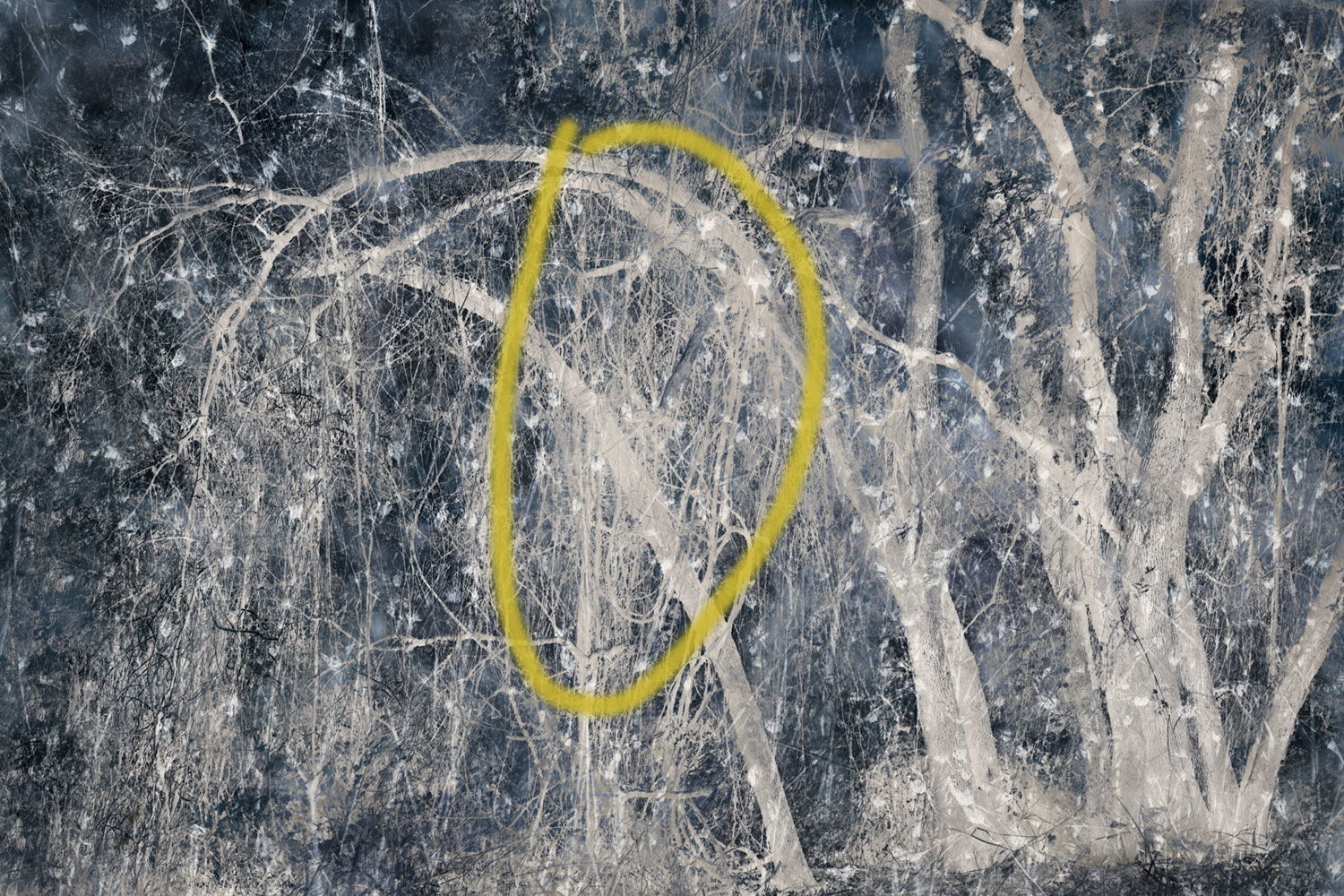
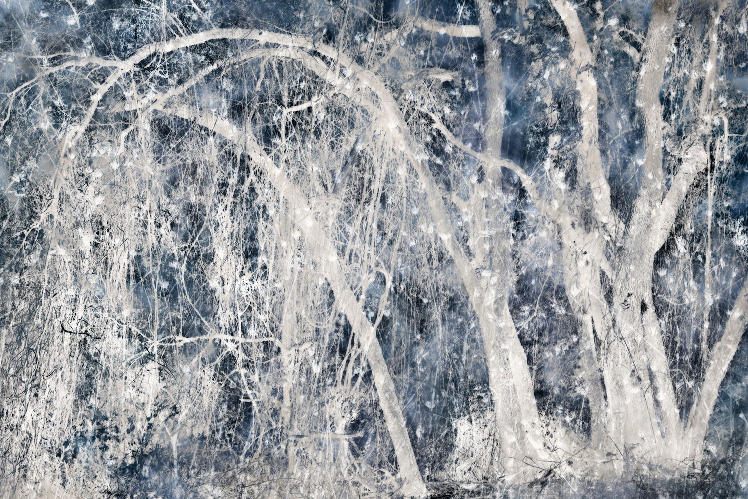
Another multiple exposure done in PS. The base layer is the trees with the drooping vines. I made that image with the intent to use it to make a ME with a winter theme (even though there were nice fall colors in the original). It was the bent over tree with the hanging native grape vines that caught my eye and which I thought would make a good focal point for a wintry scene.
It is lovely, Bonnie. Truly looks like winter to me. The blueish tone combined with the “sparkles” adds a magical holiday feel. I’d love to see it printed large on a wall. I could be lost in it for hours. Very creative and nicely done.
My initial reaction was to identify this as a snowy scene in a dark forest. As I looked a little closer my reaction was that the photo is a monochromatic tonal inversion, whether that is correct or not. It’s a pleasing composition and I like the experiment, regardless.
Wow! You continue to amaze and impress! This is simply fantastical - (new AI word… ha ha…) Maybe it’s a combination of fantastic and magical? And yes, most certainly comes across as a wonderful winter scene in the forest, highlighed by the magic of giant snow flakes or stars… which leads me to think of the old “Wonderful World of Disney” and that opening scene where Tinker Bell uses her wand to sprinkle stars… or something like that… Love this.
The analytical side of me kind of sees two images, the left and the right, kind of the yin-yang effect. But I don’t see any good or improved way to crop or separate. What I am thinking, is perhaps the layer that has the weeping branches in the middle could have the opacity dropped to lessen the intensity in the center, then the image might have a better connection between the two halves. Not sure, but just a thought. I think it might be even more magical.
This works very well, Bonnie. It certainly has a winter feel. Your processing and choice of palette really make this feel like winter-I need to add another layer.
I’m not sure what you’re seeing, Lon, with regard to the 2 halves. There’s the vertical trees vs. the drooping trees - is that it? I could see maybe toning down the more vertical trees in the right-hand third of the frame (I tried that, and I think it works).
You are correct. Two of the layers are “inversions”, using darks masks from the TK panel, converted to pixel layers. The trees were inverted, as was the “snow” (which is actually dead star thistle).
Yeah, pretty much Bonnie. I brought it in to PS to see if I could demo or show the crops I was thinking of… but then switched gears. What I’m thinking now is the very center area of the image in the central drooping branches, the contrast, tone and brightness is slightly different than either the right or left portions of the image. Both left and right areas are more vibrant/brilliant than the center area. I don’t think I can address in PS without the layers you’re working with, so I’ll settle for just indicating the area.
Impression still hasn’t changed… it’s just magical.
I think the inversion works well here, Bonnie. My first reaction, to be honest, was that all the tree trunks but one are leaning to the left and the photo is about to fall over. That reaction made me uncomfortable. Such a reaction may be an idiosyncrasy of mine and I wouldn’t attach much weight to it.
Just gorgeous! And mysterious! And winter-y! I’m late here and will just add a quick impression about the area @Lon_Overacker pointed out – for me the composition feels a little tonally imbalanced, accentuated by the leans to the left. I wonder if the central area was darkened and the left side made lighter, to balance the lightness/brightness of the right side, would that work? I love the jumble of trees on the right and think they would make a wonderful element for another creation if they could be framed without the leaning tree.
I can see why you’d feel this way. I think it’s because I left room on the left for everything to fall into. I’ve done a rework that I think will address that, although a bit of tension is ok for me - those droopy trees aren’t very cheery.
I’ve done a rework to even out the tonalities across the frame. I also transformed the tree layer so they fill the frame more, eliminating the dark spaces on the left. Let me know what you think, @Lon_Overacker and @Diane_Miller.
Bonnie, thank you for considering the feedback and taking the time. Now I must apologize because now I think I’m getting to nosey… because this is your image!
Great job evening out the tonality; it’s much more even across the frame. I think now some of the “starry night” impact has changed. I think bringing back some contrast and the darks while leaving the tonality brings it back. I just brought in to ACR, dropped the shadows a few points, actually like -30, increased the highlights for the stars and tweaked a couple being careful not to blow anything out.
Bottom line, it’s your image and what you’re happy with is what matters. I just love the image and wish it were mine!!!
Thanks, @Lon_Overacker. Yes, I may have brightened it too much. I like the darker sky. BTW, I was thinking that the “stars” were snow, but stars work, too.
Interesting – but I like your original better! First instincts are usually the best! There are so many way to go with a good image, it can be frustrating.
Bonnie, I keep going back between the two versions you shared. Each has their own story to tell. I like the breathing room on the left side of the original and would have recommended a slight rotation clockwise to help with the “leaning” issue some folks raised. Regardless of which version you go with, the image and creativity is great!
You’ve probably already researched other artists who are doing this type of creative work but just throwing out a few names: Valda Baily, Glenys Garnett, Jo Stephen, Doug Chinnery.
Good idea, Alfredo - thanks. Don’t know why that didn’t occur to me, other than that these trees really do lean like that. Posted a rework that’s rotated.
Thanks for the suggestions for other artists doing this sort of thing. I was familiar with Valda B. and Doug C., less so the other two. I especially like Jo Stephen’s work. It’s very elegant.