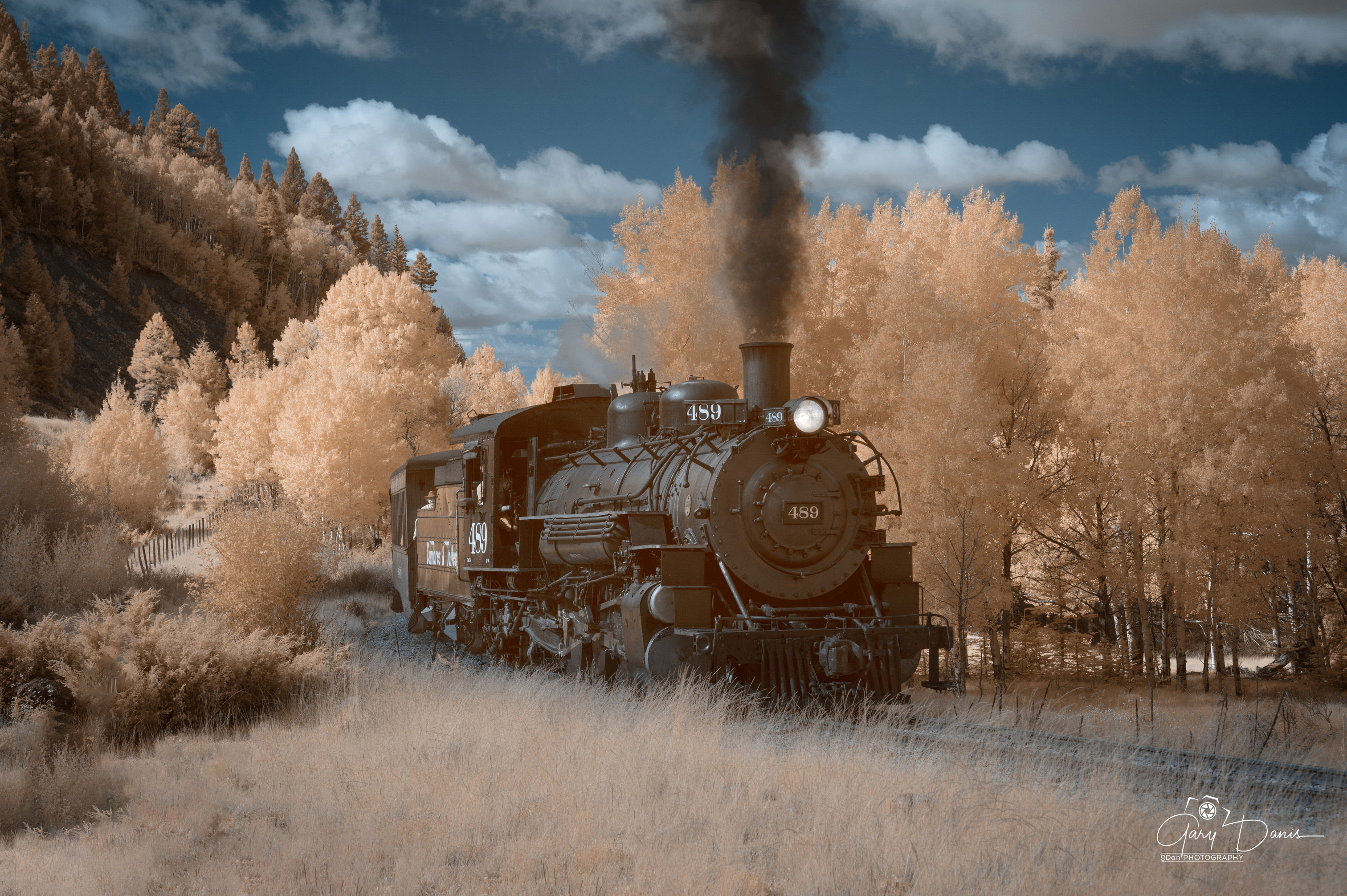
I love steam train and we are fortunate to have two in Colorado; my favorite is the Cumbres and Toltec RR, which starts in Chama, NM and ends in Antonio , CO. I spent five days photographing the train in normal and infrared.
Type of Critique Requested
Aesthetic: Feedback on the overall visual appeal of the image, including its color, lighting, cropping, and composition.
Conceptual: Feedback on the message and story conveyed by the image.
Emotional: Feedback on the emotional impact and artistic value of the image.
Specific Feedback and Self-Critique
When first viewing a IR RAW image, all you can see is a red image; but after correcting for white balance on a cloud or a neutral color in the image, the image starts to transform. When possible, I like to keep the sky blue, so I swapped colors, red for blue in the sky. Next, I played around with colors on the fore/mid ground to colors I liked. There is no precise formulas in transforming a IR image, unless of course you convert to B&W.
Technical Details
This image was taken at the start of the route as the engine emerged from a grove of aspens. It was shot at 665nm on a full spectrum camera, processed in LR & PS, color swapping colors. Not everyone has an “eye” for IR, the more I shoot it and view other photographers images, the more I appreciate the artistic quality of IR.
Gary, this scene is really appealing, and your description of what you did in changing colors (the sky) is very interesting.
At first I thought this was an autumn scene with golden leaves everywhere, and black smoke rising from the train engine. Yet I also wondered if it was IR. I like the softness of the brown tones, especially in those tree leaves, but also the foreground grasses
Compositionally I like the train emerging from the trees, from background left to foreground right.
I think old trains are so full of story just looking at them. They bring the past alive, and in this scene it seems to be coming at us, from out of the past.
Well done!
Well, thank you Mark. I’m still relatively new at this and still working on combinations that seem to work. Trying to build an inventory of what I do on images, so that I can refer back to them. My inspiration comes from the work of Rob Shea.
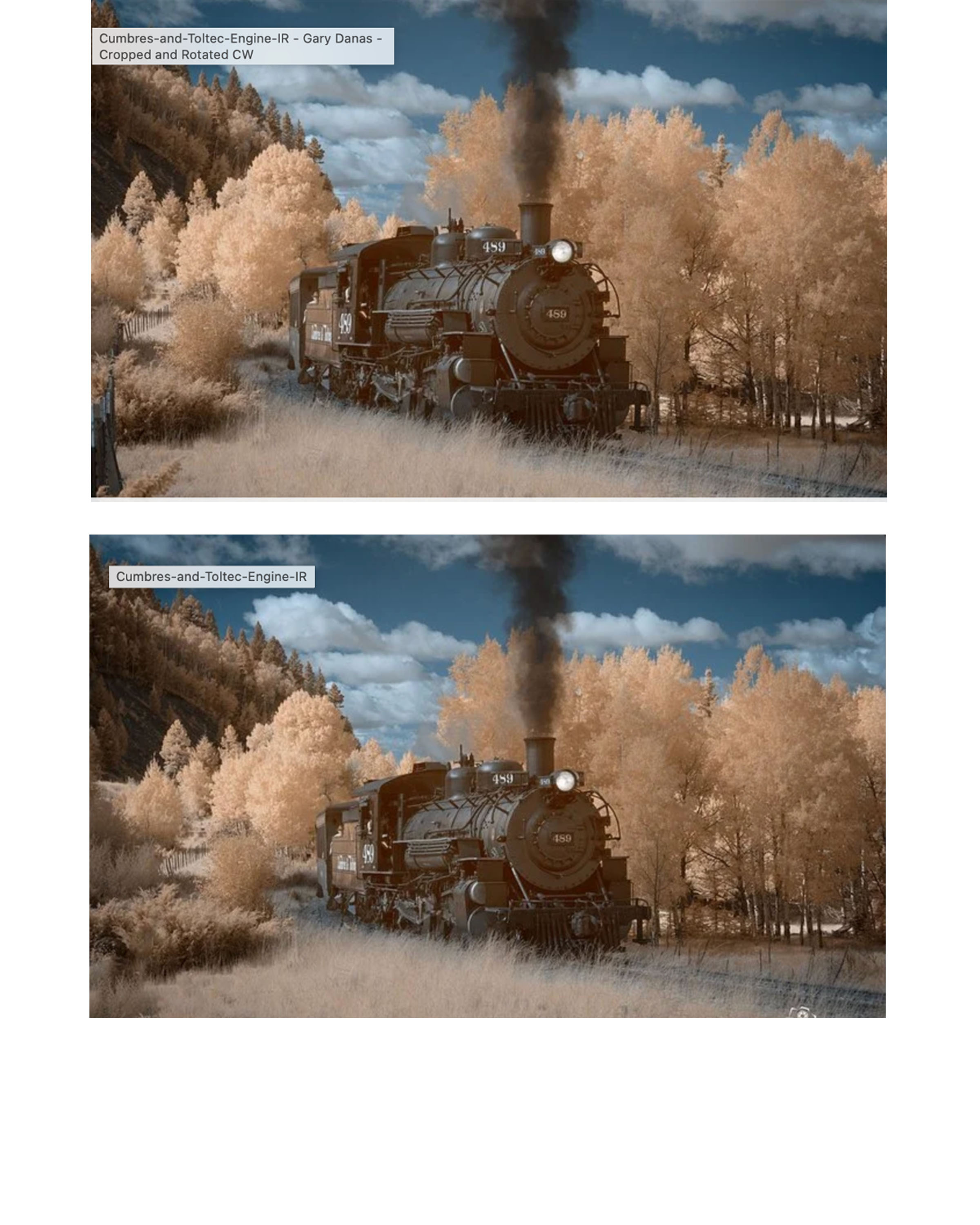
I am a big rail fan and appreciate this view into steam train yesteryear, even if it is a tourist RR. I like the comp and find the image most appealing. The color of the trees and grass set up nice contrast with the engine and sky, so the image works well. What do you think about the fence on the left? Might this be a distraction? Might you clone out the heavy foreground part of the fence and the bush next to it? To me, the train moving slightly right toward the LRC offers effective visual movement.
Hi Gary, this is such a wonderful image. I love the IR treatment. The old time train and IR gives this an old time feel, like from the 1800s or so…I think the black smoke stands out nicely too.
I like this genre of photography, it’s very unique and appealing.
I like the subject matter as well, and that’s probably because of my own passion for old steam engines. I watch a YouTube machining channel where a fella repairs and makes new steam engine parts, he works as a volunteer machinist at a museum in Georgia. I have my own small machine shop so machining is part of it I suppose.
I like the composition of this a lot, but to me, the engine appears to be leaning to its right on the tracks. It appears that the train is coming off a hill and onto a level stretch rather than going back up hill, it may be going up hill but it doesn’t feel like it. It may just be an illusion but I feel it should be corrected to some degree. I hope that makes sense and this is just my personal take on the matter.
IMHO, Sometimes we need to change the perspective slightly to make it feel right even if it doesn’t represent the actual scene accurately.
BTW, I think @Larry_Greenbaum’s point is valid and he done a very good job on the cloning
I like the inclusion of the fence on the left but the first two posts seem to be slightly dominant so I suggest that the image be:
Rotated CW slightly to keep the engine from appearing to be leaning,
Bring the trees on the right a little more vertical.
And crop the first two posts out from the left to make the fence less dominant.
As a side note: I am always on the fence (pun intended) about cropping or cloning out things in a scene because we rarely, if ever, just look at the main focal point, personally, I always look at the main focal point first, then spend time looking at everything else in the scene, I understand an element drawing my attention away from the main focal point so I can see making those elements less dominant but not removed entirely in this case.
But, we have to remember that everyone has their own personal taste.
And finally, this is a great “Yesteryear” image!
Cropped and rotated CW a bit.
Edit: I posted the wrong version, the first edit was rotated too far, sorry about that.
I usually consider items in the lower corners as not a distraction when in a vignette, however your point is well taken and I will consider watching for corner distractions in the future. Thanks.
There are two ways to greated a true IR digital image, either a 720 nm (nano meter) filter on a normal camera, which will require a long, 2-3 minute exposure or camera modified either to a specific nm range or a full spectrum camera, which can use a variety of filtes. Best to take a look at this YouTube video that explains the basics. https://www.youtube.com/watch?v=8k_vOSs8-lc
As I noted in a response to Larry, perhaps I need to be a bit more cautious of objects in vignetted corners.
I did look at the rotation of the train in the image and did a side by side comparison of the two images side by side. You may be right, but I could not comfirm when I looked at both. There was hardly a reference point to determine, and I typically pick that up, however in this instance can’t be sure to my eye. However, related to another critique, I may not be paying attention to such things and will keep that in mind. Thank you for your comments, Merv.
Thank you for posting your thoughts and for the response in general.
You might be surprised at how many mistakes I make when I’m out shooting! (and editing my own stuff).
Yeah, it’s harder for the photographer than it is for the viewer because the photographer is the one that knows the real lay of the land having been there in person.
I have a couple of images right now that I can’t figure out exactly why they don’t look right, I will probably have to post them to get help from fresh eyes.
We’re all just trying to help each other out.
I can use all the help I can get!