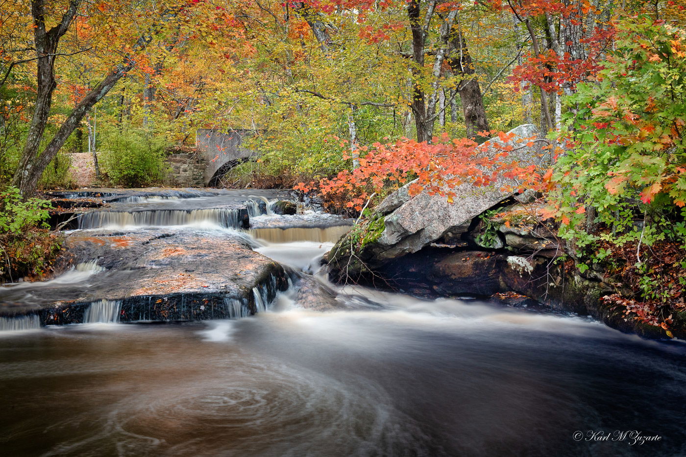
With Fall coming in earlier than expected, i thought i will post this to get the ball rolling this year!
This is Step Stone Falls in West Greenwich, Rhode Island photographed last year
What technical feedback would you like if any?
any
What artistic feedback would you like if any?
other water smoothening recommendations
Pertinent technical details or techniques:
(If this is a composite, etc. please be honest with your techniques to help others learn)
Composite
Water - 15 secs
Leaves - 1/400 sec
If you would like your image to be eligible for a feature on the NPN Instagram (@NaturePhotoNet), add the tag ‘ig’ and leave your Instagram username below.
This is beautiful, Karl. The placement of the rocks, the branch with the red leaves are all in great placement within the image. Great shutter speed for the water. I could just sit and enjoy this image. I hope you get this printed large and hung in a prominent place.
This is a wonderful capture. It’s certainly making me excited for fall…especially since we are still over a month away in the Ozarks.
The color processing looks very nice on my screen. The composition looks nice. I might have only given a little more space below the swirl to give it some more room from the edge, though it’s hard to know if that would have thrown something more important off without being there.
The water smoothing looks nice to me. There’s enough texture to indicate the movement for my personal taste. I think the only processing thing I would consider doing would be clone out or darken the whitish area (lichen, coloration of the rock, or something) near the middle right of the image, below the small red leafed tree (maple?) In the midground. It’s just a tiny distraction.
I love this composition and colors but it feels a bit bland, lacking vitality. Now that’s a personal thing and some compositions look better having a flatter look, such as high toned ones. But most people want to convey intense fall colors (as opposed to subdued winter colors). The higher tones in this image also lack contrast.
I lowered the high tones with a curve adjustment, added a bit of contrast, raised the shadows a bit, and added a bit of texture.
As you say, it is a matter of personal taste - I find that most folks who want to convey that intense fall color, look actually over do it.
Lowering the high tones = reducing whites / highlights ?
I will try your suggestions - perhaps a blend
Thanks Igor!
Stunningn image Karl. I concur with several of the other posts as well. Color, composition, and light are all well balanced. You mentioned you played with shutter speeds between 2-20 sec’s. Using a polarizer or ND filter may have helped you with decreasing a couple stops and added more of a smoother aspect to the water. I too have played with these aspects and it is a touch of personal taste. Gorgeous shot!!
Hi Karl, and welcome to NPN. I knew i should have gone with you this day
I like the shutter speed used here, and especially the way it creates the circular flows in the lower left corner (LLC). The framing of the falls with the trees, and bridge is very effective too. The multi-tierd falls creates a nice sense of depth here.
Color and saturation are very personal/subjective, but I could see doing something in between your presentation and Igors. The oranges are fairly saturated here, but the greens and yellows are not, and could benefit from a boost in saturation. Igor also increased contrast for richer blacks, and I think moving in that direction helps too.
In terms of composition, I think it works pretty well overall. I am slightly bothered by the negative space in the LRC. The circular pools in the LLC have so much visual weight relative to the empty space in the LRC, that I could see a crop from the right. In terms of saturation, i think a TK vibrance mask could be used to boost the less saturated green/yellow while protecting the saturated oranges. And I would add a little mid-tone contrast for richer shadows, along the lines of Igor’s changes. I also dodged the highlights near the circular swirls to give them even more emphasis. Here is a rework that reflects my comments.
This is one gorgeous autumn scene with an added bonus of the patterns in water at the bottom. And the only way to get those is with a LONG shutter speed, so I think you did well in that regard. Besides, the little cascades scattered about above the pool are small enough they don’t require any detail so the long exposure isn’t hurting anything there. And then, great job blending with a faster shutter speed for the leaves. I think you executed this quite beautifully.
Suggestions so far I consider tweaks - ones that might elevate this to the next level, but really there’s not a thing wrong here that needs correcting. As all note, it’s a matter of personal tasted. Having said that, I like Ed’s color/contrast edits. But for me I prefer no crop - again, personal choices.
The only suggestion I have I don’t think has been mentioned. I would do a little color correction in the darker parts of the water LR; The dark areas look a little blue to me. that’s pretty minor though.