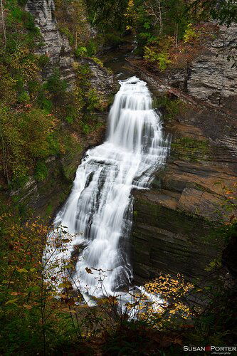
Capture this waterfall in Robert H Treman state park in New York last weekend. The fall colors were just starting to come out so there isn’t any amazing reds. I liked this view as it seems to show how deep the gorge was and give a sense of the size of the waterfall. Looking for some feedback on what works in the photo and areas where I could grow both artistically and with technical skills. I tend to like darker contrasty images so many of my images have the feel this one does.
Any pertinent technical details:
Used a 3 stop ND filter and polarizer. ISO 100 F/11 0.8sec with a 24-85 mm f/3.5-4.5 lens. Did some burning on the gray rocks to reduce how light they were and make them blend into the background. Burned a bit of the waterfall to try and give some definition to the water. Used luminosity masks with a curves layer to add contrast and a color contrast layer with Nik to make the fall colors stand out more.
You may only download this image to demonstrate post-processing techniques.
This looks real nice. The color and contrast work well.
I do have a few suggestions for fine tuning:
-
Use a ‘bright lights’ luminosity mask to see if you can tweak the contrast in the cascade to bring a little more detail. It’s real close, but a slight tweak would be in order.
-
Crop down from the top to just below the cedar branches on the right. This will give more prominence to cascade.
-
Clone out the bits of cedar branch on the right edge.
-
Lastly, try using a ‘darks’ mask to pull some detail out of the immediate foreground.
I think you did a good job handling the dynamic range, and the overall the image has a nice mood.
_p
Susan,
You did a great job in framing and capturing the entirety of the falls and it’s surroundings. I pretty much agree with Preston’s critique, although I’m not sure I would crop much, if any from the top. I think it provides good context of location; the cedar branches don’t bother me. But actually the dark rock/stump in the lower right is more of distraction for me. The good news is that it’s dark, which is more fortunate than if it were lighter. 
I like the clean whites of the cascade. I’m kinda surprised that .8s allowed for so much of the water to wash out; I think the distance to the falls may have had something to do with that. But if there’s any way to squeeze some more detail in the falls, especially the shelf areas, that would be the only improvement I think. (Maybe there are other frames?)
Lon
Thank you Preston and Lon! I cropped a bit of the top and lightened up the dark area at the bottom. The dark lump turned out to be a rock. I did some dodging on it as cloning didn’t seem to be working too well. The crop took much of it out. Used a bright mask for the luminosity of the water to try and get a bit more definition.
The water was moving very fast that weekend in all the falls I visited. They had some rainfall earlier in the week. Quite the contrast to the last time I was there with very little water flow. Think that’s what is playing into the shorter shutter speed with more blur.
1 Like
The repost looks real nice, @Susan_Porter.
If you decide to print this one, be mindful of the brights in the water–they could go wonky on you, but they look in the Web version.
Thanks for taking making the effort to tweak this one!
-P
This is a real nice showcase of this falls. Good job on the repost, I think the changes strengthen the image nicely. I have no other suggestions, looks good.
Thanks for the tip on printing. I’ve been trying to learn a bit about soft proofing with printer ICC profiles and color gamuts. Lots to learn in that space.
Thanks for the comments. It’s nice to have the constructive feedback from NPN.


