Hi,
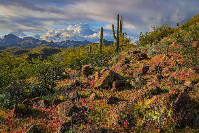
Getting in the swing of spring flowers in the desert. This is one from last week. Lot’s of owl’s clover near Lake Pleasant outside of Phoenix
What technical feedback would you like if any?
What artistic feedback would you like if any?
Does the color temperature seem correct?
Pertinent technical details or techniques:
(If this is a composite, etc. please be honest with your techniques to help others learn)
Canon RP, RF 24-105
If you would like your image to be eligible for a feature on the NPN Instagram (@NaturePhotoNet), add the tag ‘ig’ and leave your Instagram username below.
JT,
It’s nice to see a post here of the desert in bloom! The distant clouds and mountains make a nice destination for the viewer after enjoying the colorful details in the foreground. I like this composition. Regarding temperature, for my taste it appears to be a little warm and the colors appear to be a little too saturated.
Thanks for the comment, Alan. You confirm what I suspected. I’ll work on it some more. Have a great day!
This scene is very nicely captured, JT. The composition seems carefully crafted and exposure looks dead on. As for it being oversaturated, I’m not sure it is, or only slightly so perhaps. As for the color warmth, I can’t really speak to that because I’ve never visited there, but for Florida, the temp looks about right for a early or late mid-day shot. I have thoroughly enjoyed exploring all the nooks and crannies in this; my only wish is that was larger. Well done.
James,
What a beautiful landscape image from the Sonoran desert. I think you’ve really captured so many of the beautiful elements, and composed and framed them expertly.
I think the color/sat works well for 90%, but if it were mine I would tone down the lime greens in the LRC. Not because the sat is out of bounds or anything, but because that’s the first place your eye goes - (or at least settles there) and IMHO influence the though of color/sat for the rest of the image. The sky, bg mountains, green vegetation all look pretty normal to me.
for sure a well seen and composed landscape.
Lon
Thanks, Bill. I appreciate the feedback. Happy shooting!
Thanks, Lon. You gave me something to think about and I’ve toned down that corner. It does help dramatically. I think the eye moves over it much easier now and then into the rest of the image. I really appreciate the help in making this a stronger image. Have a great day!
1 Like
Great photo! My two cents worth is it is slightly oversaturated, and in the on going debate/discussion about having foregrounds that are lighter than the sky (a physical impossibility in most cases), to my eye it seems a bit unnatural because the sky is darker than the foreground. Minor nits only…good job!
This is gorgeous James! I wasn’t doing photography all those years I lived in AZ, and I really need to get back there. I love Al’s Clover.
The color balance seems a bit green to my eye, especially in the blues. (Margulis recommends that when measured in lab, the sky should be no more than -5 in the a channel; more than that suggests the image is shifted green.) I also agree that toning the foreground down a bit is a good idea, and a slight vignette helps reduce the glow of that lrc. Here’s a visual idea of those thoughts.
Thanks, Tony. I appreciate your eye and your two cents! I think in this case it is actually possible that the foreground was lighter and that is part of my challenge getting the color right. This shot is actually looking northwest so the sun is off to the left. You can see the shadows of the rocks. It’s about 5:30 in the afternoon and the clouds have broken over me, letting in a lot of light, but are blocking the sun in the mountains, off and on. Lots to think about!
Hi John! Thanks for your feedback. This is a time when it’s good to be doing photography in AZ. It’s just perfect for getting outside. As you know, that will change in the summer.
Do you have a citation for the Margulis recommendation? I’d like to follow up on that. I like your take and will do some more editing.
Have a great day!
My memory is he mentions it in several places, but the reference I can remember specifically is in his book “Photoshop Lab Color.” On page 110, of the latest version, he has a quick guide to realistic ranges for neutrals, faces, vegetation, skies, and browns (soil/wood/etc.)

