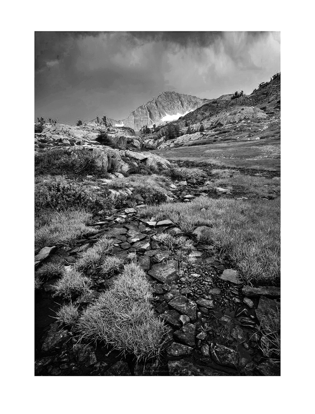
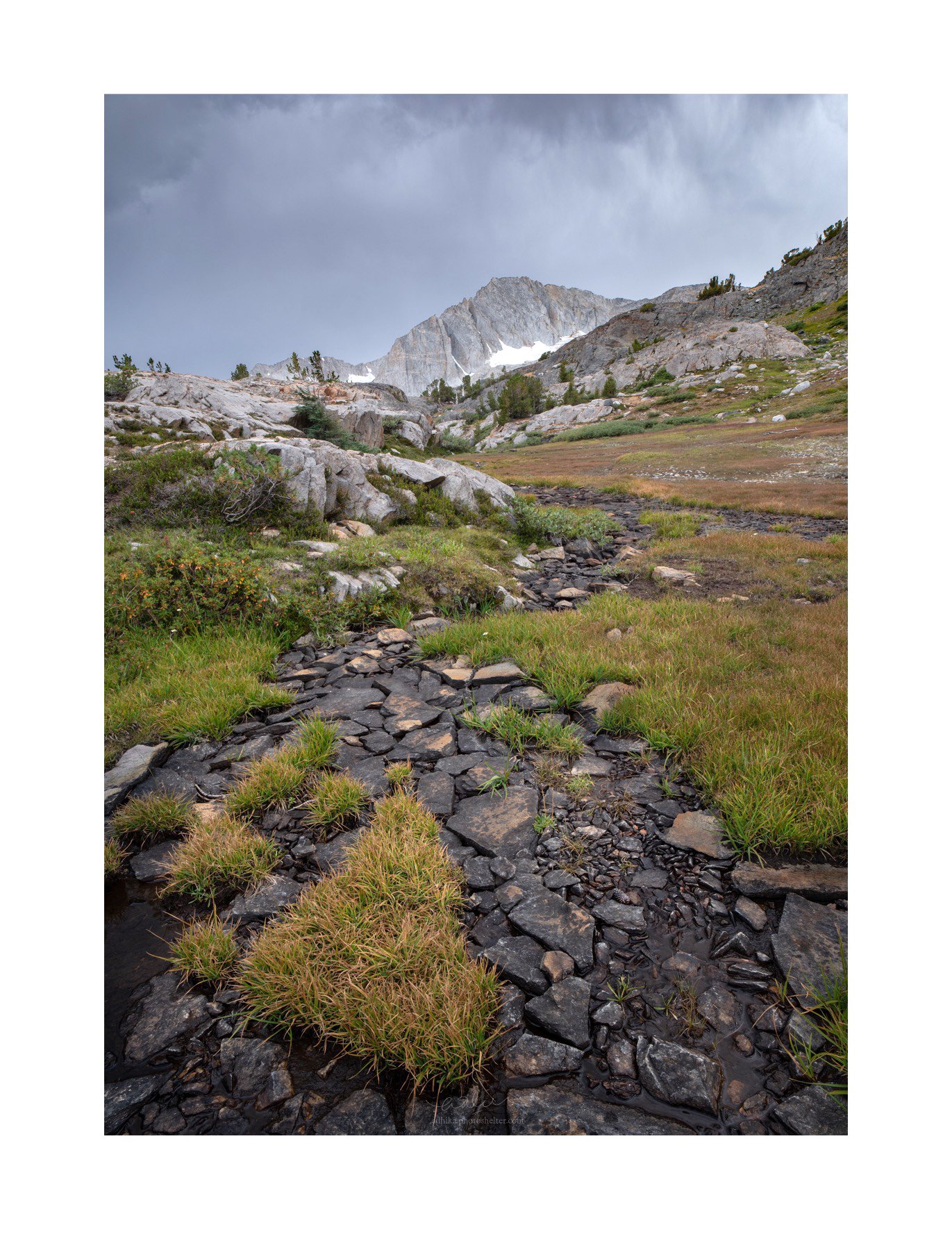
I am usually quite certain whether I want an image to be in color or in B&W. I am, however, quite torn on this one. So I would love to hear your opinion on this (and any other comments/critiques you may have on the image). The composition is a clichè and perhaps too obvious but when you are in the Sierra high country, it’s very hard not to go Galen Rowell with the composition.
Nikon D750, 21mm, f/16, 1/5, ISO 50, three images focus stacked.
We will forgive you for going Galen Rowell on us this time Adhika
As presented, there is no question that for me the color image just sings, and the B&W image is relatively less interesting. In the color image the light in the sky and on the mountain has a much more luminescent quality than in the B&W. The warm colors of the grass add some vitality to what is otherwise a not so interesting foreground. The triangle shape of the clump of grass in the LLC stands out much better in the color version (usually B&W is more effective at emphasizing graphic shapes). The leading line of the dry creek also stands out better in the color image.
But I still think the B&W image has potential to address some of the places it falls short of the color image (in my subjective opinion). I downloaded your color image, and reprocessed it in B&W. I used the Photoshop B&W adjustment layer, and really pushed the yellow and green tones in the grass to a much brighter luminosity. I think this makes the B&W foreground much more dynamic, and now the leading line of the dry creek regains it’s prominence. I also tried to boost the contrast in the sky to restore some of the luminescent quality that is present in the color image.
Adhika, I know your personal style usually leans to the softer, gentler end of the spectrum, so my higher contrast B&W version may not be to your taste. But if I wanted to address some of the issues I mentioned about B&W vs. color here, I think changes in this direction would help the B&W to be a stronger image. Just my $0.02 worth.
Adhika, I really like the variety of subtle colors. The creek makes a nice leading line and there’s a fine quiet sense that makes it easy to feel like I’m there enjoying the day. I think the b&w version would look better with more contrast, but that would give it a very different feeling.
@Ed_McGuirk: I think I understand what you see here and I think that’s my quandary, too. I also like the separation between the rock and the grass in the color image better. I think that’s what you are trying to achieve in your B&W revision and I think you are successful at that. However, I am with @Mark_Seaver here that the mood is different from what I am trying to achieve.
Now, what makes me hesitant about the color image is the color combination of the sky and the grass. Do they “go together” (either in a complementary way or in a harmonious way)? I feel like they don’t but this is coming from someone who doesn’t really know how to mix and match my shirt and pants.
In the color image I think they do go together in a complementary way (warm grass /cool sky). To me this warm/cool contrast is part of what makes the sky pop more in the color image. Even though it is in shadow, the grass is not so warm that it looks un-natural relative to the sky. Normally shadows are cooler and highlights warmer. But I don’t think you have pushed it so far that it is unrealistic in keeping the land warmer.
As presented, I would have to go with the color version, but I wasn’t convinced the B/W was doing the image the justice it deserves. I read the thread and saw where @Ed_McGuirk went with it. I like parts of it, but thought there was more possibility. Here’s a version created with a PS B/W adjustment layer, curves, levels and finally a bit of dodge/burn and a TK targeted adjustment going after some of the lighter tones in the grasses. I think this version competes well with the Color version. Both are very nice.
I like where @Keith_Bauer went with the B&W version. I might darken the sky from his version, but leave the clouds as they are. The color is not really grabbing me at all and I think in both I find the big white border tends to overwhelm the image given the viewing size.
Before answering color verses black and white I did a levels adjustment on the color photo to increase the white point because it seems too dark to me. After having done that (below) I think the black and white versions by Ed and Keith are both better photos. To me the colors are just not that compelling.
@Keith_Bauer, I like the direction that you went with the B&W but I think it goes a little bit too far for my taste. That said, I think you and @Ed_McGuirk make a very compelling case about bringing up the contrast. So, I played with it some more and I think I am convinced that this is the right way to go in the B&W image. This is somewhere in between the three versions we have in this thread:
Very interesting interpretation, Igor. I would have never thought about this. I don’t think I will go this far but could definitely brighten the mountain by a touch. Another example how we can bend the “reality” more with B&W.
I’m going to go ahead and comment before I read all the other responses. IMO the color works much better in defining the shapes in the landscape. Also the dark clouds are somewhat ominous in color-not so in B&W. I think you have a good composition.
I’m a little late to comment on this. I think that I prefer the black and white as it places greater emphasis on the line created by the arrow shaped grass which is repeated in the wider lines of the stream both of which point to the mountain peak. I like how you have used this as a compositional element in the image. My vote would be for Ed’s processing suggestion as it emphasizes this relationship. However, I can understand that stylistically that is not what you are going for. Your last re-post is a nice compromise between Ed’s version and your original post.
@Ed_McGuirk’s interpretation is like John Sexton doing Galen Rowell. I think it improves the monochrome version substantially. However, I think I like the low-saturation color version even better. It’s a very lovely scene and the balanced light is quite pleasing.
Hi Adhika, I really liked the image and its composition, and think the foreground emphasises the gradient and scale of the mountain also. The only thing I thought straight away is that the foreground needed to have more interest somehow, and thought maybe that more contrast would do it, or as others have suggeseted, bumping up the luminosity of, for example, the grass hues. I think the sort-of X shape of the path/foreground rocks could be really effective. For me, I definitely prefer the black and white treatment! Maybe also a little bit of dodging and burning on the mid-ground smaller hills/rocks might also add something. I really enjoyed your picture! Philip
Adhika , I avoided reading most of the previous posts as I saw the versions, selections, and ideas were plenty. I’m sure most all ideas work depending upon your personal tastes…
So, for my 2 cents your original color version works best for me…
I have taken a break from the rest to come back fresh on it last night, at least the B&W version of it. I was especially intrigued by @Igor_Doncov’s idea and tried to balance it with the original interpretation. I am quite happy with where this lands (at least, for now; oh how the ink never dries on these digital images).