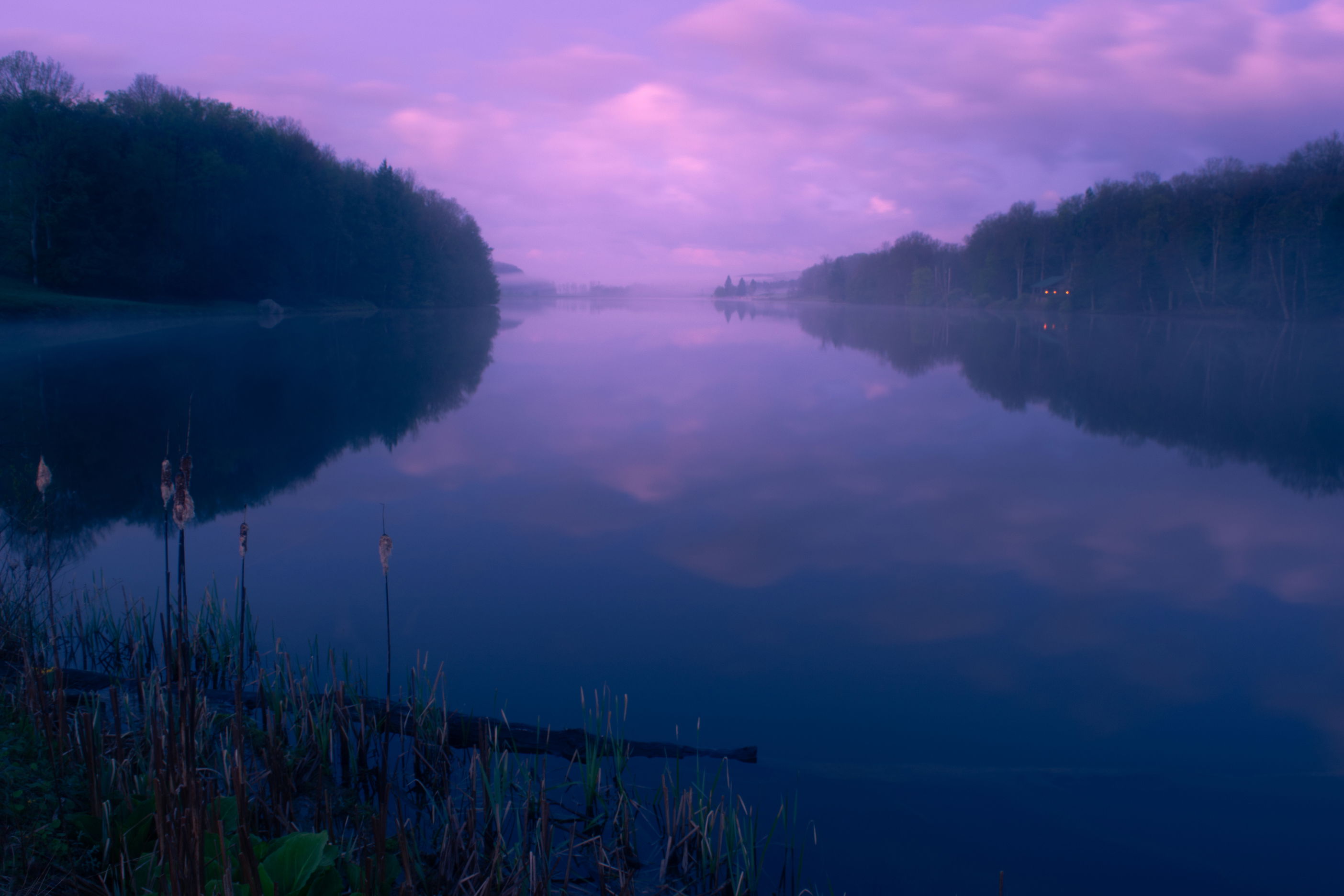
A sunrise image with some nice atmosphere. Would love feedback on overall composition and processing.
What technical feedback would you like if any?
What artistic feedback would you like if any?
Pertinent technical details or techniques:
(If this is a composite, etc. please be honest with your techniques to help others learn)
Nikon D5200 with Nikkor 18-55 mm f/3.5-f/5.6 kit lens, 18 mm, f/11, ISO 100, 13 seconds
If you would like your image to be eligible for a feature on the NPN Instagram (@NaturePhotoNet), add the tag ‘ig’ and leave your Instagram username below.
Hi Griffin, looks like you got some pretty amazing conditions for your sunrise. I should definitely get up early more often.
In terms of composition I think there are elements that work well and some less so. Good stuff - I like the symmetry of the dark areas of trees and how they converge in the middle. The foreground to be looks a bit unbalanced though. I think it could have worked if the grasses were mimicked on the right, in effect framing the rest of the scene. Or even something leading you out into the image.
Processing. Hard to tell on my phone but it looks a touch underexposed. But not much. Maybe a 5th of a stop or something like that. I may be wrong here but the image has a slight purple cast to it. I see there is long exposure so might be due to the Nd filter you were using.
The processing looks good to me. For me the magenta clouds are the star of the scene. If it were mine I’d create a little more colour contrast between the blues and magentas and boost the luminosity of the magentas a touch to enhance the glowing clouds and provide a little more illusion of depth.
They are personal nits though. The image works as is.
Eugene - thanks for the great comments. Agree with your point about the foreground. To me the exposure looks good, perhaps slightly intentionally underexposed (personal preference). Also agree re the magenta cast - no ND filter used, I think probably the result of my color grading and probably added a bit of magenta to the tone (again more of a personal taste thing).
Nathan - thanks for the suggestions. I did do a bit of luminosity and contrast work to the sky in Photoshop using luminosity masks but could potentially go a bit further with it. Might play around a bit more and see if I can get a bit more luminosity and contrast to the contrasting colors.
I agree that the magenta in the sky is the best aspect of this image. The ambiguity of the islands adds to the atmosphere. Those 2 elements work well together here. The composition feels unbalanced due to all the negative space in the lrc. Also, the electric lights on the opposite bank I would clone out.
No worries. The image has a strong blue cast which can hold the magenta’s back a bit. If you duplicate the layer in PS and neutralize the cast in duplicated layer and then blend that layer in soft light or hard light in the area’s that are magenta the magenta’s will pop and it will add some contrast to your image.
Thanks Igor - point taken about the negative space. Also went back and forth about whether or not to clone out the cabin lights… I think I like them, but still very on the fence.
Late to the dance … again. But I just had to say, Griffin - do not remove the cabin lights. To me it is one of the things that raises this image above the run of the mill - that and your choice of colour. It’s the little details, like that hit of green in the foreground, that push this image beyond the tried and true.
Another vote to not remove the cabin lights. It’s an integral part of the story for me.
The negative space in the LRC is not ideal, but you are kind of forced into it by the wide focal length. I think it also would have been interesting to try a longer focal length here and extract an image from the URC, or the top half of the image. While the foreground vegetation creates an anchor / entry point to the wider view, I don’t find the vegetation to be particularly appealing relative to what’s in the rest of the scene.
Thanks for these comments Ed! Will have a think about maybe different crops and/or re-shooting another time with different focal length/framing choices.