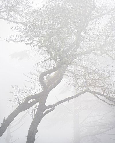
On our coast trip last month, @Steve_Kennedy and I drove the Otter Crest Loop. Steve noticed a group of trees with interesting shapes that stood out in the fog, and we spent a bit of time playing with various images.
Much like “Alder Fog,” I played with a black and white version and found that I like the subtle dash in the color version better.
Specific Feedback Requested
I find it challenging to keep the low contrast the fog brought to the table, while at the same time bring out detail and enough contrast to keep it interesting. Does it look like I rode the fence correctly here, or would you recommend more/less contrast? (I’ll post the jpg the camera converted from the raw file I was working with below for comparison to what the camera was seeing; in the end I didn’t move the image very far from the camera’s take.)
As always, all thoughts and comments are appreciated.
Technical Details
NIKON Z 7II
NIKKOR Z 24-200 f/4-6.3 VR at 200.0 mm
1/125 sec. at f/8.0 and ISO 64
1 Like
Here’s that camera jpg:
You can’t see it at this resolution, but in the full-size image I like the dew the moss holds:
John, I am by far not the person to give you the best help with this photo, but I will say that I like how you handled the fog in this image. I tend to like the softness that many high key type photos bring to a photo. I would image that a little more contrast would look good too, but it would change that soft, faint look that fog gives to many images. I really think this comes down to taste. I can feel the fog in this image and I like how you’ve brought out that tree in the background - it’s just a little softer than the main tree so it doesn’t draw the eye but you know it’s there. I’m curious to what others will say. I think it’s wonderful.
My immediate reaction is to want just a little more contrast; I find this one slightly too murky.
I like the looming trees in the background, the one on the right moreso than the left. I wonder if simplifying a bit by cloning out that background tree on the left side would add or detract from the composition?
Hey John, I think this works well because of the comp, the design from lower left to upper right. I like the fogs it hides the background…maybe a touch more contrast on the foreground trees, but just a touch. Wonderful image and well seen.
John, handling the low contrast that fog creates is always a challenge, especially in the internet posting age where eye grabbing colors are emphasized so routinely. This has the subtlety that makes in necessary to look for longer times or again and again. The twisted trunks angled across the frame grab the most attention, but then the softly seen trees in the background start to be seen and enjoyed. I too think the hints of green are a good addition. You might call this “The Twisted Mister”… 
I can’t see any improvements! Looks great as is
This is great John! I like the detail you brought out while still keeping the fog as a main character. The ghosts of trees in the background adds well to the scene.


