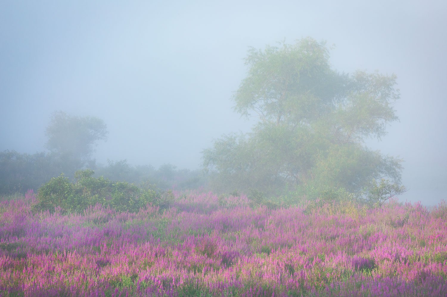
Another image in my Summer Fantasy series taken during the last week in July. There was heavy fog along the Sudbury River in Massachusetts. And the purple loosestrife flowers were in full bloom. Who could ask for more, other than it was taken only 10 miles from my house???
The dense fog was heaviest along the river, which is literally just behind this tree. I waited until the sun started to burn the fog off, and caught this scene in a transition zone, where the fog was thinning out in the meadow with the flowers, but it was still very heavy on the river behind the tree.
No Orton or negative clarity used here, this fog was all natural. For this image, unlike my prior posts, I did not apply any positive dehaze, since the fog in the meadow was already starting to thin out.
As a point of reference to scale, each of those purple flowers is about 2 to 3 feet tall.
What artistic feedback would you like if any?
Any critique or comments are welcome
Pertinent technical details or techniques:
Canon 5D MKIV, Canon 70-200mm f4 lens, at 169mm, ISO 200, f16 at 1/10 sec.
This is your best one so far, Ed. I still think your flowers are a bit overdone but you’re pretty firm on that matter (so I won’t mention it, lol). This looks like a Renoir to me, or a Monet in his later years. Fog sometimes gives images that impressionist look and this does it beautifully. The colors and their intensity are balanced and there is a hint of lightness to the whole thing (which is what the impressionists were all about). A white frame would likely lift this image from the dark background. Really well done.
Thanks Igor. The color of the flowers was intense due to the light, they look pretty much how they do in the unedited raw file. In my original post, I did not add any vibrance or saturation. I did reduce purple saturation -10 in this rework though. I do agree that a white frame makes sense for this" light" image. I think it nicely accentuates the blue cast in the fog.
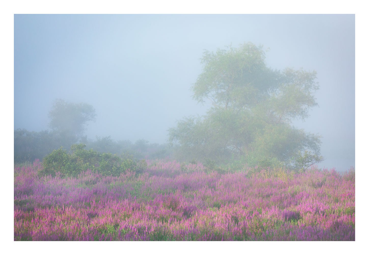
For me, my favorite still remains your original post, Summer Fantasy, and all three are beautiful. Composition is excellent here, flowers look great but, to me, the sky appears kinda dark overall given that the light in the FG seems somewhat dappled, suggesting there was some actual sun available. Also, as Lana mentioned, the vignetting seems a bit dark too. In my mind, I might consider brightening the sky a wee bit and actually going with a very slight reverse vignette for good measure. My rework is pretty rough since I didn’t have the original file, but you get the idea.
Ed,
You killed it that morning as this is another gorgeous image with such a dreamy inviting mood to it; very painterly in fact. The light is lovely and the color combination of purples and greens work beautifully together and the fog really sets the table in this gorgeous scene. It looks like you are making up for the lousy spring weather you had. For me your rework nailed it.
Bill and Lana, I added no vignetting to the image when I processed it. But there is some variable lighting in the scene, the light was dappled and the ULC was further away, was nearer a bend in the river, and had thicker fog, so it naturally was darker. But I like the tonal balancing that you did in your rework Bill, the more even tonality looks better. I will incorporate that into the final version of this image. Thanks.
I’m late to the discussion here but I like the mood here Ed.
I would go even more high key with the sky and educe contrast in the upper half of the frame and add more contrast to the foreground to give the dappled light more pop.
I’m not sure it’s any better, probably just different personal preference. I didn’t;t find your magenta’s too strong as presented.
This is beautifully done Ed! Although the other images from this series have been great I think this is my favorite because of the prominence of the flowers which add some color to contrast with the moodiness of the scene. I also like the simplicity of the two trees in the composition. Nicely done!
Thanks Nathan. I normally don’t venture too far into creating high key images. But with this subject, it feels like every time I lightened it further, it got better. So you may be onto something with your comment.
And across this entire series of images I keep geeting some folks looking for more contrast/dehaze, and some looking for less contrast. So I figure that I might already be hitting a happy medium.
You have certainly gotten good mileage out of this purple lustrife - I ditto the other comments and find this to be superb. I toyed with lowering the brightnesss just a tad. This brings in the tree more, but loses sone of the soft mystery created by the fog. I prefer it just as is. You first image with the lustrife as it was is my preference.
I love this image, Ed. I haven’t seen the other in your series, yet, but I like the strong colors in the first post before any rework, as I prefer lots of color. The fog adds a beautiful dreaminess, which I’m aiming for in my infrared and lensbaby photos. I can’t add anything more than what the others said, but I did want to add my opinion.