Summertime (+revised)

Revised Version

Revision 2 (latest)
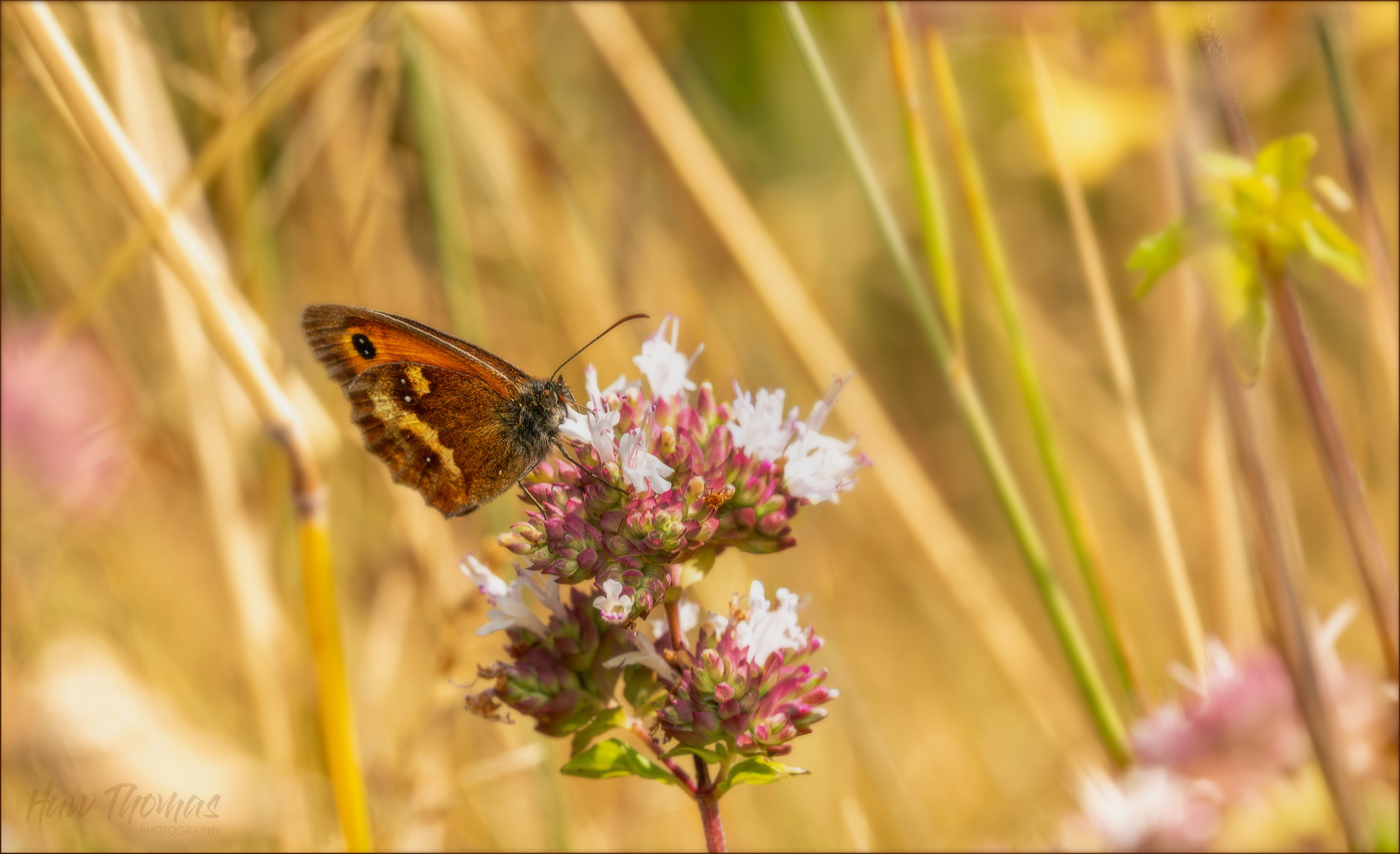
What changed: Brighter butterfly and lightened/blended stalk behind BF to make it less noticeable

Revision 1
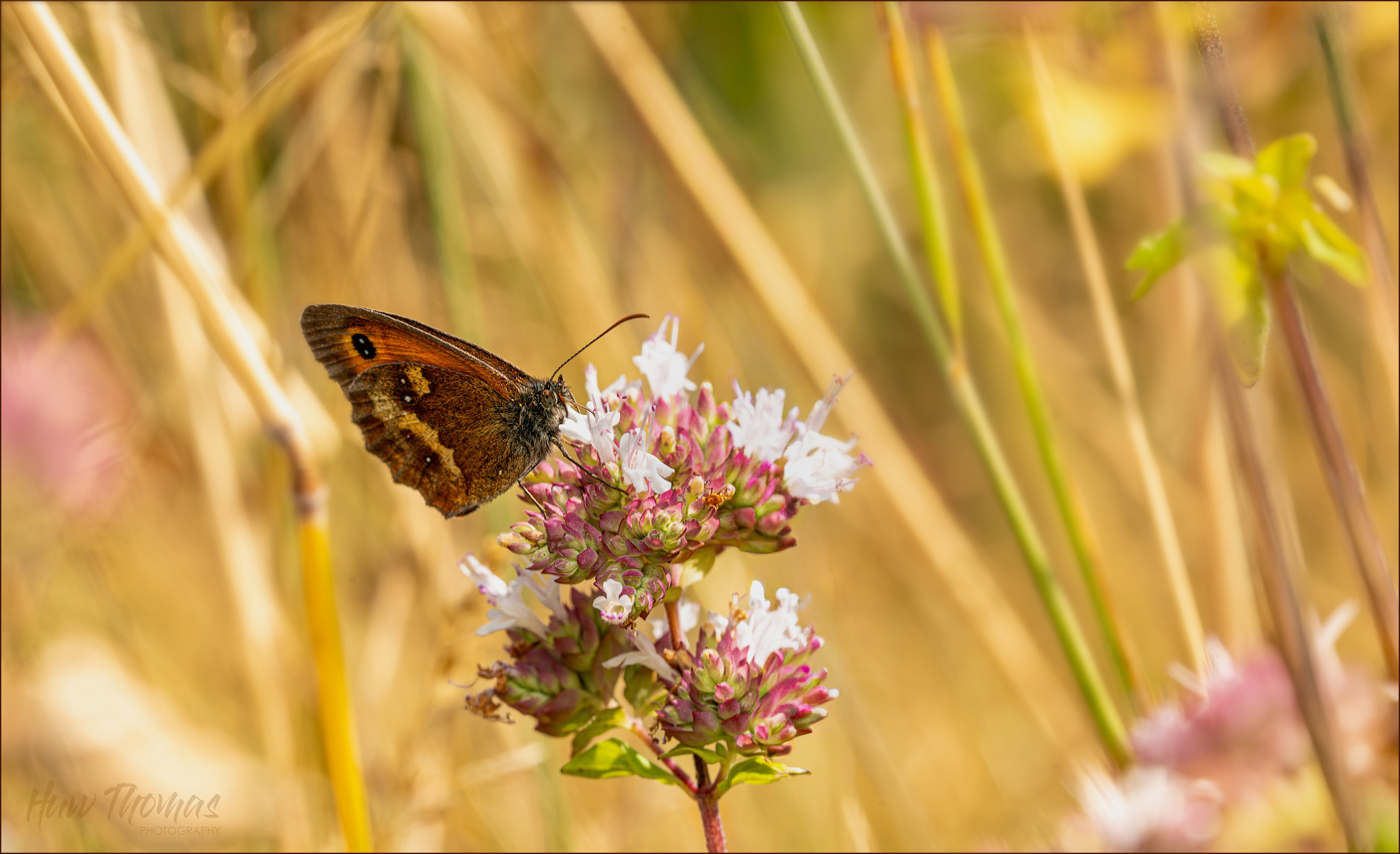
Added after receiving feedback from the community.


Original Version
Critique Style: In-Depth

The photographer is looking for deeper feedback connected to their intent, creative direction, and specific questions.

Feedback Focus: Artistic / Expressive

About This Image

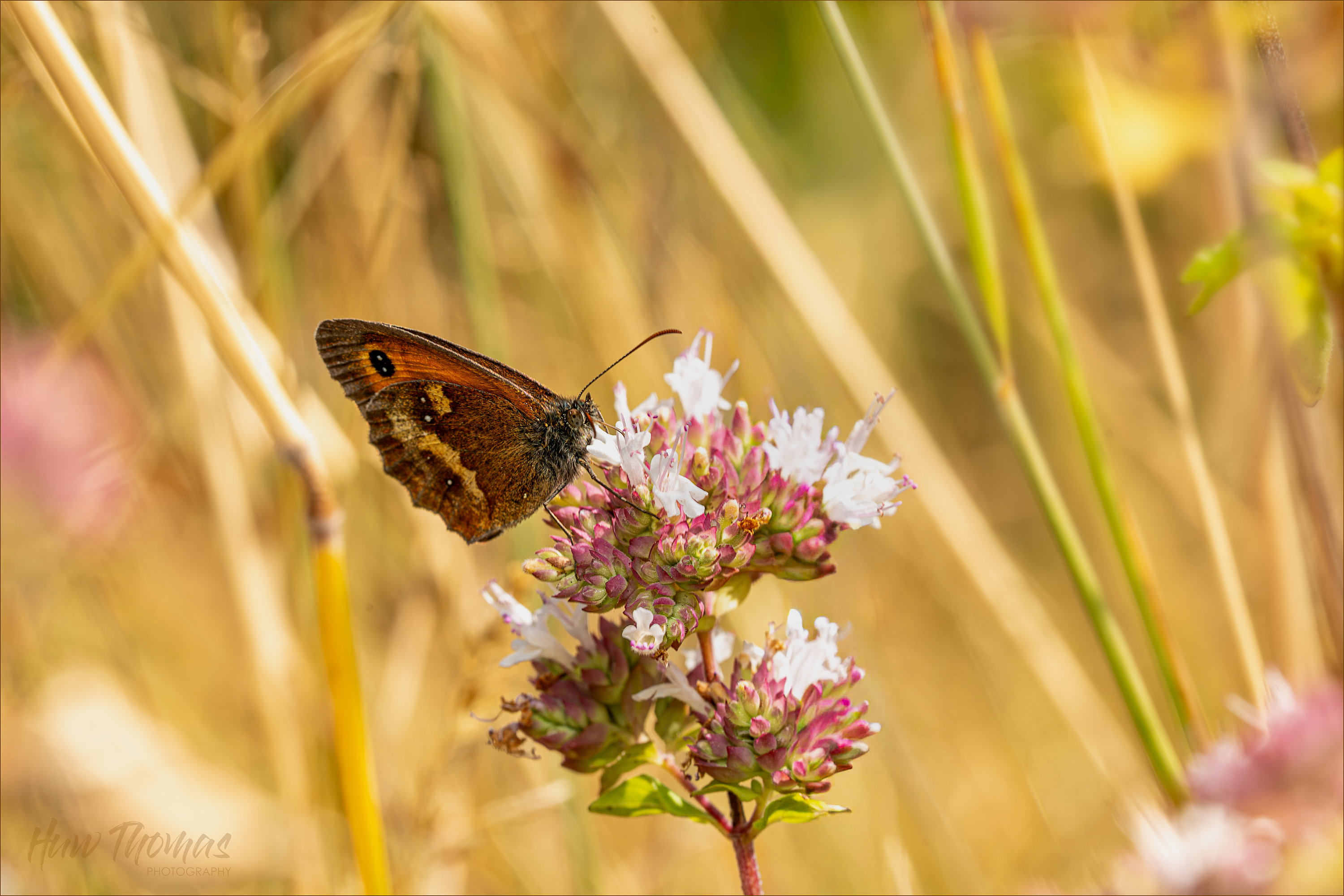
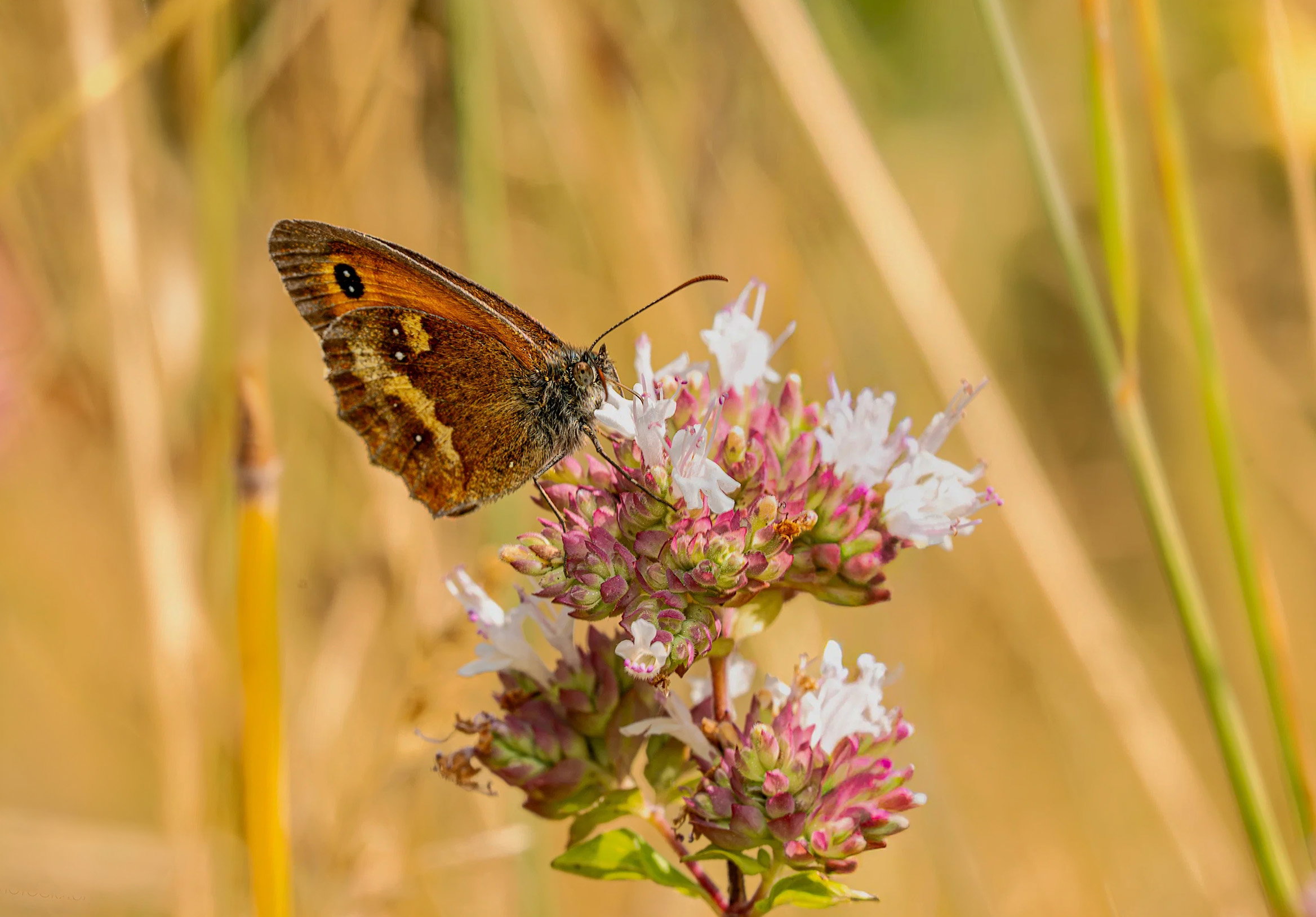
Out walking this morning, Uk in midst of heat wave. This was a few hundred yards from my gate.

Why This Image?

I’m trying to build a series of nature images that are more about the colour and light than the actual insects involved.

Having bought a great macro set up, most of my current effort is about trying to get sharper and more detailed very magnified images I want to learn techniques stacking, etc. There are some great images and magnificent technicians around, but my particular inspiration (and emphasis in my resulting pictures) is still light and colour (even though I try to get any critters as sharp as possible). This image didn’t need a stack but the short telephoto lens was all I had with me.

The bright sun and colours today were amazing. Focussing in close, the background was nice and blurred and so I composed the background as much as the subject. I removed one stem, and and added some gaussian blur to the flowers on the edges that happened to be sharp and in the same focal plain as the butterfly.

This is pretty much how I framed it in camera :open_mouth:

What I’m Trying to Express or Explore

Summertime, Bright (10am) light, summer flowers, over ripening grasses, yellows, pinks - went for bright, possibly over exposed although I think I have rescued most of the whites that were a bit blown out by raw file manipulation.

Where Feedback Would Help Most

Does this say Summertime to you? Do you like the composition, is butterfly too central (can’t do much about it now)?
I really want the composition to work - so the colours come through and the butterfly is only a small part of the narrative

Technical Details

Camera: Sony A7iv
Lens: Sony 90mm G OSS
Focal length:90
Shutter speed:1/160
Aperture:f/13
ISO:200
Flash: fill in ttl
Exposure -0.7 ev

EDIT…

Really wanted the subject further over to the left - so did the unthinkable and used generative expand in PS
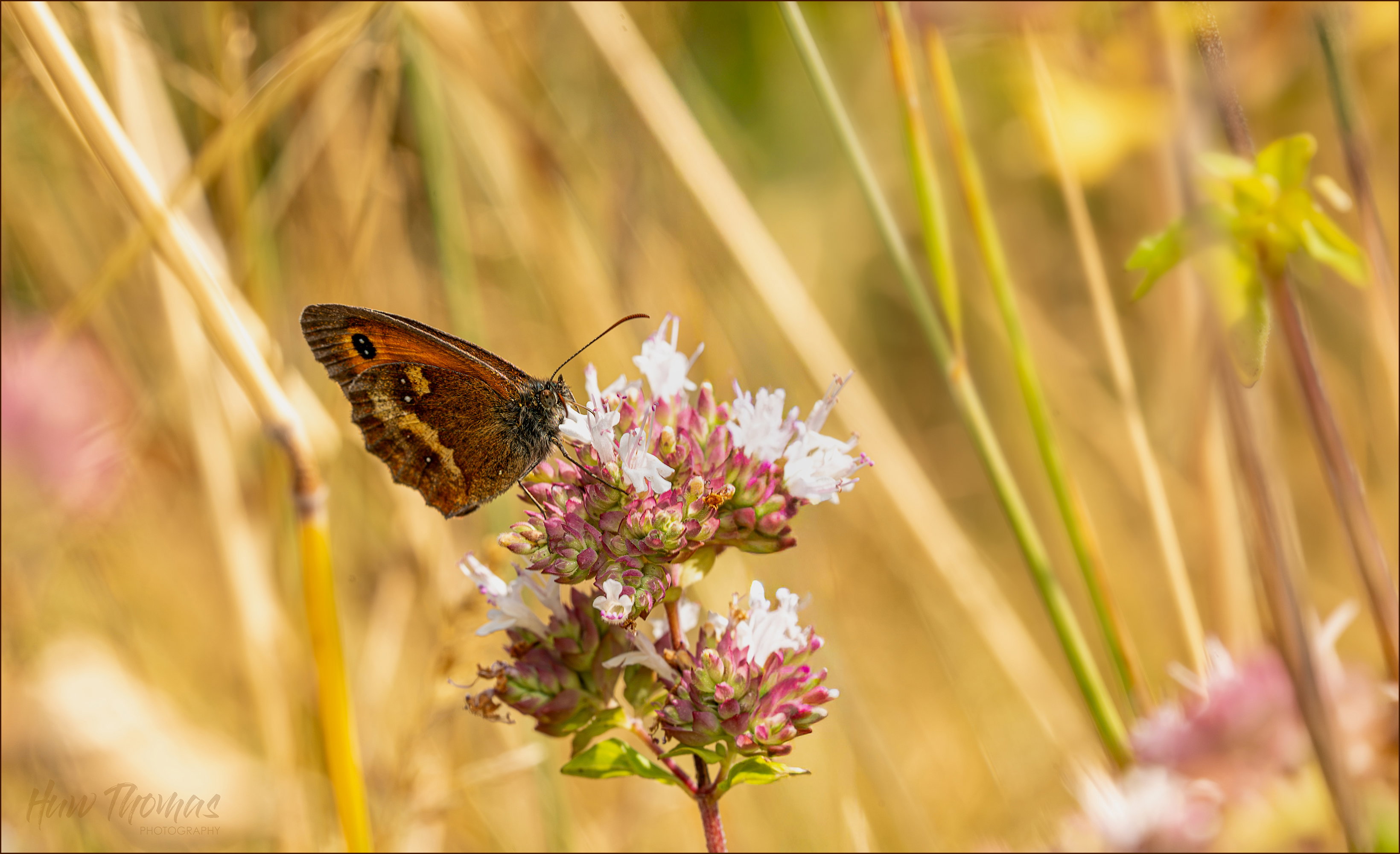
Huw, this certainly speaks of summer to me. The center flower is beautiful and the butterfly is sharp. You did a good job.

Although the white areas in the center flower don’t appear to be blown out, it might help to darken them a little. The butterfly/moth is a little on the dark side and I suggest lightening it a little.

There are several distracting bright areas in the image. I think the image would be improved if you got rid of those. There are several ways it might be done but I thought a crop and a little rotation would accomplish most of it. Here’s a suggestion. You may find a better solution.

Huw: A beautiful critter, perch and environment. I can see what @Don_Peters is saying about the flowers and think a small tweak there can help but the bright reed extending from the butterfly to the ULC does significantly distract. I would be sorely tempted to burn that down or even paint in some light color from the less illuminated half of the reed. As for the canvas expansion I think that turned out pretty well. You might get the same effect with a 150-200 pixel crop on the left which would have the added benefit of whacking off part of that offending reed. Back to you and, BTW, I have really enjoyed your presence on the site and in Macro especially. You’re helping us raise the bar. :+1: :+1:>=))>

1 Like

It very much says summer - the heat fairly radiates through my screen! Even though it isn’t dominant, the butterfly steals the show to an extent. It does have to fight a lot of hot spots and highlights, so if you wanted to keep it from being the center of attention, that certainly is one way to do it. The additional canvas on the right looks really natural, so if it works for you I’d say keep it. Agreed that the flowers on the main plant look a bit washed out and lacking detail which looks to be there since Don’s version has a bit more. Makes me wish I could go outside, but the smoke is too bad and so another day inside it is.

1 Like

Thanks Don - appreciate your help and work editing the image - and I like the suggestion of the crop if the emotion I was trying to convey was a beautiful butterfly on a summer flower.

I have called it Summertime. It was a lovely mid morning walk - second week of uk’s 30 deg+ weather, scorched plants etc etc .

When is a distraction not a distraction? Its an interesting discussion I haven’t necessarily got the answer to - - "when it adds to the narrative " would be my answer.

The recent Webinar talk by TJ Thorne was very interesting “Cultivating Authenticity and Meaning in Photography”. He talks about throwing away rules and creating with your gut feeling and adding emotion to photographs

On my walk I was really feeling summertime! How could I convey the heat and the warm light in a photograph? I composed in camera and I purposely included the summer flowers in the corners, nicely blurred by the short tele 90mm lens. The whole image had to be a bit high key to convey summer light - no vignette today except perhaps a white one. The soft edges of the flowers and blurred edges added to the feel of Summer with the intense light, its ok to burn out the whites a bit - better conveys the heat.

We all see different things in other people’s photographs, and as creators many of our creative tweaks don’t get through to the viewer, often because they are too subtle, misinterpreted or just our ideas are not shared by everyone else.

I hope that maybe if I describe the thoughts behind the processing of the image it might explain my creative choices. Its really hard and fun to try and fill ones pictures with feeling and emotion - I’m quite pleased with this one - and have printed it at home to cheer bit of wall come next Winter

Regards

Huw

The original poster added a revised version of their image.

Huw, I don’t think I fully grasped your intent. I think all suggestions that are made around here come with an implicit qualifier: as long as it’s consistent with your intent. Anything that isn’t should be ignored.

1 Like

Thanks @Don_Peters

I really appreciate any help and critique . It helps me grow as a photographer and I know we can only give critique honestly on the pictures as we see them. I also have broad shoulders and not sensitive to criticism We need fresh eyes to help us evaluate our own photographs - as creator one has too much invested in the image and what are obvious creative decisions to me certainly dont all get through to the viewer..

Photography is fun - and I am now creating images that try and convey a strong message or feeling . I now sometimes intentionally make creative decisions (eg over expose high key) that would formerly be considered as mistakes - the hope is the viewer asks …why has the photographer done that…and then the message of the photograph is transferred.

Kindest regards

Huw

The original poster added a revised version of their image.

The original poster added a revised version of their image.

Regarding Revision 2:

Huw, the bright colors themselves are a “summertime” look. It sounds like the composition suits what you were looking to achieve. For me, the star of the show is the BF, and I would have been cropping in so more of him can be seen, but that’s just my style. I’m enjoying your work and seeing your different experiments makes me wish I could grab my camera and run outside and have some subjects to photograph. Keep shooting and sharing!

2 Likes

The original poster added a revised version of their image.