The photographer is looking for generalized feedback about the aesthetic and technical qualities of their image.
Description
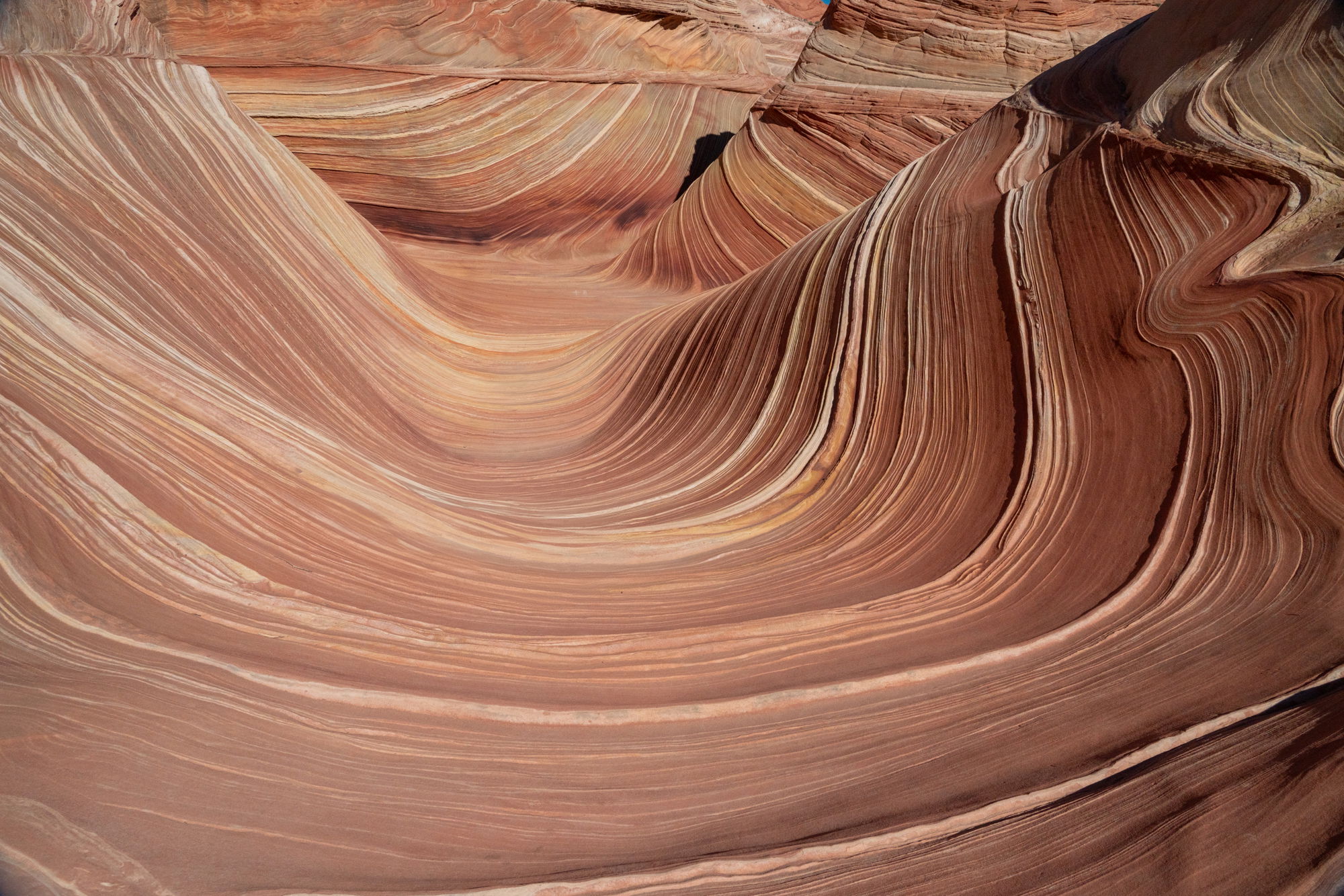
This was likely the most epic destination in my photographic life. Difficult to get a permit to see the place, but I am so grateful they limit visitors, because I know it would be overrun otherwise. It took six days of applying & getting turned down to get our permit, & we’d almost given up. You should have heard our hoots & hollers when we realized the final email we got was saying ‘Congratulations!’, instead of ‘Sorry’. Hearing from others later, who had tried various ways to land a permit for months & years, we understood how unlikely it was that we scored. Our hearts were full. Especially as we trudged back to camp in the early evening.
Specific Feedback
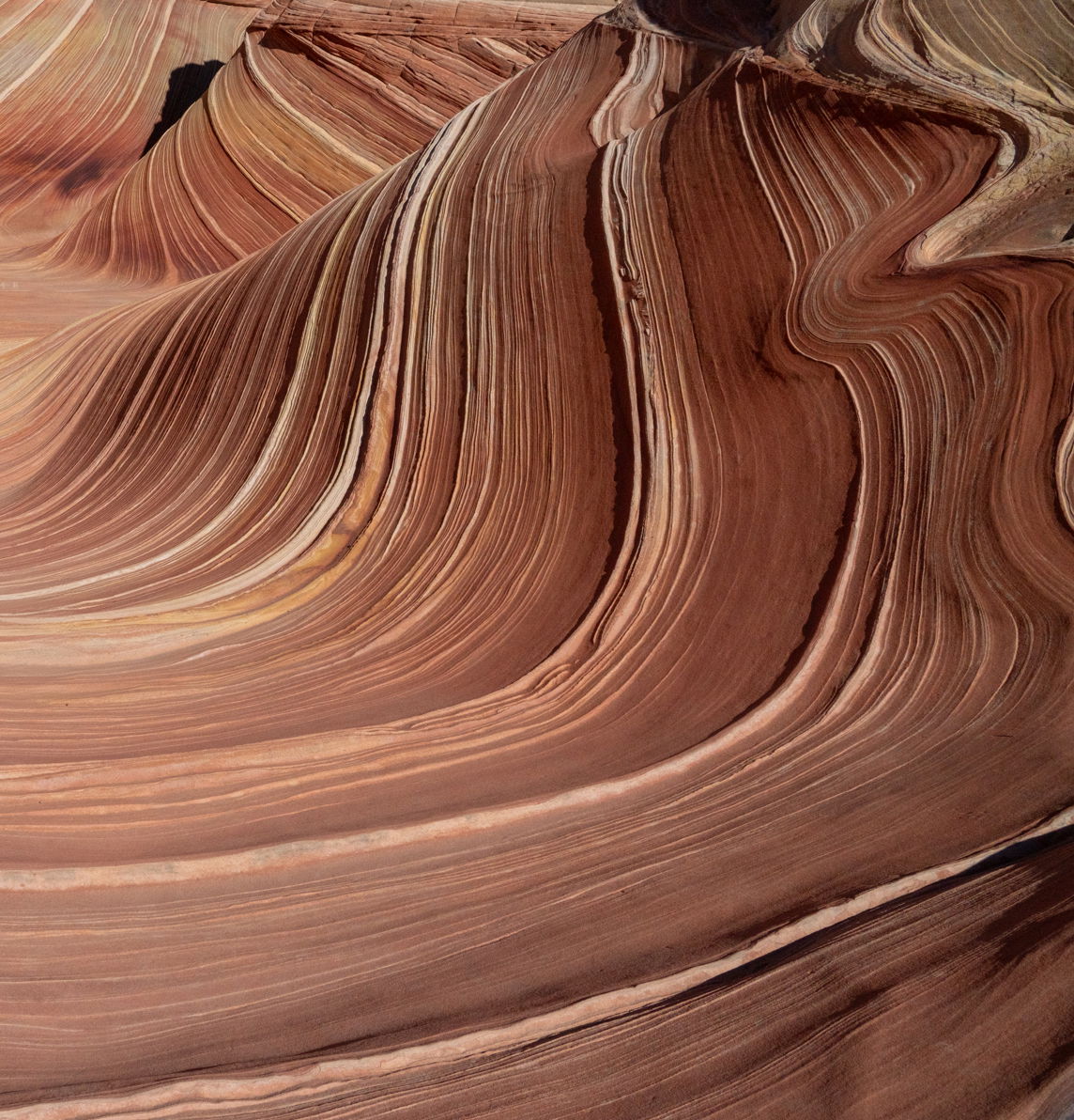
The formations and crazy lines are so…crazy, I find myself at a complete impasse with how best to process this (& the many others I took). So I’m putting it out there to get some ideas from y’all. The second image includes a very clear blue sky too, which is nice color contrast, but gives it more context., & not sure if that adds or detracts.
Technical Details
Sony A7RIII handheld
ISO 640, 1/2000, f/13. 24mm
Critique Template
Use of the template is optional, but it can help spark ideas.
Wow! Lovely raking light angle, too! I can love either version, but I would lower the saturation of the sky, and in that image do a subtle gradient burn from the left and increase contrast just a bit.
Connie, I like both versions. The dark blue sky in V2 makes quite a contrast with the warm tones and great sweeps in the stone, I like that as a change-of-pace. I do think that both versions could use a bit more mid-tone contrast in the brighter areas along the left and in the middle. That will show off the layers more strongly. There is a tiny dot of blue at the top of version 1, that’s best removed, if your going to make a large print.
Yes, sort of like getting to the desert table after a big meal! What a great problem to have. I too think either can work though I tend to favor sans sky. I might suggest printing both and putting them in a place where you see each regularly. Regardless, enjoy an excellent photo of what is clearly a great memory.
Yes John! That’s it - desert table with too many choices. Thank you everyone for your thoughts & ideas. I think I’ll work on this one today with them in mind and repost what I come up with…
Connie, I prefer the “no sky” version. My only suggestion is to level the photo on the fault line near the top and then crop it out. To me, the photo contains many wonderful fluid lines and then the skew straight line brings discord. An impressive photo
Thanks Sandy for your comments. I took soooo many versions of this place. I felt like I was on drugs or something! The Wave is on BLM land right on the border with Utah & Arizona.
Hi Connie, Hope your holidays are going well. It is a bit late to respond to this, yet I came across it and thought I would comment. As you noted, the variations to this iconic place can be overwhelming and congrats on getting there to explore.
As a more intimate landscape photographer, I would definitely lose the sky. I agree with Rob Skyes to also lose the horizontal band, which breaks the flow of the wave. The right half of the image has some wonderful waves and lines sweeping from left to right. I added a crop, although you will need to play with what works for you.
Play with this with a little more contrast as noted by others, possibly with a little dodging of the highlights and burning of shadows to lead the eye to the upper right, which has some very interesting dynamics.