The photographer is looking for generalized feedback about the aesthetic and technical qualities of their image.
Description
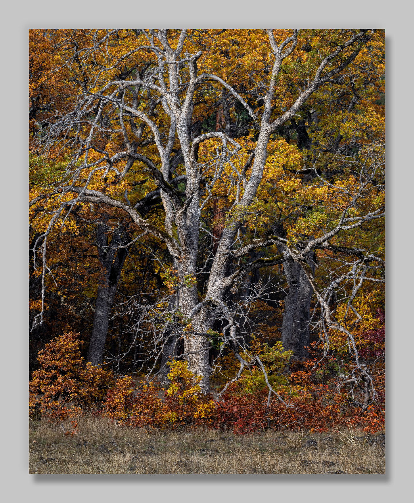
A second bare oak that caught my eye this fall. Interestingly, I had to rotate this image clockwise from what I believe was true level (this was on a slight slope) to keep it from looking “wrong.”
Specific Feedback
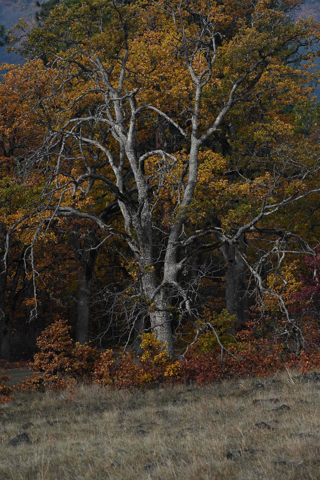
Zooming out to include the entire tree brought in some unattractive elements, so I elected to crop into the branches on the sides and the top. Does that still work?
Any other comments and suggestions always appreciated.
Technical Details
NIKON Z 7II
NIKKOR Z 24-200 f/4-6.3 VR at 160 mm
1/60 sec. at f/11.0 and ISO 64
Critique Template
Use of the template is optional, but it can help spark ideas.
Vision and Purpose:
Conceptual:
Emotional Impact and Mood:
Composition:
Balance and Visual Weight:
Depth and Dimension:
Color:
Lighting:
Processing:
Technical:
Works for me, John. I’m actually a strong proponent of cropping into a tree leaving it’s branches reaching out and extending beyond the frame. Makes for a much more interesting and dynamic look than trying to include the whole tree, thus as you say, introducing unappealing elements.
What @Preston_Birdwell said!! How fantastic to have found these two amazing trees! (Maybe they found you!?) This scene is perfection, with the foliage reminiscent of a pointillist painting, and worthy of a huge print! But I have a couple of minor thoughts. I wonder about darkening the BG trunk on the left (just the lighter straight part) to make it merge more into the BG, as its lean is something I notice. (The one on the right doesn’t get my attention.) And I wonder about a subtle vignette from the bottom. I love the grass there, and its color, but that makes me want to dwell on it.
Another wonderful and naturally rendered tree. It almost looks one of those Lon Overacker trees from Yosemite Valley that he used to post in NPN 1.0.
One minor suggestion that might just be a peculiarity of mine. I like the pedestal of the image to look darker than the subject. From that perspective it would be nice if the brighter dry grass at the bottom wasn’t lighter than the grass above it. However, I wouldn’t do a crop because it messes up the aspect ratio.
It’s funny you mention zooming in vs. including the entire tree. I sometimes struggle with that decision myself. More often than not, I end up zooming in to minimize distractions, as you’ve done here. And yes, this works…big time. The contrast between the bare oak and colorful leaves in the background makes this such an impactful image. Beautiful lines and textures and colors. Heck yeah!
Hi John,
This oak makes for quite the subject with the branches radiating outward across the frame. Your decision to zoom in to this final crop looks perfect for my personal tastes. I used to think that I had to get the whole tree in the frame, but as you mentioned you can get all those unwanted elements in the scene. With this crop you have everything that you need; beautiful autumn color, a magnificent oak, all anchored by those lovely FG grasses.
Heck yeah! The composition is well balanced and includes everything a viewer needs. A great subject front and center, two well placed darker trees behind the main tree, gorgeous Fall colors, branches with tons of character and some really nice foreground shrubs to seal the deal. Well done, John!
I thought I was looking at a Lon Overacker photo when this first came up, and one from Yosemite as well - I hope you take that as a compliment.
It is a wonderfully intimate photo of that oak. The branches are very expressive and fill the frame nicely. I do not mind that the reach and go past the edges of the frame. I don’t think I would change a thing a bout it.
Mostly gaps that didn’t seem to fit as well. I don’t have an image that shows the sides, but here’s the original sidecar that shows what the top looked like. (It also shows the tilt of the slope that I rotated.)