I love all things trillium and to be honest I’m just looking to add to the conversation that @Karlag started with her beautiful photo.
Image #1. I’m still searching for the perfect overhead photo of interlocking petals. The photo I uploaded is the best that I have so far. This photo was difficult to take. The sun was going down and the light at the forest floor was terrible. I tried a number of things to get light, but with the lens being directly overhead, it was difficult. I don’t remember, but I think I may have used a pen light for illumination for this photo. I purchased a lighting system over the Summer geared toward these types of photos. Hopefully I’ll get a better photo in the Spring. I’m also going to try focus stacking my next photo.
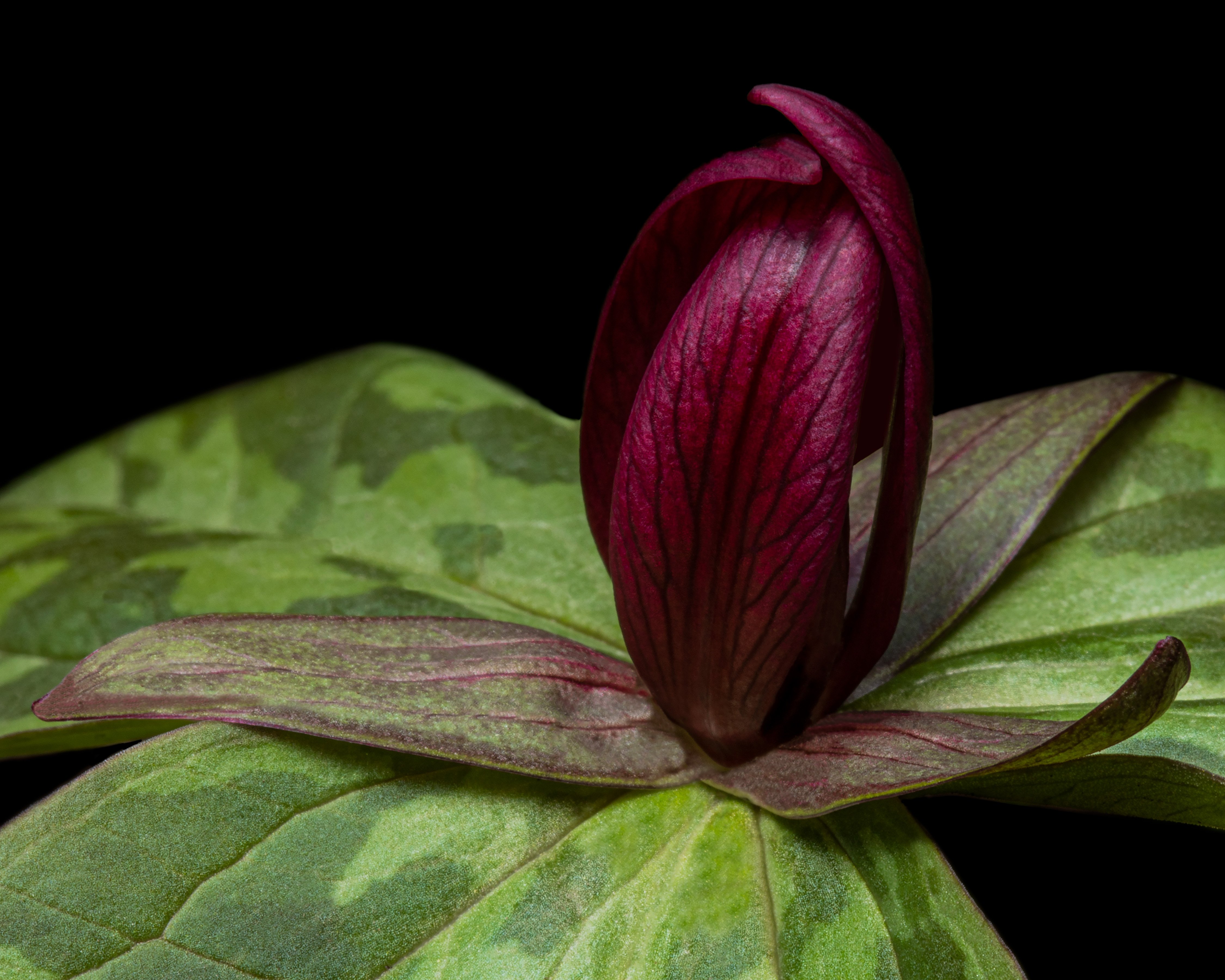
Image #2. This image was made in the middle of the day. I used a diffuser to take out the tree filtered overhead light and a flash with a softbox to illuminate the flower.
Specific Feedback Requested
All comments are welcomed.
In image #1 there are grain like anomalies in the petals. This is present in the RAW file, so I know that it isn’t something I created in ACR. I’m curious if anyone has seen anything like this before and if anyone can offer suggestions on how to remove it. Cloning hasn’t worked well.
Technical Details
Image #1 - f5.6 | 1/4s | ISO 100
Image #2 - f32 | 1/125s | ISO 100
Both images were taking using a Canon 5D IV and ef100 Macro lens
Processed using ACR and Ps
@David_Starr These are gorgeous. I especially love the top down look and the way the leaves range out underneath out of focus. I am going to have to look more at the top down view this spring, but I don’ t recall seeing anything anywhere near this lovely. Thanks for adding these to the discussion. They are very inspiring.
Gorgeous and unusual – both of them! I love the composition of both and only wonder about a slight desaturation of the larger back petal in the second image.
I think the grainy appearance you’re seeing may just be the fine surface structure of the petals that the camera brings out. We expect flower petals to be smooth, but many have a surface texture that shows in the right light. My recent orchid posts show it, where visually I just see a slight sparkle.
Super Great love the angle of #1 and the color harmony.
I know I say this a lot- this image takes the viewer beyond a document of the flower into the scope of art.
Steve
David, both images are just stunning. I love the top down version as it gives me a sense of vertigo–in a good way. I love the trio of petals and trio of leaves below. Awesome.
The second image is much more peaceful, but just as impressive. I agree with @Diane_Miller about desaturating the left back leaf to match the other two. A subtle change but it does draw my eye as it is.
Finally, these are some of the best Trillium images I have ever seen. I’ve tried to shoot them here in the Pacific NW, but they always come out as…meh…
Thank you all for taking the time to review my photos and provide input.
@Diane_Miller, @David_Bostock Thank you for pointing out the saturation on the back left leaf. I changed the saturation and re-posted. The change is subtle, but very noticeable. I think this is you were referring to. I still have a lot to learn, but I am learning with help from the folks in this forum.
Great photos. I find the first one very compelling- it benefits from simplicity and elegance (I have never seen interlocking pedals on a trillium). The colour is nice (so rich) but I think I could also see this a B&W with some silver toning which would let the background drop out a bit and keep the strong focus on the pedals and their luminescence.
Great work! Did you find these in the wild or a garden? That’s the only place I’ve seen them, but have not photographed them with this much drama. Both images show the beauty and simplicity of these flowers. Trillium are so varied in some ways, but so alike in others.
David, Beautiful images - both! The rework of #2 is much better. Great colors and I like the top down image better, as it is unusual. Both well composed. I like the simplicity also.
Simply lovely David. Image #1 caught my attention immediately with the colour balance, contrast, and wonderful background bokeh. Very nice indeed. We have a lot of triliums of this colour under trees in our garden and while I have taken plenty of photos of them I’ve never thought of a vertical viewpoint as you have here. Wonderful. Cheers.
I think you did great with your overhead shot. The shape, details, color contrast, and the BG blur and structure is very good. I also like the second image a lot.
Hi David, Both of these images are beautiful, but I like the first best for its simplicity and color contrast. I agree with others that the rework of #2 is a nice effect.