REWORK
ORIGINAL
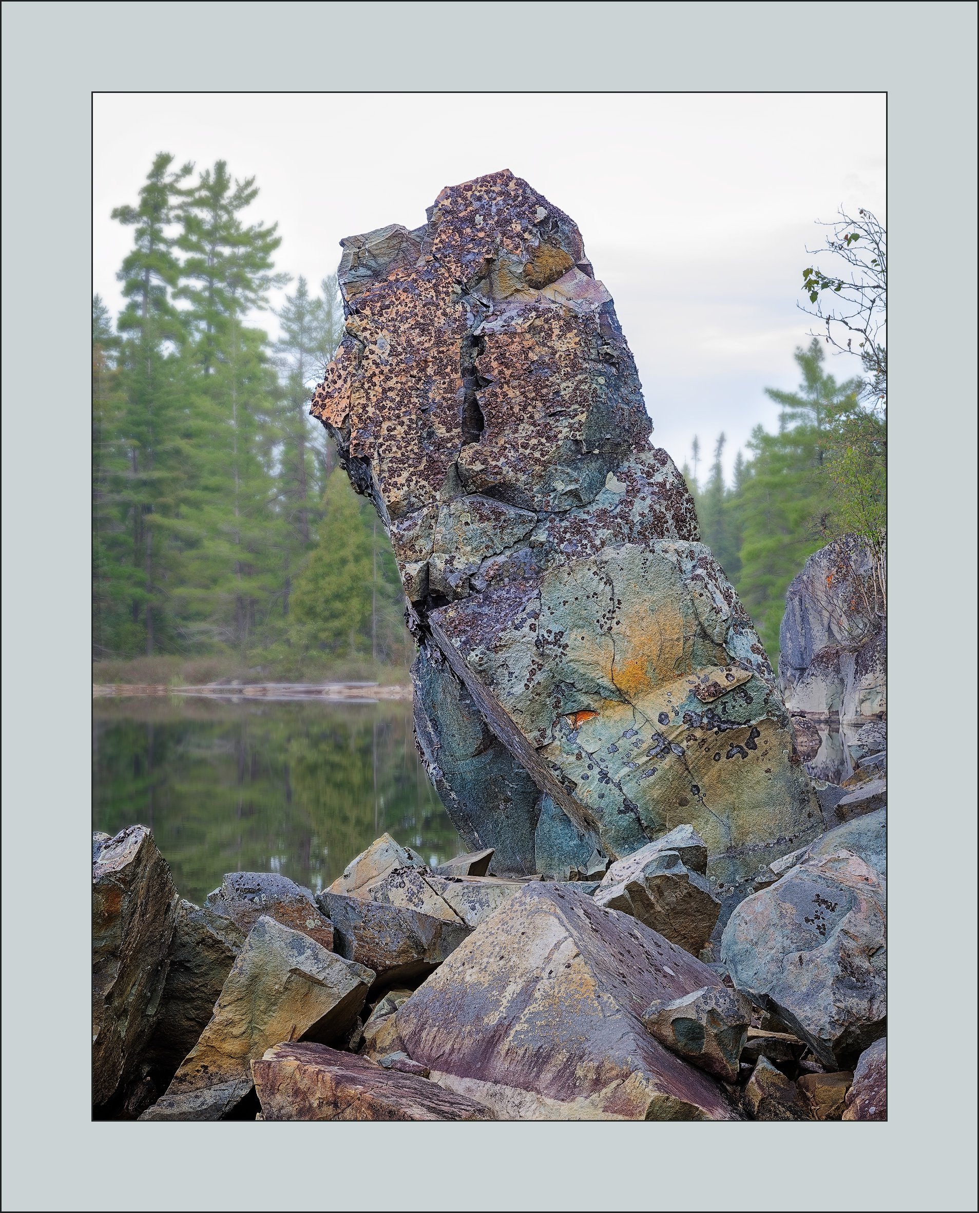
When I finally saw this picture hidden amongst my downloads, it turned out to elicit both surprise and regret. The surprise was that it was an after-thought – three or four frames taken after I’d taken pictures of the lower portion of this “rock pile”. After downloading, I didn’t even flag it and only accidentally came across it the other day. What I like about it is also my regret, namely the textures and the colour hidden in the rocks. Now that I see that, I realize there were a couple of abstracts begging to be created – that exquisite bit of rock face with the orange, for example or the area with all the purple lichen. Really, I could kick myself, but I just didn’t see it at the time. Or, I can’t really remember, but it may have been that I didn’t want to risk breaking my neck getting up there. Ah well, learning to see is such an important part of photography and this missed opportunity is a learning experience that I’ll keep in my back pocket. Still, it is a pretty dramatic image and I’d be most interested in what it elicits for you, the reader. I’d be interested in any technical feedback especially with regards to colour. Thanks for taking the time. I look forward to your feedback.
3 Likes
Your experience with this photo provides some good reminders and lessons to us all. The rock is fabulous with all the various textures and colors. I think the composition is good. The only thing I have to comment on otherwise is that, to my eye, the background seems to draw too much attention.
Beautifully processed. The collection of rocks have quite a personality. I do see some excellent intimates on that rock face. I have been passing up great potential ones as well due to how hard it is to get there so I can’t blame you.
Perhaps a bit less saturation would do the trick. On the other hand the sky is pretty pale so you do want something to make up for that.
Stunning detail in the rocks, Kerry. A great reminder to all of us to stop and take the time to really look from all angles and perspectives. Thanks for the reminder.
I like how you used the shallow depth of field to make the subject stand out in the composition. The blurred background provides enough detail that it provides a sense of place, but blurring out the background makes the textures on the rocks stand out even more.
The good news - that is if you have the pixels, is that at least with a severe crop you still might be able t salvage a fascinating rock abstract. The colors, texture and detail are excellent when viewing the large version.
The composition as presented is nicely handled. The selective focus, dof, is appropriate - you might even think about blurring a teenie bit more and as Chris suggested, drop the sat a tad bit. but that’s all subjective of course.
I see a square crop in here that removes the sky and the brighter rock-top on the left edge. But then I worry you loose the context of the environment the bg provides.
Nice image to have “forgotten…” 
That rock has a lot of character and many possibilities for abstracts Kerry. I too like your depth of field but not sure what to do about the white sky.
What a find in your scrap heap! Good lesson learned for all of us about exploring all the options when on scene.
I played with it, and given my leaning for pushing color a bit, pushed color a bit. I found that curves in the sky exposed some interesting gradations of brightness there, but I did not do much with it.
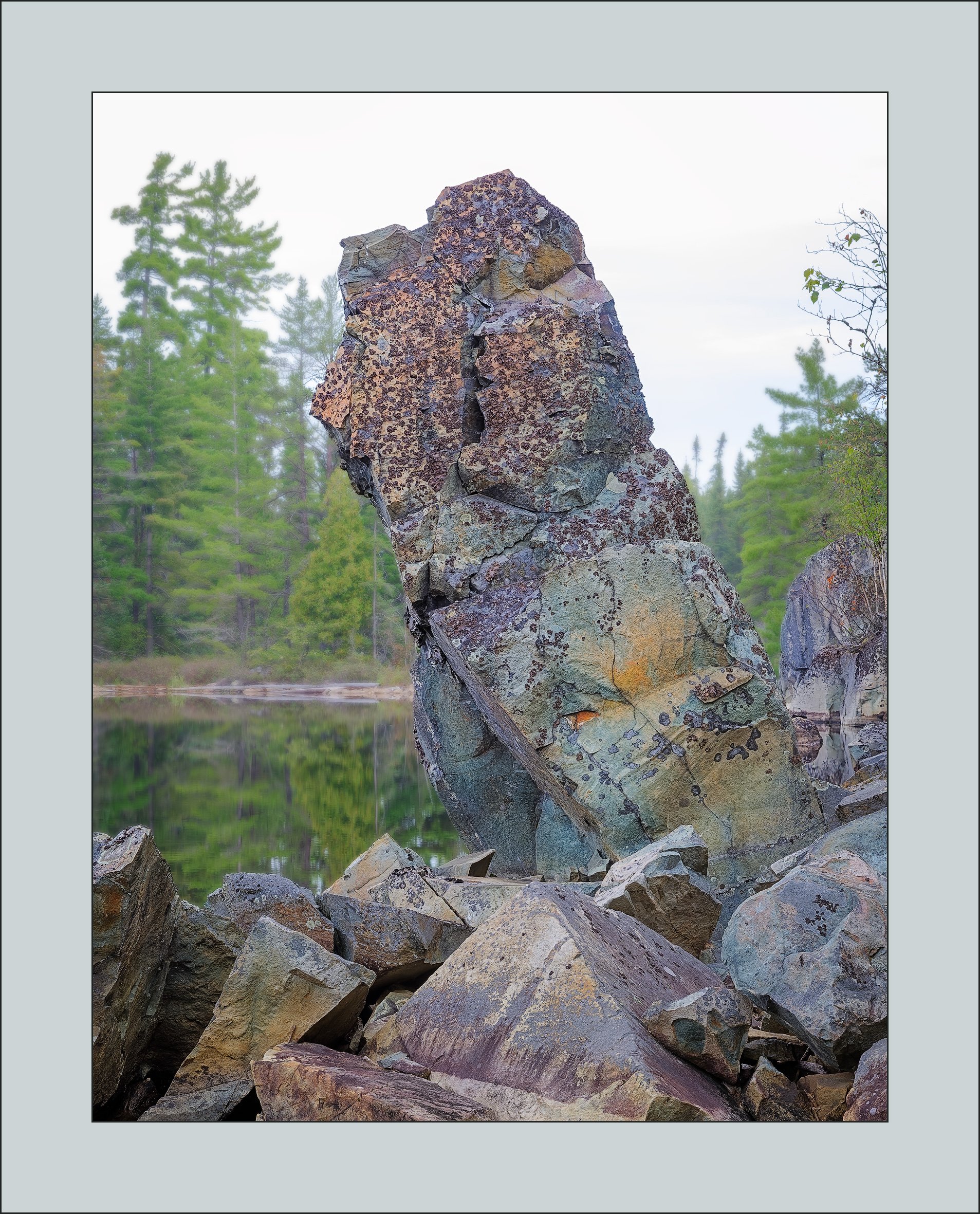
@Chris_Baird , @Igor_Doncov , @linda_mellor , @Brian_Schrayer , @Lon_Overacker , @Eva_McDermott , @Dick_Knudson - Thank you all for your comments and suggestions. I have posted a rework where I lowered the background saturation and added a bit more blur. I added a bit of mid-tone contrast to the central formation and tried to bring up the sky a bit more so it isn’t quite as stark. Hey, there’s only so much I can do to make an afterthought into something more.
@Lon_Overacker - I had thought about doing a super crop for an abstract but it really is futile. First, it is a ridiculous amount of cropping but second, and more importantly, even if such an extreme crop was successful, it isn’t the picture I want. Sometimes you have to lick your wounds and move on 
1 Like
Kerry, the rework hits the spot. It certainly makes the foreground rock formation stand out a bit more. Boy, do you have some incredible rock formations that are just begging for an intimate scene. Good that you went back and found this in the scrap pile. 1, it makes a really nice standout image on it’s own but 2, you can now go back to this location and gather at least one or two intimate images from here. That section of the main Totem at the base where it is yellow and green would make a terrific intimate. so would al of those triangular rocks in the pile below.
Oh, and just to the left of the Totem, there is a section of the background that appears to have been accidentally sharpened from the shoreline up to the top of the trees.
@David_Haynes - Given that it took two weeks to paddle in there, chances are about zero to nil that we will ever get back to the exact location. But I don’t think it is about going back so much as developing my eye for this kind of image - there’s no end of opportunities. With respect to intimate images, you have developed your eye marvellously and that is becoming a source of inspiration for me.
Good eye, by the way on the artifacts on the right side of the frame. I had cleaned up that bit on the edge with Content Aware Fill and when I went back and altered the contrast I forgot to update.