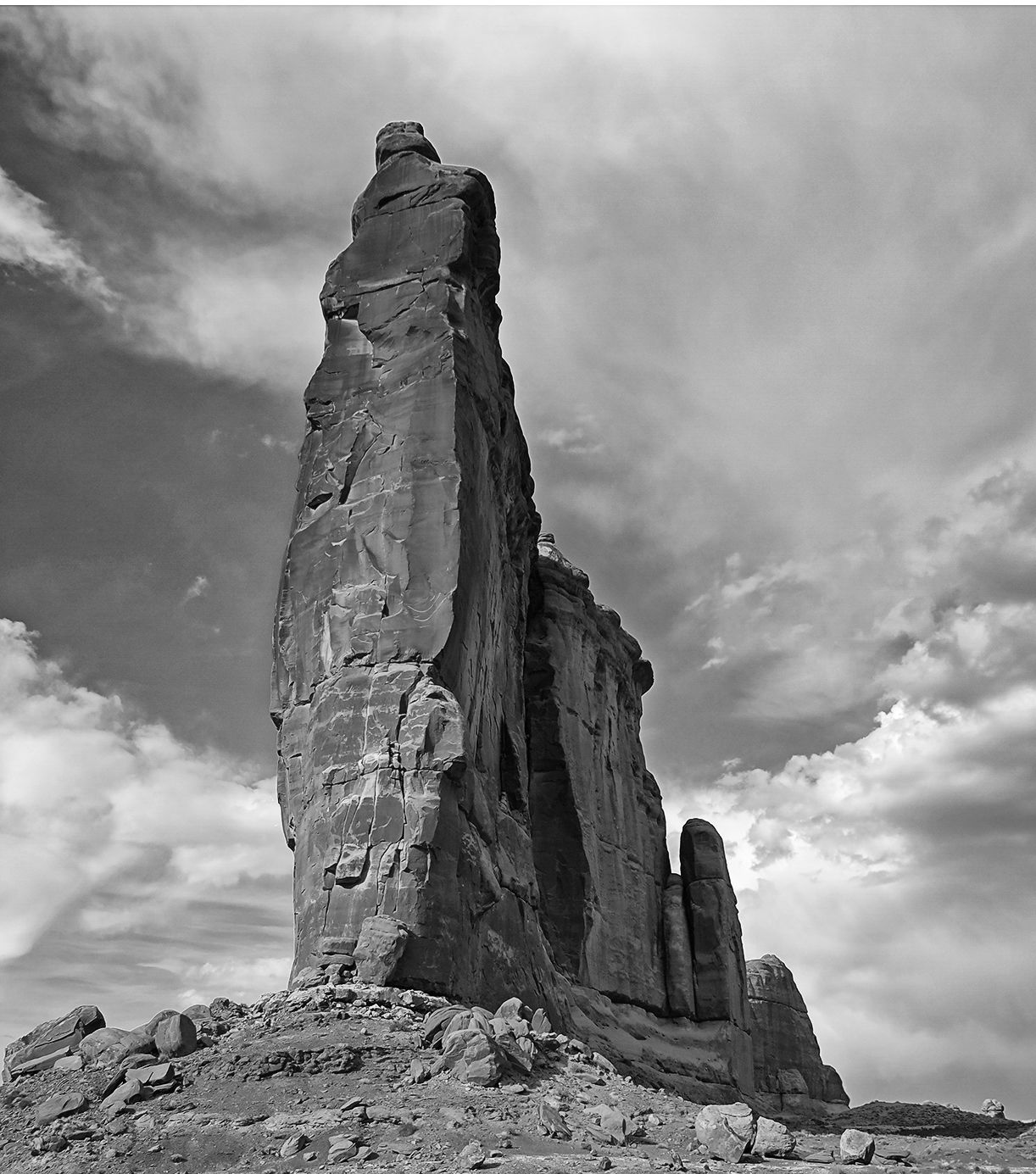
Certainly you can’t miss this one if you’re driving along the main park road in Arches. I have family members interested in getting a print, so I would really appreciate your thoughts. My workflow for this was pretty basic. I did a bit of shadow/highlight work on the formation, and worked the sky a little with sat/vibrance, then fiddled with exposure and color balance on each layer.
I recently got the TK plug-ins, but know next to nothing about it. I would like to play with adding some pop to the greens, and owing to my lack of skill I could really use some advice. Also anything else you might suggest. I invite you all to show me examples that might illustrate you workflow, and to help me learn.
You may only download this image to demonstrate post-processing techniques.
1 Like
One question I would ask is, what were you “seeing” when you took this shot? And what could you do now that would emphasize that? And what could you do to downplay what’s showing up NOW that wasn’t obvious when you shot it?
I imagine that I would have been captivated by how bright the front face of the rock was and how the light dropped off down and back to the right. I might not have been paying attention to how bright the foreground was as well as the sky behind the tower. I would be tempted to play with darkening the foreground as well as the sky. I can easily picture a scene here where the sun was peaking through a break in a dark and cloudy sky behind and left of me . Of course, this may well not be what you saw there.
1 Like
Hi Bill: I think your image is technically very good. Exposure is fine, comp is fine. I don’t know what else was there to help with a different comp, but as is it’s fine. The biggest issue is time of day and tough light.
To directly answer your question on some processing: I created a color range selection in TK of the green shrubs and boosted Vibrance and a little saturation. I created a TK mask going after the brighter white clouds to make them pop a bit more. I then created more of a mid tones mask from TK and worked some contrast in the sky while masking off the rock formation. I also did a little dodging on the shadowed side of the rock to create a bit more variability. It is not radically different from your version. See what you think.
1 Like
This is not a direct answer to your request, but I would change this composition. For me this is about the power of this butte rising up into the clouds. I would crop out all the vegetation below and reduce it’s base. Then crop off a bit from the right.
I personally like a b&w version more.
1 Like
I appreciate the input on this. @Rick_Alway and @Sandy_Richards-Brown, you both bring up interesting questions. But it’s pretty simple: I just want advice on how I can make the image more appealing. This formation is a favorite of my non-arch icons in the park which I’ve shot numerous times over the years, and so the processing for a good print is my intention. @Keith_Bauer, good point about the light and time of day and high contrast on the tower, which resulted in flat lighting on the surroundings. I really need to learn how to work with the TK masks, particularly with specific colors and luminosity. @Igor_Doncov, thanks for the ideas on cropping and for the reasons you state. After looking at the original, I realize that there is a fair bit more foreground than is needed. And I do like your B&W version very much. Thanks to all, gang.
Bill, I’m glad to see that you decided to delve further into the TK LM’s. There is a learning curve, but the time spent will pay a lot of dividends. While I think your original post is pretty well processed, I like what @Keith_Bauer did with with mid-tone contrast and shadow dodging. His changes are subtle but they do help, especially if this is going to print.
In terms of cropping, I like something halfway in between your original and Igor’s suggested crop. So I started with your original, and cropped it to my suggested crop. I then tried to mimic Keith’s changes.
I did a TK MT 2 selection on a curves adjustment layer, and set that layer to soft light blending mode, which adds midtone contrast. I then placed this in a group and painted on the group mask (mask the mask) to apply this MT contrast only to the clouds and sky. I then did a Darks 2 selection minus a Darks 5 selection (a subtracted mask D2 - D5), applied it to a levels adjustment layer, and moved the right triangle of the levels to the left. This is a method to lift shadows while retaining contrast, leaving D5 unaffected keeps the darkest shadows dark. And finally I dealt with the green shrubs. I used “Color” as the source and clicked “Choose”, this brought up the color picker which I clicked on one of the larger bushes. This gave me a selection of the shrubs which I applied to a Color Balance adjustment layer, and then shifted it to more green, which made the bushes greener (they look green, but actually have a lot of yellow in them).
These changes are subtle too, but your original was in pretty good shape to start with.
3 Likes
Thanks, Ed. As I mentioned to Keith, I really need to play with TK masks. And so I appreciate your detailed explanation. Might be interesting for you to note, that after looking at the crop @Igor_Doncov showed, I felt the FG plants seemed awkward at the bottom edge in my original. And it so happens I actually looked at the very same crop option you show, which also reduces the somewhat excessive foreground but all of it, and it gives the tower a stronger prominence in the frame as Igor suggests. I will take everyone’s advice when it comes time for printing. As always your suggestions are much appreciated.
Bill,
I think despite the light and time of day (and I agree with comments,) this will still make a fine print with some additional tweaks.
Agree with cropping the foreground. I did a similar to Ed’s with some cleanup cloning along the bottom edge.
One of the things you can do in targeting specific colors for adjustments is to use TK’s Channel selections. Now, I’m still on v4 and don’t know what is included in v6, but I’ll have to assume that the color channel selections are still available. for example, I click on the “Reds +/-” button to create a series of Reds channels. These are then found in the Channels tab of the layers pallette. You then load one of them as a selection and from that selection create a layer mask - Levels/curves, HSL, or any other adjustment. The changes will then only effect the reds in the image.
I tried this with the green channel for the brush, but green isn’t really strong here so that wasn’t a good option. I went ahead as I often do (habit) is duplicate the image and convert to LAB Color mode and make adjustments there, then combine that back in to y our original image. I wrote about this a while back; you should be able to find in the Post Processing discussions. You can use various blending modes. In this particular case some of the effects on the image went too far and I simply added a mask and painted out the effects until I got what I liked.
Something else is that I was wondering about the light to dark transition of the main tower. I’m guessing that’s just how it is, but does look like a ND grad was used. I think someone mentioned dodging… What I did was use that Red channel, loaded as a mask and then created a simple Levels layer. I adjust the brightness up a bit to brighten the top half of the rock. Remember, only the reds are selected - so, the rest of the lower part of the image was impacted as well. I simply painted black on the mask at medium opacity, like 25% so the masking would be gradual with each soft brush stroke. I then painted on the scene to return the bottom of the tower and ground to normal levels and essentially lightening just the upper half. Not sure if I’m making any sense here…
In the end, it’s all personal taste. I think in general - and however you want to accomplish it - would just be a slight boost to color/sat, contrast and maybe a drop 1/2 stop in brightness.
1 Like
Bill, this is very very fine image. I think the light is beautiful and the sky is very dramatic: appropriate for this beautiful rock formation. The blue in the sky complements the red rock really well in my opinion. I am a Lumenzia guy so I can’t comment much on the TK Panel (it should be very similar). I like what @Keith_Bauer did to the image. I think a simple midtone contrast as suggested by @Ed_McGuirk can be very effective, too. I wouldn’t change the composition. Those vegetation works really well as a base to the image.
Adhika, do yourself a favor and check out the TK panel (and related Bagshaw videos), it’s way more powerful than Lumenzia. The TK panel does have a learning curve, but for someone who appears to be as serious about landscape photography as you, I think you will really like the level of control that TK gives you, as well the amount of one click Photoshop automation it provides.