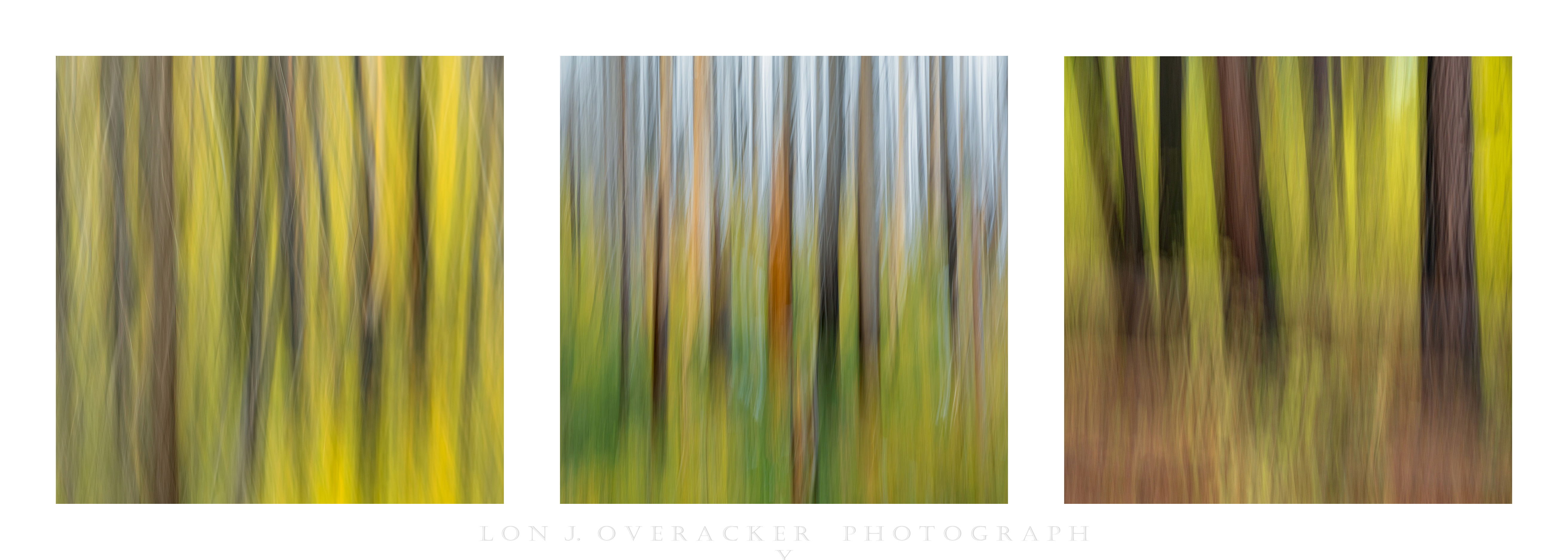
I’m reminded of the saying, “The whole is greater than the sum of the parts.” I think though that if you enjoy the ICM technique, the saying may not hold true as each might stand on their own. However, in the case of posting all these in different threads, I think it’s better to join them in a triptych.
These images all captured during my autumn trip to Yosemite, each at different locations, but the conditions and colors were pretty consistent throughout my visit.
Type of Critique Requested
Aesthetic: Feedback on the overall visual appeal of the image, including its color, lighting, cropping, and composition.
Technical: Feedback on the technical aspects of the image, such as exposure, color, focus and reproduction of colors and details, post-processing, and print quality.
Specific Feedback and Self-Critique
All comments, feedback and suggestions always welcome.
Technical Details
Center image D7100, other 2 D800E, all 1/4s exposure on single vertical ICM. Colors/sat freely expressed in PS…
Lon, the three images work quite well together as a triptych. Nice work! I like the consistent square format. Each image has a common unifying subject. The colors work well across all three images. I don’t see anything wrong technically. I think this is a successful presentation and triptych.
Very nice presentation with three cohesive images. I think they work well together and I like the order/arrangement as well. Not seeing anything I would change.
Each one is to die for!! But that leaves me a little torn about them being in a triptych, as each one seems just a little too unique and demanding of full attention.
I wonder about moving the one on the right into the middle and finding another one for the right that is similar to the one on the left, without sky. No need for them to be from the same location or time, although that is a lovely thought. That would leave me looking in more detail if they were more similar – if that makes sense.
I love this as is, Lon. The three images work really well together. One has a foreground, one has a sky and one has no foreground or sky. I think you placed them perfectly also. Although I like all of these individually, I think I like them better as a grouping in this beautiful Triptych. Well conceived.
A set of great ICM images in this triptych. Looking at the colors of the images the order of the images works well. The first and last image have similar colors, while the one in the middle include blue sky. One other idea to order the images could be to zoom in as you move to the right. Then the images could be ordered 2, 1, 3. I could to some extent agree with Diane´s comment regarding putting three such amazing images together.
Maybe we will see these three images complemented with some more in the future project category?
Wow, you out did yourself, Lon. Your ICMs just keep improving! Tree ICMs are my favorite, so I have no complaints about these. The colors blend in very well with all 3 images. Like others have said, I like the arrangement too. Just wonderful.
I was thinking the right hand image being much darker and heavy might not be a good fit, so I tried at least get one of the colors, the yellow, somewhat consistent to tie them together. Of course all being vertical tree ICM’s also puts them in a group.
Lon, the tryptich looks great. I like how it tells the story about the entire forest, ifrom the grasses at the base to the trunks against the sky. There a lot of drama in the color changes across the page. I could see an alternative “story” where the colors stay in the yellows/browns/greens, but with differing amounts as seen in the two views on the outside.