The photographer is looking for generalized feedback about the aesthetic and technical qualities of their image.
Description
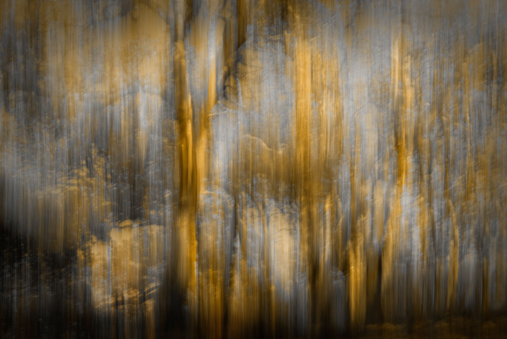
I’ve been going back through some old ICMs to try to get inspired to do some again, and found this one that I’d love to emulate. It’s just a stand of trees.
Specific Feedback
All comments welcome!
Technical Details
Lost to history, but hardly relevant to creative stuff. The layers were flattened, but I think it’s only two images, in some blend mode with possible masking.
Critique Template
Use of the template is optional, but it can help spark ideas.
What got me here were your “technical details.” I do like the minimal color palette. I could see getting these yellows to go a little more vibrant gold. And the light blues to go a little darker and bluer? Gives such a nice fall feeling as it is. Nice.
I’d call this one “haunting”. It’s very atmospheric, Diane. I might be tempted to remove the darkest part along the bottom and/or possibly lighten the dark LLC a bit. I love the texture here.
I love how some ICM images of one subject leave you wondering just what that subject actually is. What appears to me here is a rock wall with various shades streaking all over it, yet it is a stand of trees as you state. Excellent work with this one Diane.
Great ICM Diane. ICM photography is a hard style to do. You captured the trees and made this a beautiful interesting image. I love the color and the tone. Congratulations on EP…
@Mike_Friel – the bottom edge was a quandary. The right 1/3 was naturally dark but to the left the vertical streaks went off the bottom with no attenuation, and I felt it pulled the eye too much. Certainly an idea worth playing with, though. If I can identify the component images in the filmstrip I might play with a redo – I’m curious to find if I would do things differently today. Since there is no record in layers what I did, it could be interesting.