The photographer is looking for generalized feedback about the aesthetic and technical qualities of their image.
Description
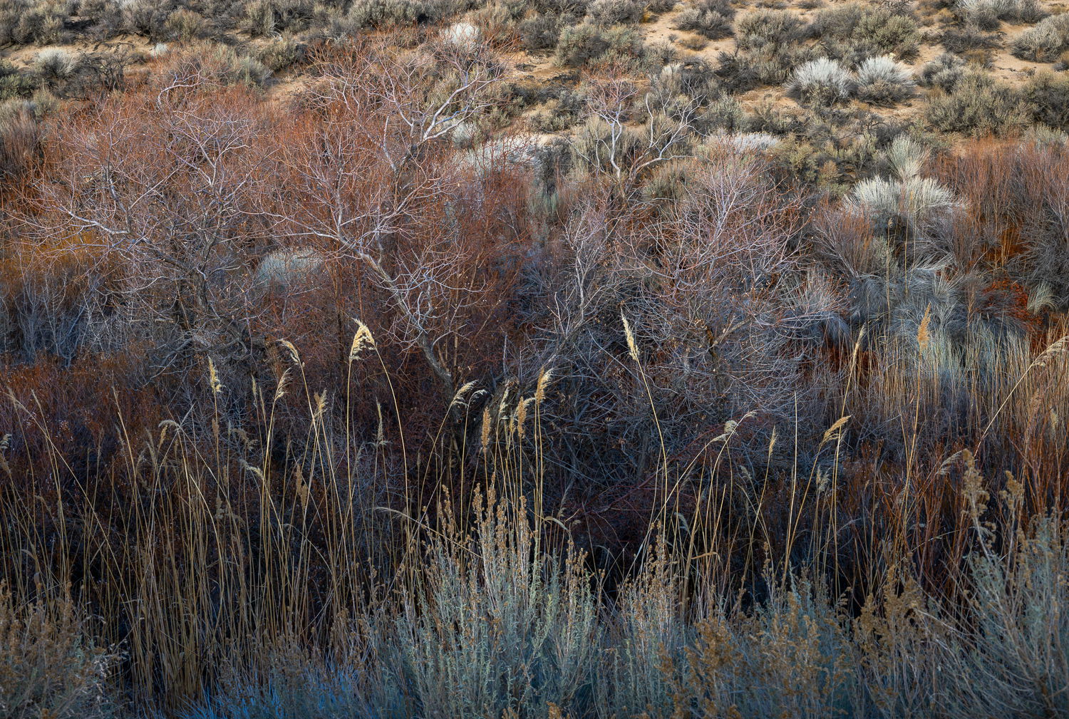
In the dry creek beds in the Eastern Sierra, you can find an abundance of beautiful foliage colors and textures. When departing our campsite on an overcast morning, I was compelled to capture the rich reds, golds, and subtle green tones of this small scene along Tuttle Creek.
Specific Feedback
Curious if folks find this scene too busy, without any obvious focal point.
Technical Details
ISO 400, 47mm, f/11, 1/250 second; photographed handheld
Critique Template
Use of the template is optional, but it can help spark ideas.
Hi @beth_young, I really like this tone poem of an image you have shared with us. The subtle tones and textures interweave to give the eye much to explore and enjoy. Well seen and processed.
It’s great to see another post from you here in Landscape Beth; you have such a wonderful body of work.
Not at all. In this type of layered-vegetation photo, I actually think that’s a bonus. In the larger view my mind’s eye immediately started cropping snippets of interesting areas in this. Not because they are better, but because there are so many beautiful little areas within the bigger scene. (In fact, this got me thinking that a fun project some day would be to have the first image be a scene like this, and then the subsequent images all be pieces from the larger view.)
I love the subtle use of color, and the tonal contrast is very nice. Optimally having the very foreground elements as sharp as the bulk of the image would be nice, but it’s subtle and not a deal breaker. My only other thought for improvement would be to “edge patrol,” and darken those small bright snippets of plant in the center on the bottom edge so they don’t try to grab the eye from the beauty above.
Bottom line, a wonderful image and thanks for sharing it!
John, thank you for your kind comments! I agree about the foreground elements- I do wish they were sharper. I’m usually focus stacking on a tripod, not jumping around shooting handheld like I did here. And I took your advice on the “border patrol”- thank you so much!!!
Too busy? No way. It’s a great image to get lost in, exploring all the wonderful colors and textures. My kinda image. Great layers to the image also. Hope you don’t mind, but I always play around and see if there are other compositions in an image. I found a pano, not better, just different.
Cheers
Beth, I could see what attracted you to this scene. The colors are lovely! As John mentioned, there are some wonderful parts to the image. The initial challenge for me was being drawn too much to the brighter plant tuffs on the upper right, which seemed to pull my eye away from the structure of the tree trunks and branches on the left half of the image. Although busy, I like how they stand out against the nice reddish color behind, and the blue/grey shadows. The yellow grass heads contrast and flow nicely with the tree structure. I played with a quick crop to get in closer to the area of the image that works best for me, then did a little dodging/burning to pull the trees out more, and darkened the upper background.
Too busy? No, not busy enough. I think the photo needs more of the blue sage that is on the bottom right side of the photo to really anchor it. The BG colors and textures are also intriguing. I love the landscape of the Eastern Sierra and this photo portrays it well.
Hi Beth,
Not at all busy for my tastes as I love the subdued color palette along with all those wonderful details. I do really like the pano rework from my brother @Michael_Lowe as it provides another option for this beautiful image. It would have been nice to have those beautiful FG grasses a bit sharper, but you are already aware of that. Really nice scene! BTW, you have some lovely work on your website.
I like both modifications that were offered. Mine was going to be a tonal gradient from top down. I think the brightness of the very top draws the eyes away from highlighted reeds/grasses.