hey everyone,
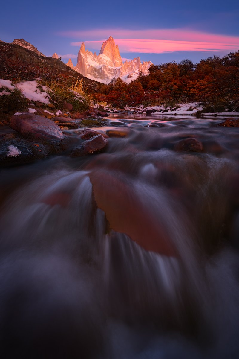
i took this shot more than two years ago during a 6 month period i was staying in patagonia. my goal was to capture those well known (and probably over-shot) peaks from new angles and at their best. while still using the same old (compositional) recipes i was hoping to give them a personal twist by just going a little bit further, by leaving the well trodden paths and by returning over and over again. it took me countless attempts to find and finally capture some of the images (out of several thousand i have a handful that stand out to me).
with this one i’m a bit torn. first, because i have 2-3 more captures from this morning (very different in view and composition - the clouds tell it’s the same morning though) which are probably stronger images and i’m not sure if it would add anything to my portfolio. second, i stayed very close to the originally captured colours (and their intensity) but i’m afraid that it will come across as one of those candy-coloured, photoshop-crafted kitsch-monsters that we are bombarded with every day (and i’m saying this as someone who doesn’t even use instagram).
i’m very curious to hear your thoughts.
What technical feedback would you like if any?
any
What artistic feedback would you like if any?
any
Any pertinent technical details:
ultra wide ~14mm (can’t tell exactly because i’m using the nikon 14-24 adapted to my 5d3). 3 exposures manually blended. 2 for DR and DOF plus a third for water movement. no warping or similar techniques.
1 Like
Fantastic light and scene. I feel like there is a bit too much foreground; having a bit more blue in the sky isn’t necessarily a bad thing.
@Richard_Wong - that’s interesting. i feel that if anything, i would like to see a bit more room for the foreground (which i don’t have). adding more sky (i did crop a bit here) leaves me wanting even more foreground.
Great color and lighting in this one. I agree with Richard I also feel there is a bit too much foreground in this shot. I don’t think it needs more blue sky as much as a crop to some of the water at the bottom to make the mountains feel more grand.
I’m going to disagree with the others re the foreground and the amount of sky. I think if you showed more blue sky, the cloud and mountain would look isolated in the middle of the frame. I think by having it on the quarter it suits the image well, especially with the close up of the foreground. Which incidentally I think is well framed.
My critique would be that I feel the mountain is slightly overexposed (may reduce the highlights a bit and the very foreground is slightly dark (but that could be my taste for the foreground). The mid ground looks ace!
Hope that helps.
Eugene
Hey Joerg, great image and great colour. The colour feels natural for the scene, rather than artificially boosted.
Some of the snow on the distant peaks look a little clipped (admittedly while looking on a phone), which may be making the entire peak feel too hot. In actual fact, the rest of the peak looks detailed and quite nice.
It might be nice to dodge some of the grey in the rapids in the foreground to accentuate those lovely curves that could act as leading lines to the peak. That may offset the feeling that the foreground is too dark as I think the shadow areas of the foreground are actually nicely toned.
Hi Joerg I have to agree with the others about the foreground I think there is a little too much there.
Also while I think the colours are great I would back off slightly with the blue in the sky just by desaturating it.
1 Like
The main problem for me is that the FG dominates Fitz Roy instead of complementing it.
Great scene. I love the colour.
My feedback is that my eye is drawn to the rock with water flowing off of it in the foreground. When I go up to the mountains my eye tends to drift back down to the rock. I don’t think there’s anything in post that can help with that.
To me, the magic lies in the thin strip between the blurred foreground and the (rather dull) hills left and right. The mountain and sky are good in a conventional sort of way, and the foreground is dramatic and disturbing, but there in the middle is where you want to get me to focus.
Yes, exactly what I was trying to get at here.
I think it comes down to what you want to emphasize in this photo. The Fg is really in your face and kind of hard to get past that when I think the most interesting part of the scene is the mountains and light. A personal choice really.
1 Like
thanks everyone for your feedback.
i can see what you mean. in the web presentation the top patch of snow looks a bit flat. it’s not clipped though and even the -2EV raw file doesn’t show any more detail there. the sun hadn’t risen so there wasn’t a lot of contrast in the snow. i backed off with the highlights a tad bit. now, to me, the “flatness” at least looks more natural rather then a processing artefact.
i worked on the midground rapids a bit.
that’s an interesting point. my whole intention of taking an ultra wide, low angle shot like this is to create tension. and shift balance. of course, standing there looking at the scene the mountain would be the dominant element. whether you want to keep the original balance or counteract with lens choice and composition (or still shoot ultra wide and then focal length blend) probably comes down to personal taste (and processing ethics).
i was happy with the image as originally posted, but the fg/bg balance has been brought up by most commenters so i did rework it with that in mind. i shifted balance just a tiny bit (and i wouldn’t want to go any further) - is this any better for you guys?!
perspective correction FTW
here we go:
2 Likes
The revision works well for my eye. My eye flowed better through the scene.
May I ask what tools you used to make the revisions?
for compositional balance:
standard LR perspective correction. iirc i gave it about a + or - 10 vertically, a + or - 2 horizontally and a little bit of reverse distortion. then adjusted the crop accordingly.
flat highlights:
luminosity masked curves adjustment in luminosity blend mode in PS
midground rapids:
elliptical mask targeting the midtones in LR (with a boost in whites).
1 Like
It still feels very jarring for me. But anyways, the other thing I am seeing is a warm/red cast. I would work on the WB a bit to get some more color separation and give the scene more depth which could help the mountain stand out more as well.
@Eric_Bennett: i’m afraid i’m having a hard time understanding your comment/suggestion. could you be a bit more specific? which colours do you suggest separating more and in what areas?
thanks!
The entire image is too warm and has a red cast, meaning the shadows that should be cooler, are warm. With cool shadows and warm highlights you will get better color separation.
@Eric_Bennett: thanks - makes more sense now! i’m attaching a quick re-edit with cooler shadows and reduced reds (in the foreground rocks). there are a few areas now where the blues are to saturated, but i’m too tired already to go into the details. is this the direction where you’d take it?