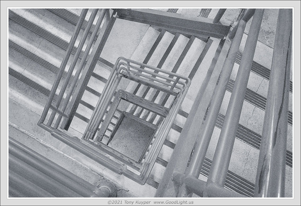
Continuing to explore the stairwell as sketch-o-graphs and to channel M. C. Escher.
Specific Feedback Requested
These are experimental composition-ally and also with regard to post-processing, so any thoughts would be appreciated.
Technical Details
Is this a composite: No
2 Likes
I am liking this one, Tony. I took a few liberties by cloning the vertical post and increasing the contrast. Just a little different take on it.
I do find the contrast in these images a hard thing to settle on. I try to keep them looking “sketchy” so that might be why I opt for less contrast. However, I like them with both less contrast and more contrast, and have prints with the different options. In the end I just go with whatever print looked best to me.
Amazing and wonderful! I do prefer the slightly bolder lines in @Harley_Goldman’s take. It’s still high key and retains the sketchy look.
Is this THE @Tony_Kuyper? I feel bad critique a TK image…
I love spiral staircases and love them even more when they aren’t spiral shaped! I really appreciate the abstract nature of this composition.
However my eye is having a hard time navigating the image. It needs some direction to help my brain make sense of it. I think burning the hand rail and leaving the lines of steps alone, would help emphasis that spiral.
As is it feels like a Fibonacci Spiral that self identifies as a repeating elements shot ; )
Tony, I really like the Escher-ness of this. Curious if you did any tweaking of the shapes in Photoshop? Or is this how it looked?
David
This image feels very modern to me. I don’t sense a height so much. I believe that Hitchcock gave that feeling by zooming up and down the stairwell to make you feel as though you could fall. In your image I feel it’s more a sense of arrangement of shapes within a frame and the mental state it puts you in by doing so. I’m not experienced with this but I believe that’s what modern art strives to achieve. The fact that the angles are all askew and that many lines are converging does give a sense of purposeful unbalanced. Yet the overall composition is well balanced. Perhaps that’s the point - to make you feel disoriented. But as I said, I react to this more as an abstract of an arrangement of shapes than what it really is. The little curved shape at the bottom is out of character with all the other shape angles.
I appreciate the idea of using higher tones on this. You could alternatively go really high contrast with this. That may actually add an edge to it and foster the vertigo idea. High contrast together with sharp angles could carry a message.