The photographer is looking for generalized feedback about the aesthetic and technical qualities of their image.
Description
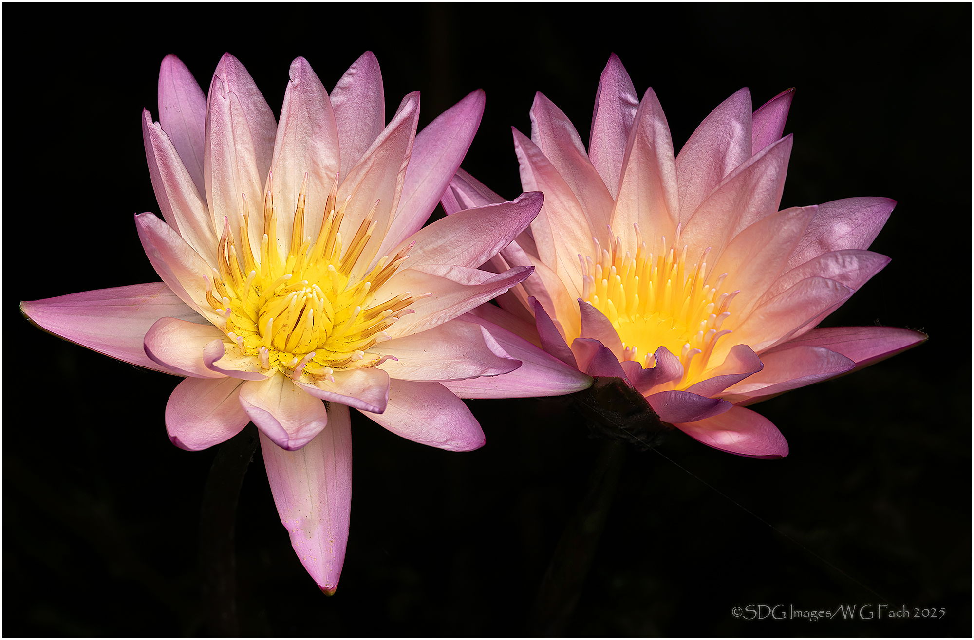
Returning to my series of water lilies, this pair caught my eye. >=))>
Specific Feedback
Blend/stack of two images with the centers of each bloom sharp. Had to do a lot of clean up of the debris on the first flower but left some of the less egregious stuff. Is there still too much dirt and does that spoil the image? The light pretty much spotlit the flowers with a dark BG that I ran pretty much all the way to black. Your thoughts?
Technical Details
Sony A7rIII
Sony FE 70-200 f2.8 GM-II, 2xTC @ 282mm
ISO 400, 1/50 @ f16, 2 image stack in Helicon Focus
Critique Template
Use of the template is optional, but it can help spark ideas.
Bill, the flowers themselves are beautifully captured - crisp and colorful - and the composition of the two side by side is very pleasing to the eye. I’m not 100% behind the way they seem to be floating in a vacuum. I’d prefer to see a bit of muted support from water and/or vegetation below the blooms, which could be brought back from the original. Or just some leafage as in your previous water lily shots. But I’m probably in a minority of one on this, as it’s an interesting change in your approach.
The black specks on the LH flower do not bother me and I like the dark BG. One feature that’s captured very well are some of the wrinkles in the petals which provides additional texture. Well done…Jim
Great light on this. As far as dirt, I wonder as nature photographers, do we clean up too much? It’s that balance of highlighting the beauty of nature and letting nature be, well, natural. I think your image does it well. I also like how the lily on the right has all that texture and it gives it personality. I like the black and how it sets these off. One thought, the crop on the left just add a little more to balance the amount of black on the right. Nicely done.