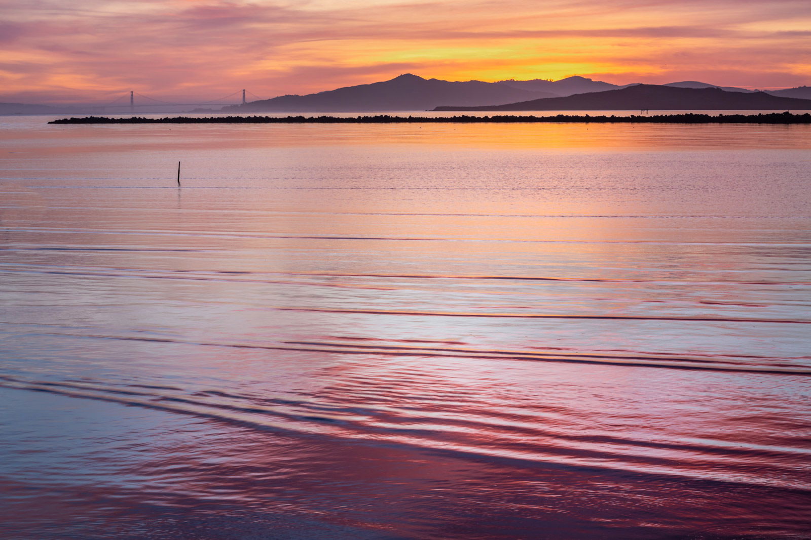
This is a testimony of my fascination with color, but I am wondering if it holds enough interest for the viewer? There’s a voice in my head that thinks it’s just too cliched, just another sunset, etc. Also, should I clone out the stake in the water? I left it in because it leads the eye up towards the Golden Gate bridge, which might otherwise be overlooked. I appreciate any comments and feedback. Thanks in advance.
What technical feedback would you like if any? Any
What artistic feedback would you like if any? Any
Pertinent technical details or techniques: ISO160, 70mm, f/16,1/6 sec
(If this is a composite, etc. please be honest with your techniques to help others learn)
If you would like your image to be eligible for a feature on the NPN Instagram (@NaturePhotoNet), add the tag ‘ig’ and leave your Instagram username below.
Kathy, the colors are beautiful. The series of larger ripples in the water provide interest from front to the middle, where the land a bridge take over. I like the stake, it’s a nice extra, but this would probably be equally inviting if you remove it. Definitely a keeper.
I agree that this is about color. The subtle yet skillful blending of blues with all the warm colors is really appreciated. I don’t think of this as a sunset picture, at least not in the usual sense. Tastefully done without the “wow” factor.
Kathy, to me this image is primarily about the lovely color and texture in the water. In the water, I especially like the subtle blue color mingled in in with the pink, red, and yellow. With water this nice, i can see why you minimized the sky. This is a nice set of sunset colors, that are vibrant, but not over the top, i like your processing of color here.
Regarding the stake, in viewing the small image I thought to myself, you need the stake to draw the viewer’s eye to the bridge. But in viewing the larger image, the bridge is more prominent, and the stake is not needed for that purpose, and the stake instead competes a little with the bridge. So I could see removing the stake for that reason (but truthfully its so small it probably doesn’t matter much whether it stays or goes). Either way, this is a very nice sunset image, I enjoyed viewing it…
This works nicely, Kathy. Gorgeous mix of cool and warm colors in the reflections and the water action adds a lot of fore/mid interest. The bridge provides a strong focal point. I would suggest cloning that stick out - just a distraction, IMO
Really nice work. You captured a beautiful scene, composition seems to be unbalanced upwards but, after seeing well, i noticed that the shadows in the bottom right help to balance the composition. My eye is attracted by the triangle formed by the stack and the bridge in background and the light on the sky is gorgeous. Thanks for sharing.
Kathy, this is a lovely photo. Indeed, it does look like a watercolor painting. Usually I am one of those nitpicky photographers who objects to photos where the land is brighter than the sky (physically impossible under most circumstances). I tried darkening the highlights in the land just a bit, but found that I liked your version better. So my nitpicky brain gives you a dispensation. All this again reminds me of a story about Picasso. A woman was standing next to him and commenting on one of his paintings entitled “Fish”. “Mr Picasso” she said, “this doesn’t look anything like a fish”. He replied “It’s not a fish, it’s a painting”. Sometimes photos aren’t reality, they are just photos…
Gorgeous colors! And yes, it’s about color and you’re making a bold statement here with the expanse of the water. This works beautifully as presented, including the stick - although I would agree it’s less important in the larger view.
Alternatively, this would also make a killer, classic pano by basically cutting this in half. But only an alternative view - kinda like getting bogo… buy one, get one free…
Lon