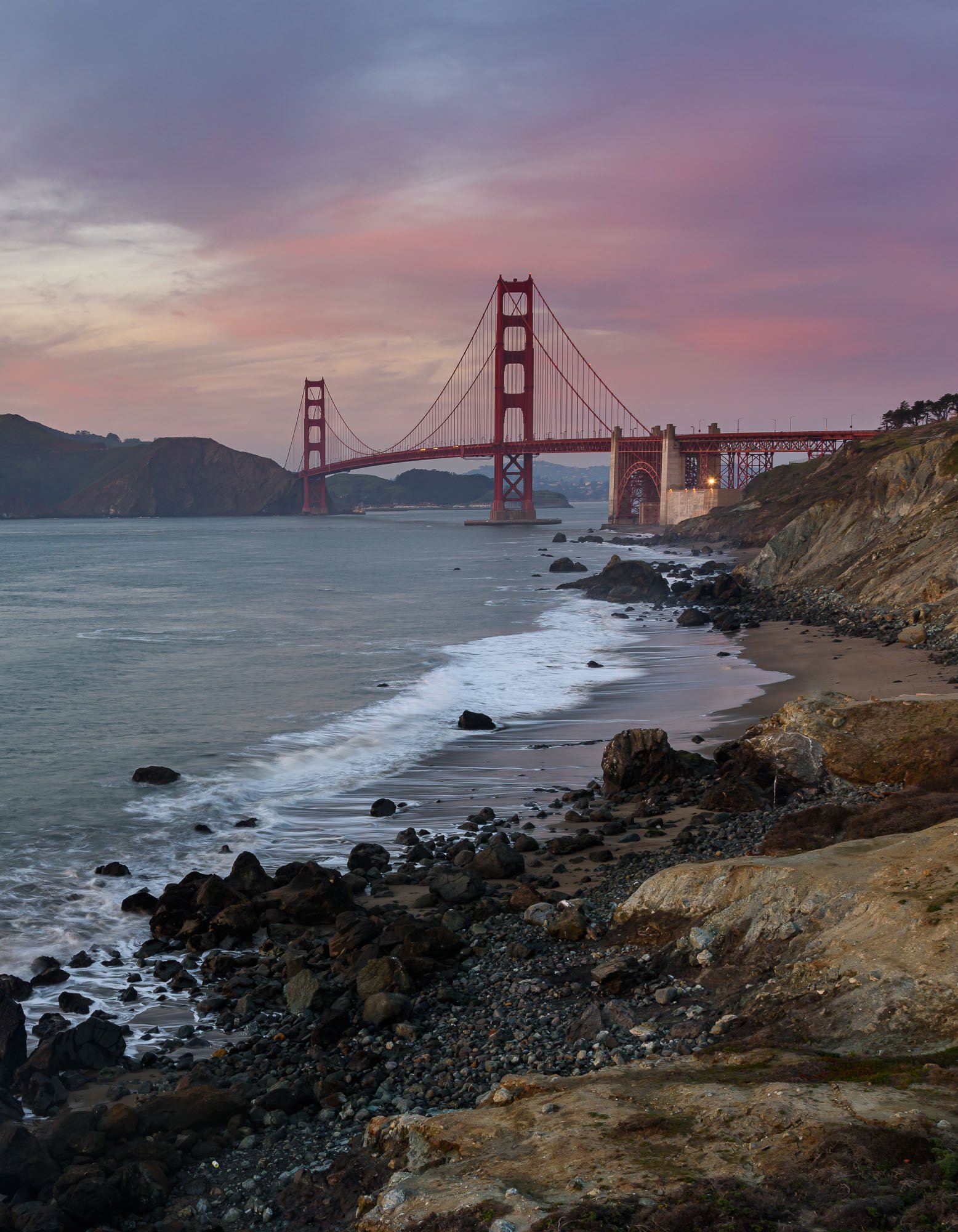
Sunset at the Golden Gate Bridge a couple of years ago. Please let me know how I can make improvements to this image. Thanks for taking a look. Your suggestions are always invaluable.
What technical feedback would you like if any? And and All
What artistic feedback would you like if any? Any and All
Pertinent technical details or techniques:
Nikon D810, 31mm, ISO 64, 1 sec @f/14, 24-120mm lens
(If this is a composite, etc. please be honest with your techniques to help others learn)
Single image
If you would like your image to be eligible for a feature on the NPN Instagram (@NaturePhotoNet), add the tag ‘ig’ and leave your Instagram username below.
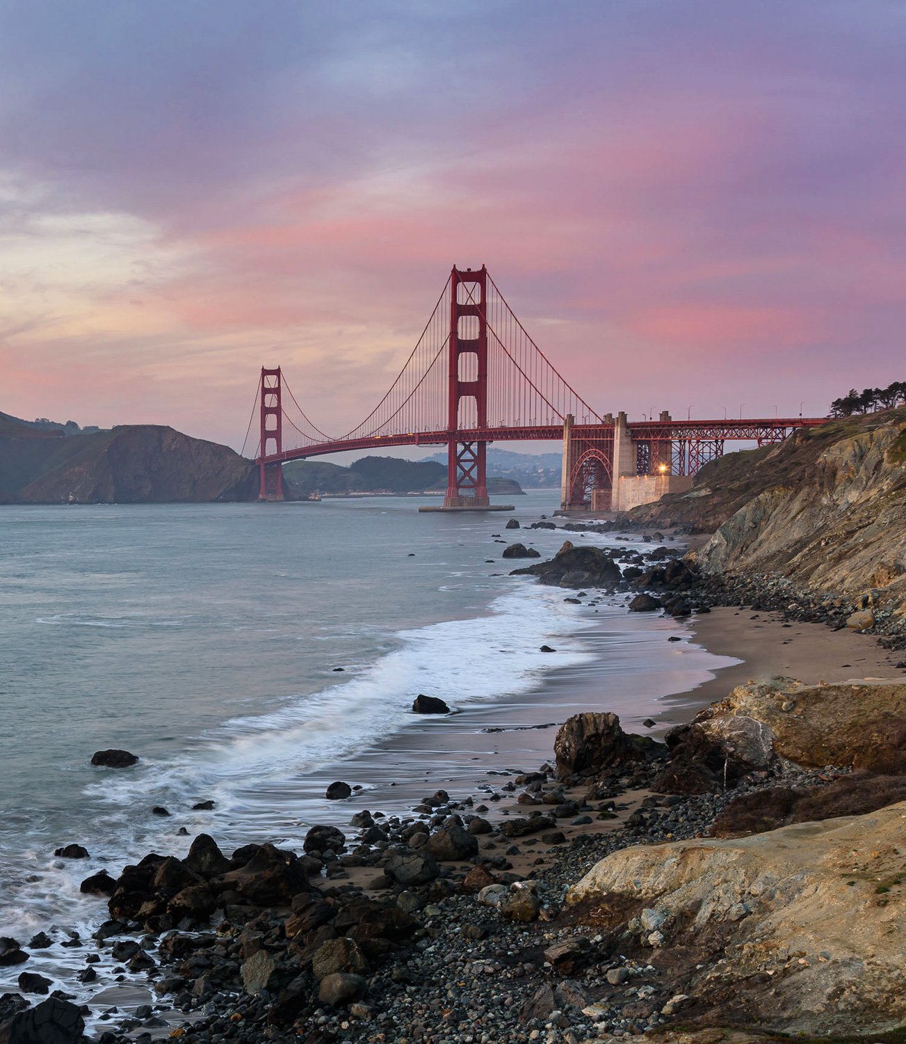
I think it could be improved in three areas. First, I think it needs a crop off the bottom. The rocks distract from the more interesting shoreline and the Golden Gate Bridge. Second, on my screen it seems too dark and could use more mid tone contrast. Third, I would darken the bright patch of sky in the upper left. My eye also wants to see more of the brown sand on the right side, which is cut off. Like so:
That mid-tone contrast made a huge and very noticeable improvement @Tony_Siciliano. Well done. I’m now torn on the crop. It almost seems like a 50/50 ratio of sky and foreground but I agree that there needs to be a crop but not sure where. I will play with it. Thanks again Tony
David,
A classic look and beautiful scene - The Golden Gate - like no other in the world crossing the amazing California coastline.
This works quite well as presented. I was thinking of some improvements, worked on it, and then came back to see Tony’s edits. Just what I was thinking. The crop, definitely need to bring it up; if there was something compelling in the immediate foreground, then that’s understandable. But it this case, it’s the white-water wave line that draws the eye in, and the bottom rock isn’t really adding anything.
I also thought luminosity, contrast and even saturation could be bumped a little - no mind you, these aren’t critical suggestions, but more along the lines of personal preferences.
My edits were before seeing Tony’s and now curious to see how they compare. If you like the more narrow look, I think you have some room to shave a little off either side.
Terrific as posted, but with some suggestions:
@Lon_Overacker, I think you saw nearly the same improvements that Tony saw this image needing and I agree with both of you. I knew it needed something which is why I asked how this could be improved. I just didn’t see it. The original seems so muddy now compared to both of the revisions. This is why I love this forum. Thanks for the suggestions Lon!
Beautiful shot here, David. I like the ideas presented by both @Tony_Siciliano and @Lon_Overacker; I think they both represent nice improvements. Of the two revisions, I believe I prefer Lon’s because I like the way he also lightened the brown areas on the right more.
I came across this image this morning which was taken from the same area around 1933 when the bridge was being built.
1 Like
I prefer the original composition. The only suggestion I can come up with would be to clone out the light on the bridge. On my monitor I prefer the darker look of the original.