Image(s)
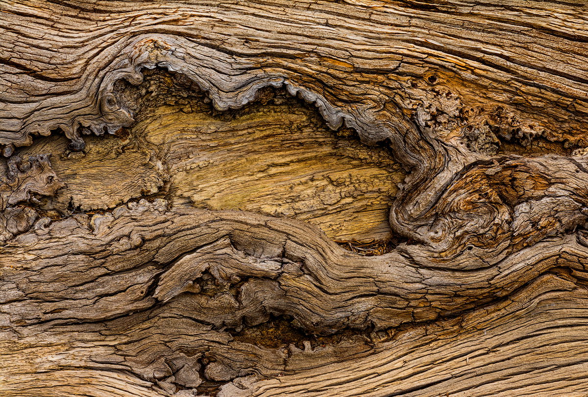
Original
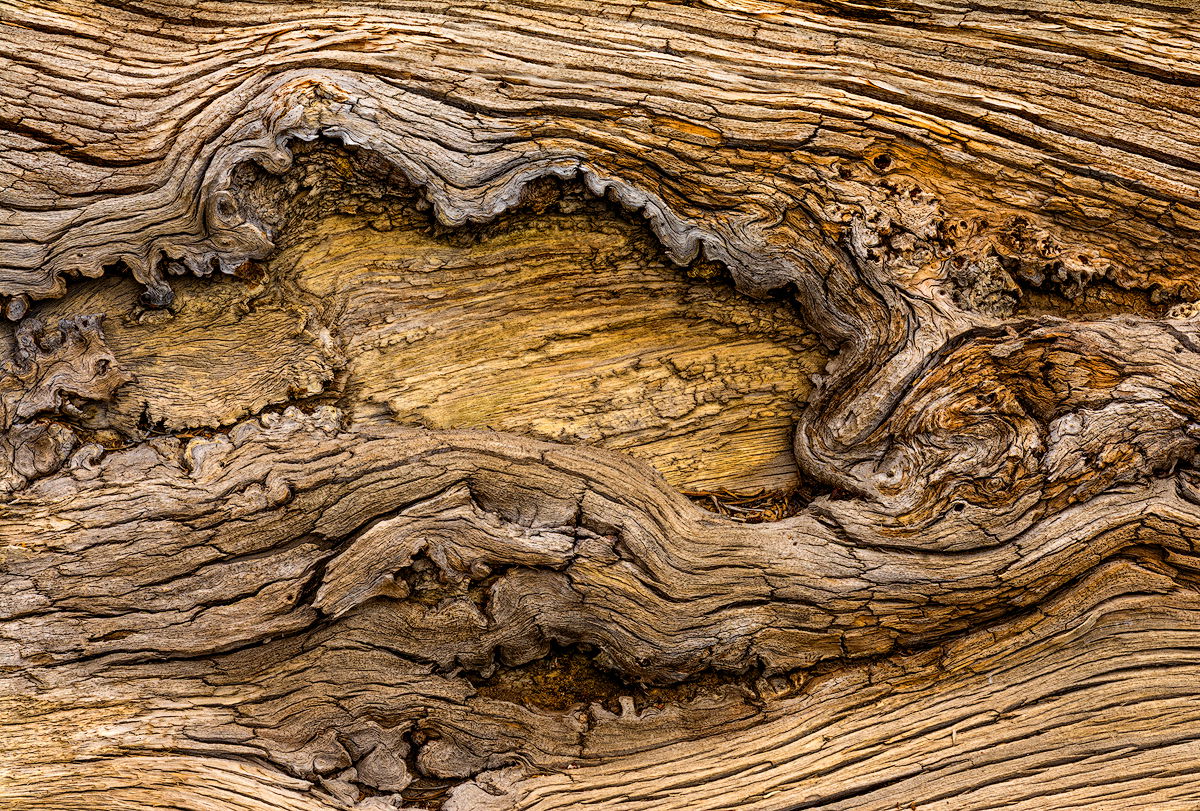
Tweaked
Image Description
I found this weather sculpted fallen Lodgepole Pine near Sonora Pass. I liked the varied textures and subtle reds and yellows.
Feedback Requests
The upper portion of the image was lighter in tone than the lower portion, so I attempted to balance the top and bottom by using levels and some burning on the upper part. How did I do?
Also, is the saturation about right? I wanted to keep it close to the real color.
Pertinent Technical Details
Nikon D 7100
Nikkor 18-140 mm @ 75 mm
F16 @ 1/50 s, ISO 100
ACR
PSCC 2024
Neat Image NR
TK’s Luminosity Masks and Burn/Dodge Layers
Hi Preston–the tonal values look good across the frame. Nice details and I like placement of the knot in the frame…Jim
Preston: I love images of old wood and this is a good one. The tones are spot on IMO and the more I look the more I like it. Great find and an even better capture and presentation. >=))>
PS: It’s really great having you posting again.
1 Like
Thanks for your comments @Jim_Zablotny and @Bill_Fach !
After posting this, I felt the original image was too dark, so I have uploaded a slightly brighter ‘Tweaked’ version.
Any thoughts you might have comparing the two versions will be appreciated. Thanks!
-P
Preston,
I don’t recall seeing this one before - and it sure is a beauty! I love the old, weathered logs and I love what you’ve seen, arranged and captured. Very cool.
I love this as presented with no nits or suggestions. However, now that you’ve posted a 2nd version, I had a thought. Personally, I don’t think the original was too dark - but then so much depends on when/where/how someone might be viewing this. My idea was to keep the surrounding wood as the original, but to raise the luminosity of the center to the level or your rework? Of course this is all around personal choice.
Beautifully seen, captured and presented
Preston, this is a great look at this weathered log and knot. Both views look fine to me, especially the detail in the ridge around the knot. The tweaked version feels a bit yellow in the knot for my taste. When I go back and forth between the two, I find the darker version, having just a touch more of a somber mood. This does look like an image where you could put in a ton of time tweaking details…
I like the original the best. The brighter version might be a tad too yellow and the original conveys old and weathered better…Jim
What an amazing find, so well presented!! I love both but could go with the idea of the darker top version with the lighter center I don’t think the color is too strong. It fits with the strong and unusual shape. 11/10!