The photographer is looking for generalized feedback about the aesthetic and technical qualities of their image.
Description
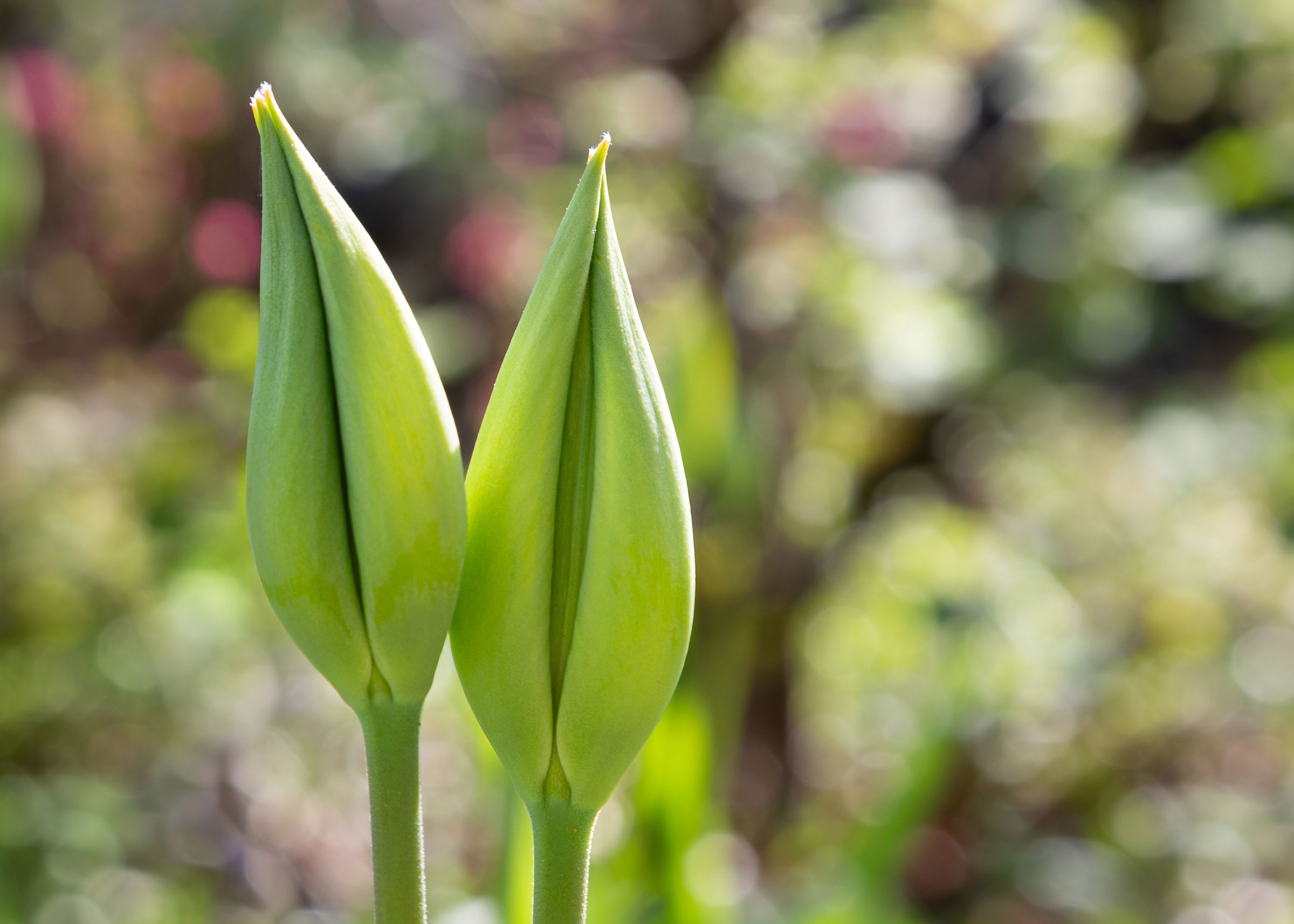
This is a “reject” from my “low-down” shoot for the Weekly Challenge. It wasn’t quite low down enough, and I wasn’t sure whether it was too busy. I took several frames of this, and ended up trying to get the background flowers (not far away) to go totally bokeh, and it worked, but I’m not sure whether it is still a bit busy or whether there is a loss of focus in the twin tulip buds.
I liked it because it felt so celebratory, like a couple on their wedding day surrounded by confetti and color, and I found myself singing that Carpenters song (based on a bank commercial, but oh well) on the walk back home.
Specific Feedback
I’m curious about several things:
Does it capture that sense of celebration and beginnings?
Is the subject sharp enough?(no tripod and focal length and shutter a bit close to each other)
Is the crop pleasing or would a square centered composition look better? I chose to place the subject toward the left to give the readerly sense (in English, anyway) of being at the beginning with more space to right, moving from present to future being my logic).
Anything else you can think of? I’m rusty after a year off and ready to get back to work in the field and in processing.
Technical Details
Canon 5d3 with 24-105 at 96mm
ISO 160, f/10, 1/80th
Processed in Lightroom, but not a lot as the scene was high contrast and colorful from the start. Did a little bit of dodge and burn, removed a stem, reduced saturation slightly in the bg by selecting subject, inverting to create that mask.
Critique Template
Use of the template is optional, but it can help spark ideas.
Hi Marylynne. I like this image and don’t think the buds are too soft. I associate a little bit of softness with newness, so that works for me. I’m curious as to whether you thought of a vertical composition or if the background would have supported it, since I tend to associate the vertical with growth more than the horizontal, though I know those stems aren’t going to grow much at this point. I like the background though with the sense of celebration as a theme, you might play with the saturation there a bit. I think there’s enough color contrast between the subjects and the background to support it, particularly if you concentrate on the reds. The new color mixer in LR is great for that kind of adjustment. Lastly, there are a couple of tiny blemishes in the buds that I don’t associate with beginnings.
Thanks for the feedback, @Dennis_Plank. I had toyed with a vertical (more of a portrait orientation) but wasn’t sure it provided enough of the confetti-like background, but in 8x10, I think it works (didn’t in 5x7).
I retouched both and posted them above with the original post:
Cloned out the blemishes on the buds
Returned the bg saturation to its original in-camera
Brightened the buds a tish
4 Created a vertical comp for comparison ( could clone out that one bright spot between the stems if they are distracting).
Let me know what y’all think. You never cease to make my work better.
I like both of the reposts for the confetti background, Marylynne. I’d probably get rid of the bright spot between the stems, but I don’t know if others would react in the same way. When you brought the colors up on the buds I noticed that it also brought up the highlights, giving them a slightly harsher look. I think that conflicts with the feel you were going for, so you might soften the contrast and bring down the highlights a bit on those buds.
I do like the vertical interpretation and hopefully you’ll get some more input on this one with other people’s take on it-always dangerous to rely on a single critic.
Thanks, Dennis. I’ll see if I get additional feedback before tweaking further. I figure two heads are better than one, and your insights are appreciated). I see what you mean about the buds and highlights though. I’ll see if I can give that a less contrasty treatment while I see if the image gets any more critique.
ML
Marylynne: I’m late to the party but like your final landscape iteration especially. It’s a somewhat unconventional comp for a tall flower but I think it works great. Well conceived, composed, captured and presented. >=))>
Thanks Bill. I’ll post one more with softened light on the buds and a brighter background, based on feedback preceding yours. It’s not going on a wall anywhere, but it’s getting me back in the routine of seeing, shooting, processing.
ML