What technical feedback would you like if any?
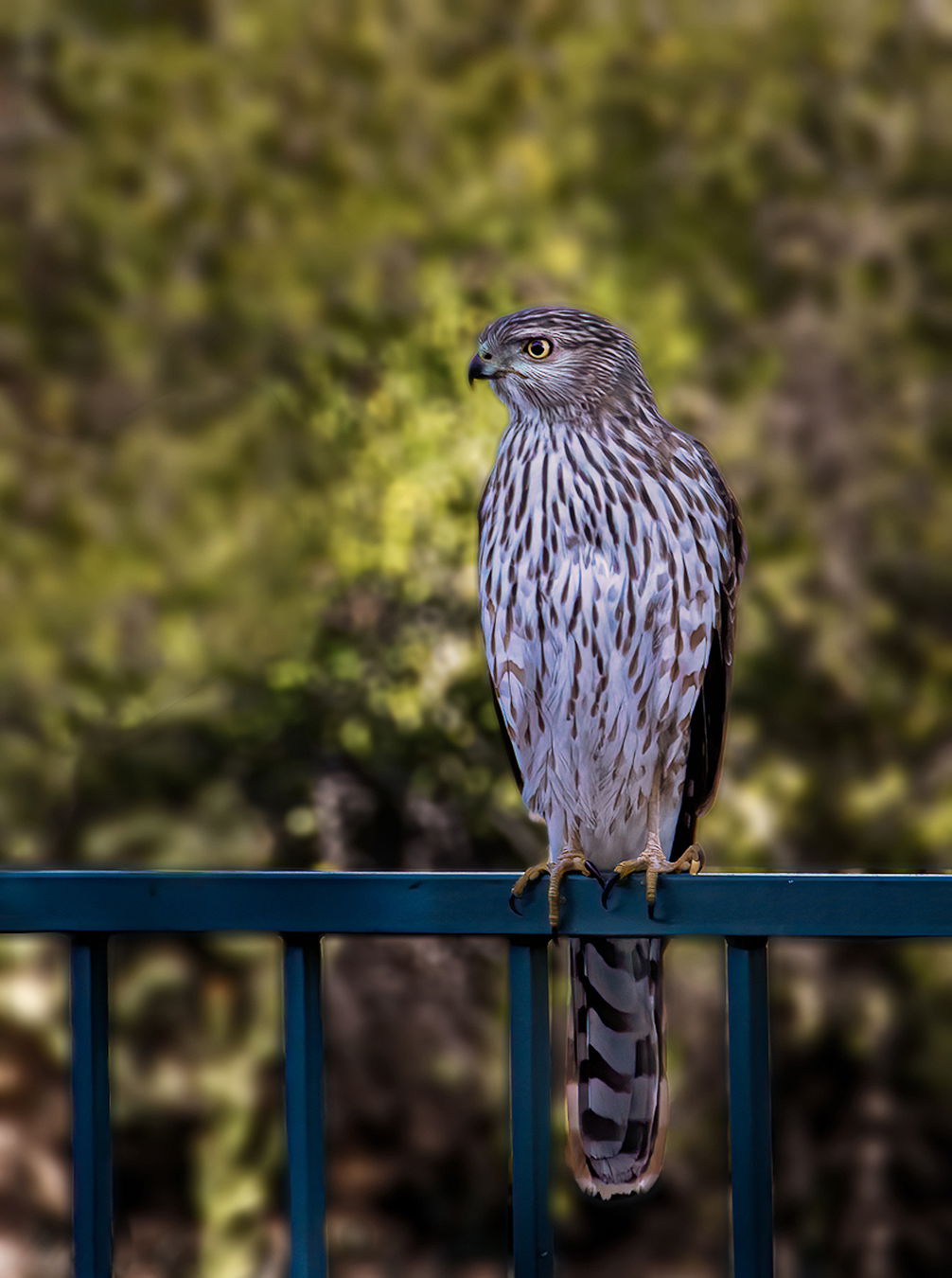
Because the subject was in the shade, the background was too light and I had difficulty darkening it. The brush made it kind of blotchy. How would I darken the back ground consistently?
What artistic feedback would you like if any?
I don’t like pictures of birds on artificial structures but, she(?) just came in for a drink and then hung out on the fence. Probably a female, juvenile Coopers judging by the size.
Pertinent technical details or techniques:
(If backgrounds have been removed, etc. please be honest with your techniques to help others learn)
Canon 7D ll, Tamron 18-270mm, ISO 1600, 1/640sec, F/5, 270mm, hand held.
Lightroom CC, Topaz Denoise AI
All comments greatly appreciated.
If you would like your image to be eligible for a feature on the NPN Instagram (@NaturePhotoNet), add the tag ‘ig’ and leave your Instagram username below.
Hawk was nice and close that is for sure. The only suggestion I have is to use your software to separate the bird from bg. Then up the exposure on bird a bit and decrease exposure on bg a bit. It is a back lite subject so if you try to reverse the lighting artificially then I think it will not appear correct.
You may have to live with some improvement of a dandy memory. Nicely focused. It will be interesting to see what other suggestions you get.
Excellent job on the focus and reasonable exposure, Charlie. I love your composition and don’t mind the railing. I agree with David on the course of action. What works best will depend on what software you’re using. I use some old Topaz plug-ins with Photoshop, but there are good selection tools built-in these days. What I would do is select the bird and probably the railing at the same time and put them on a separate layer on top of the background. That lets me play with the background with almost complete impunity. In this case the background has a texture that my eye finds disquieting, so I’d blur it to some extent, probably using the PS blur brush. Then I’d lower the exposure on it a little and possibly do some auxiliary burning of the really bright areas. I’d also increase the exposure on the bird & railing combination layer a little bit. The amounts are a matter of experimentation and what looks good to your eye.
I hope that helps a little.
1 Like
Hi Charlie: Well, you had some very challenging light to deal with with the bird in the shade and the background brightly lit. I did some work in PS with a whole host of options to blur the background, darken the background, desaturate the background, brighten the bird and remove the blue color cast on the bird and more. Here’s the result. The selections aren’t perfect by any stretch so close examination will show some errors, but hopefully this example shows were the image could go.
Charlie, this is a beautiful look at the hawk. There is a blue cast to the bird and railing. Removing this with the hue/saturation adjustment should help a lot; you can even move the lighten slider to the right a bit. As the background is mostly yellow, you could do another hue/saturation layer and darken this color. This should help and just take a few seconds.
Thanks all for the suggestions. I need to work more on masking areas to isolate them. Keith got rid of that bright area on the left of the picture and lightened up the tail. Much better. Just what I wanted. As I write this, a Sharp-shinned came in on the railing but, no camera this time. Maybe tomorrow.
Thanks again.
Need to put some perches out there 
I second @Karl_Zuzarte, @Charlie_Chaffee. Most birds will land on a perch you put up if it’s higher than the place it’s used to using. Zip ties work well for attaching to things like your railing.
Good luck and good light!
Nice to have such a brutal visitor  … As others mentioned, the BG is a little light and I find the tones on the bird a bit cool. As a -very - quick fix I would in LR bring down the highlights and increase the shadows first, and then add a little of warmth. Can’t keep my eyes of this impressive raptor though . Cheers. Hans
Thanks. I will definitely add some perches.
I’m a little late joining in on the conversation here but I agree that the blue cast was the most annoying aspect of the image. You did an excellent job with the composition I also don’t find the railing that distracting. Keith did an excellent job with the color balance.
Thanks. I don’t appreciate the blue cast but, that could be my monitor. Will have to re calibrate.