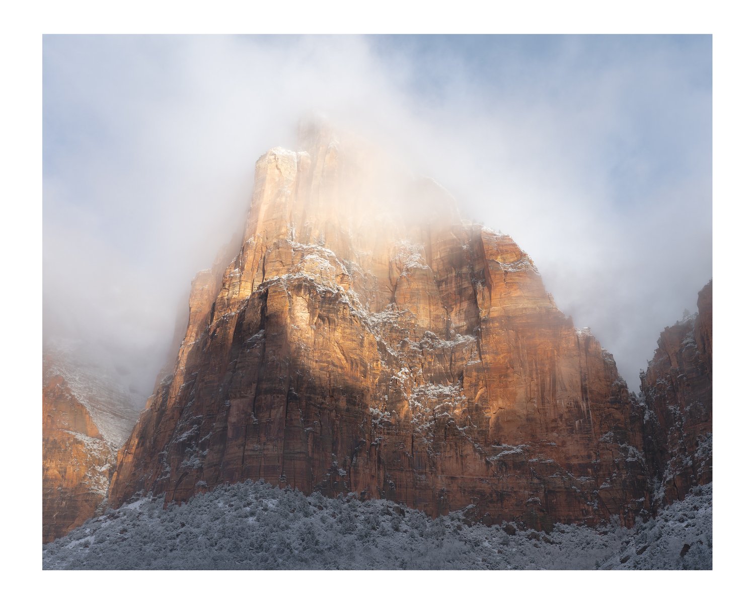
This was shot back in January 2018 and I’m not sure how often snow accumulates in the valley in Zion but I gather it’s not super common.
I actually processed two versions of this image. The other version was more muted in terms of colour and contrast and I thin k I’ve lost perspective on this one. Any comments on where this is too contrasty or could be pushed further would be good.
What technical feedback would you like if any? any
What artistic feedback would you like if any?any
Pertinent technical details or techniques:
(If this is a composite, etc. please be honest with your techniques to help others learn)
If you would like your image to be eligible for a feature on the NPN Instagram (@NaturePhotoNet), add the tag ‘ig’ and leave your Instagram username below.
@nathankleinphotos
3 Likes
Lovely image. My vote is to push it further: increase the reds and yellows in the Patriarch, maybe slighter increase the blue saturation in the sky and definitely darken the blue sky just a bit. Lastly try to remove the color cast from the bottom snow covered hillside. My favorite simple way to add punch in PS is to create a curves or levels adjustment layer and change the Mode from Normal to Multiply. That will usually be very over the top and garish, but simply decrease the opacity to desired effect. You can also try changing the Mode to Overlay instead of Multiply and go through the same routine. Also don’t forget you can use a black brush on the mask (that is automatically created) to mask out any specific area that is too extreme. Multiply mode will tend to darken things a bit, and Overlay mode will lighten. Both will add punch.
I like the degree of contrast in this image. Increasing more might take away the ethereal nature of the fog. I would think the image would improve impact with more blue in the sky as @Tony_Siciliano conveyed. The monochromatic nature of the grey S-curve at the bottom helps emphasize the curve and texture without competing with color. With that said, I’d be tempted to carefully and gently cool down the base just a touch to sandwich the blue from above and below. Yet, that’s my view and yours matters most.
This looks pretty much right on to me. It’s a marvelous image, fog or no fog. If anything I would experiment with raising the shadows at the base just a tad, and not lose any color.
A misty image suggests muted colors to me. I would therefore not increase either contrast or color.
Oh my, this is gorgeous. It looks spot on to me, too. Anything further seem to detract from the “softness” of the atmosphere. This is a super lovely image.
1 Like
thanks @Tony_Siciliano @Jim_McGovern @Igor_Doncov @Adhika_Lie for your comments on this image. It’s interesting to hear different perspectives.
I went back and looked at my edits for this image and I actually tuned the blues by increasing the lightness values in a hue/saturation layer in Photoshop. I did this as though the blues had more punch as shot I found that the blues in the sky were contrasty with the mist and it pulled my eye away from the light on the peak.
I have added a solid colour overlay to the shadows at the bottom of the peak which has given a subtle saturation most to the base.
Here’s the less contrasty and much more muted version which threw out my perspective.
The less contrasty version is not for me, Nathan. And I am also not sure about the lighter blue on this repost (the borderless one). I still like the original the best. The less contrasty version takes away the quality of the light at the top of the mountain, I feel.
1 Like
Here’s your muted version with more color:
1 Like
Put me down for the original too. Excellent atmospherics and mood.
1 Like
Interesting to read the comments and input. I also end up on the original. It looks well balanced to me and the atmosphere is fantastic!
1 Like