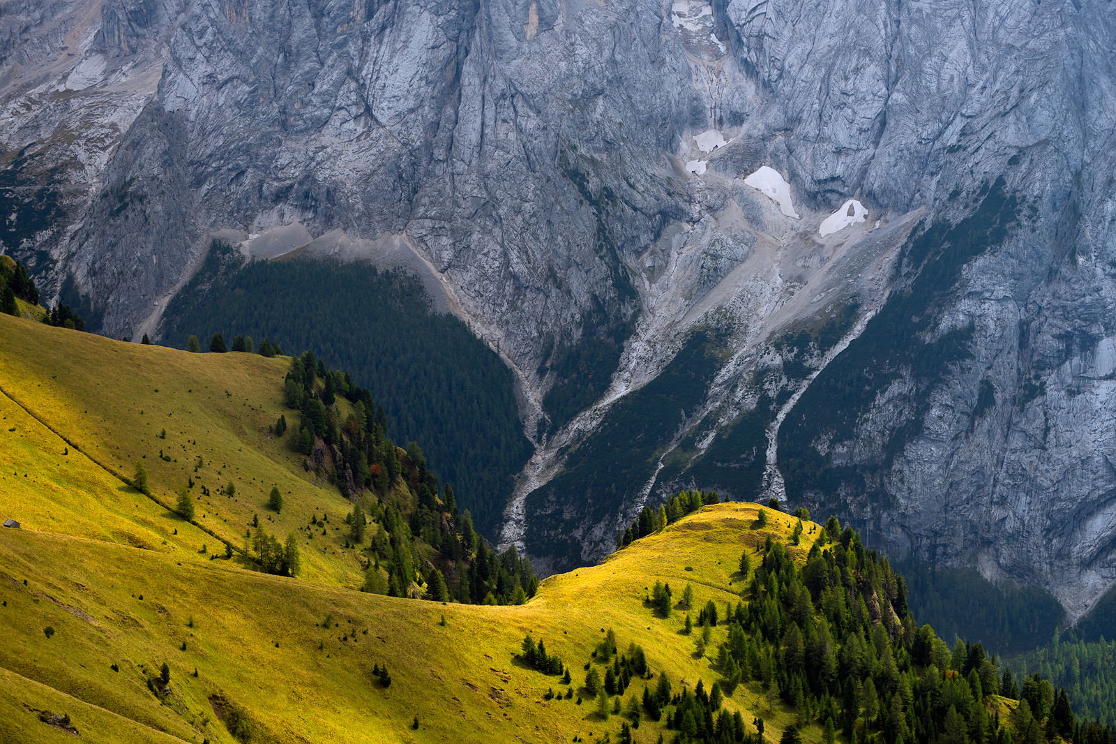
Hi everyone, here in the Alps there is a striking difference between north and south faces of mountains. South faces usually green and sunny, north faces uneven and shady. I really like this kind of contrasts in nature.
The shapes, colors and tones are most enjoyable. I might be tempted to burn down the background rock quite a bit to enhance and pop the yellow foreground (which to my eye is the star in this show). Real pretty scene!
It’s a really striking image and you’ve named it absolutely perfectly! I agree about bringing down the background. It should really feel like the light is just striking the green hills quite strongly. That’s all you really need though because you’ve done such a good job already!
I think you have done a wonderful job in showcasing that contrast in nature. This is well seen and captured. I also think not only the balance in light/contrast, but also in proportions given is excellent as well. Clearly the sheer granite walls dominate in terms of scale, but the light and color of the north facing hills visually balance beautifully.
I can see experimenting with the brightness of the granite wall, but I think this works very well as presented. Great vision with this one!
I really quite like this. The shapes, comp etc is really quite nice. Really cool actually! Some of the others mentioned darkening the north slope. At first I though it unnecessarily but looking again I agree. Reason being is that there is a light/shadow interaction in the foreground that I think you could emphasise more and that would work really well with a darker background. I think it will give you more of the dramatic impression you may have been after.
I can see darkening the mountains a bit. The problem is that the more interesting part of the image takes up less space than the interesting. I think there is plenty of ‘pop’ in the warm area. The blue area needs more or should be cropped down. Just my opinion.
This is quite nice, Mattia. I love the graphic quality of it along with the contrast in colors. I’m not sure whether it is darkening needed in the granite slopes behind, or more contrast or micro-tonal contrast, but some additional work on the tones there would make this pop more and make the title more convincing.
The other thing I might be inclined to explore is a little crop off the top. I suppose the rising gray wall lends a sense of alpine extremes, but I can see a yin yang being 50/50 also.
I’m enjoying seeing this and hope you post a retouch if any of our feedback interests you.
ML