The photographer is looking for generalized feedback about the aesthetic and technical qualities of their image.
Description
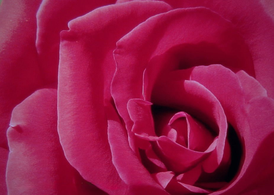
This was the first rose I grew myself! Pretty proud of how perfect is seemed to me then. It was supposed to be a deep red, but turned out to be a deep pink with some red in the shadowy areas.
Specific Feedback
I’m considering entering this in my local club competition, but I’m doubting my choice. Best in Macro or Open category? Or maybe not enter it at all. I would appreciate finite suggestions to make it better and honest opinions.
Technical Details
This image is a number of years old and the exif data is gone from too many edits and my lack of knowledge about workflow back then.
Critique Template
Use of the template is optional, but it can help spark ideas.
Vision and Purpose:
Conceptual:
Emotional Impact and Mood:
Composition:
Balance and Visual Weight:
Depth and Dimension:
Color:
Lighting:
Processing:
Technical:
Welcome to NPN, Lori. I’d guess this would go in floral, though it depends on your specific club rules. The image is nicely composed the the off-center center of the rose. Lighting is reasonable, but a bit flat so there’s room for more drama with a different angle of the light, though I personally don’t know how to simulate that in post processing. If you do decide to enter this, one thing that people are sure to point out is the upper left corner where there’s just a touch of green showing. Since the intention of the image appears to be to fill the scene with nothing but rose, that little triangle calls attention to itself. Since the tone and color are pretty uniform in that immediate area, just cloning over that corner would work fine for filling it. I also think a bit of an s-curve in a curves layer to add some extra punch to the image would be nice. I downloaded your image and tried playing with some other filters without finding anything I really liked, so the only other thing I can think of is maybe boosting the saturation and vibrance a little bit , but that tends to move it more toward red than pink, so it’s moving a bit away from the rose as you saw it.
A very nice image. I look forward to seeing more of your work and reading your comments on other folks efforts.
I think it’s a very nice image, and well worth cloning out the corner @Dennis_Plank mentioned. Suggestions are much easier to make if we know more about the basic image. Is it a raw file, or had you converted to a Photoshop file, a TIFF or a JPEG? What software do you have to do further work on it?
Or, it looks like you are just asking about enter it or not, as is, in what category? That’s a judgement call based on what you have seen in your club and their guidelines.
Lori: My apologies for the tardy response to your fine image. I’ll pile on with the others about the ULC but that is a tiny easy fix. I do like how you handled the red especially and the overall frame filling presentation. From a compositional standpoint this is close for me but I would prefer the center of the rose to be a bit higher in the frame, perhaps at the lower right thirds point. I think it just needs a touch more room at the bottom. Great to have you aboard and looking forward to more of your work and your comments on other’s images. >=))>