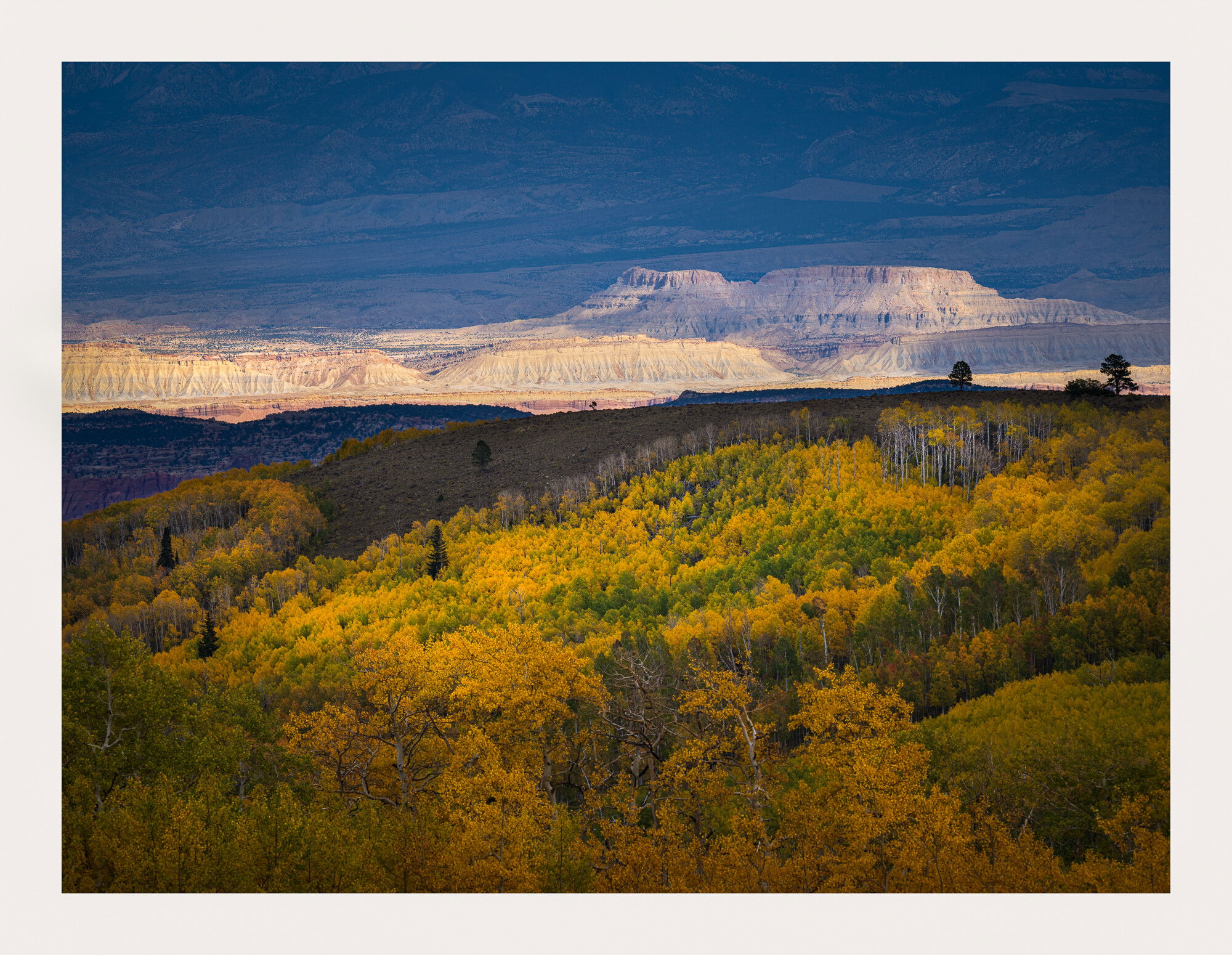
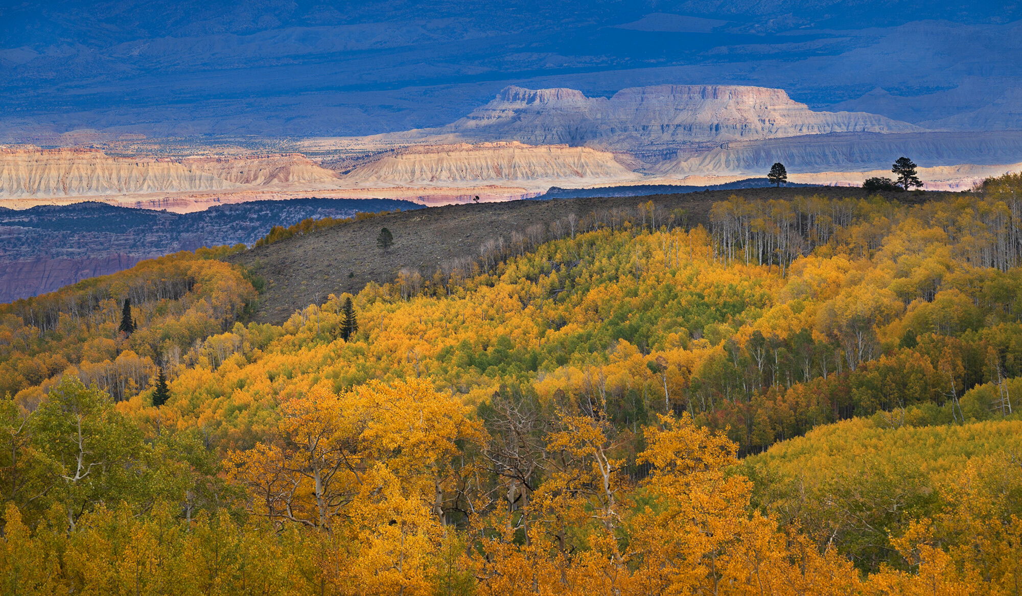
Another from my recent trip to Utah. I was traveling home from Northern Utah when I spent a night in Capitol Reef for the night. That evening I spent a few hours exploring the local mountains high enough to have aspens on a stormy day when this shaft of light hit some of the badlands far below a grove of aspen in shade. I loved the contrast between the arid badlands and the peak color of the aspen forest high above.
Specific Feedback Requested
The bright areas and dark areas were even more prevalent than what I’m showing here so, I’m wondering if this is a good compromise so that the aspen forest is not too dark and the buttes below are not too bright? I have a brighter version and a darker version but I thought this was perhaps just right??? I’d love your thoughts on this.
Also, white balance??
Technical Details
Z9, ISO 200, 100-400mm lens @ 400mm, f/10, 1/160th hand held, manual exposure.
Not knowing this area at all I don’t know what ‘Badland’ in the title refers to, but I expect it is the desert-like arid background at the top of the image. To me, the foreground is the centrepiece and it would be good, maybe, to see it brightened a bit so that the detail in the leaves and tree trunks shines through. Similarly, maybe toning down the closest bright badland scarps may show the detail of these a bit more as well. I really like the image and find that just a hint of what is in the background quite tantalising. To me, this adds to the foreground detail to provide an image that immediately got my attention. Cheers.
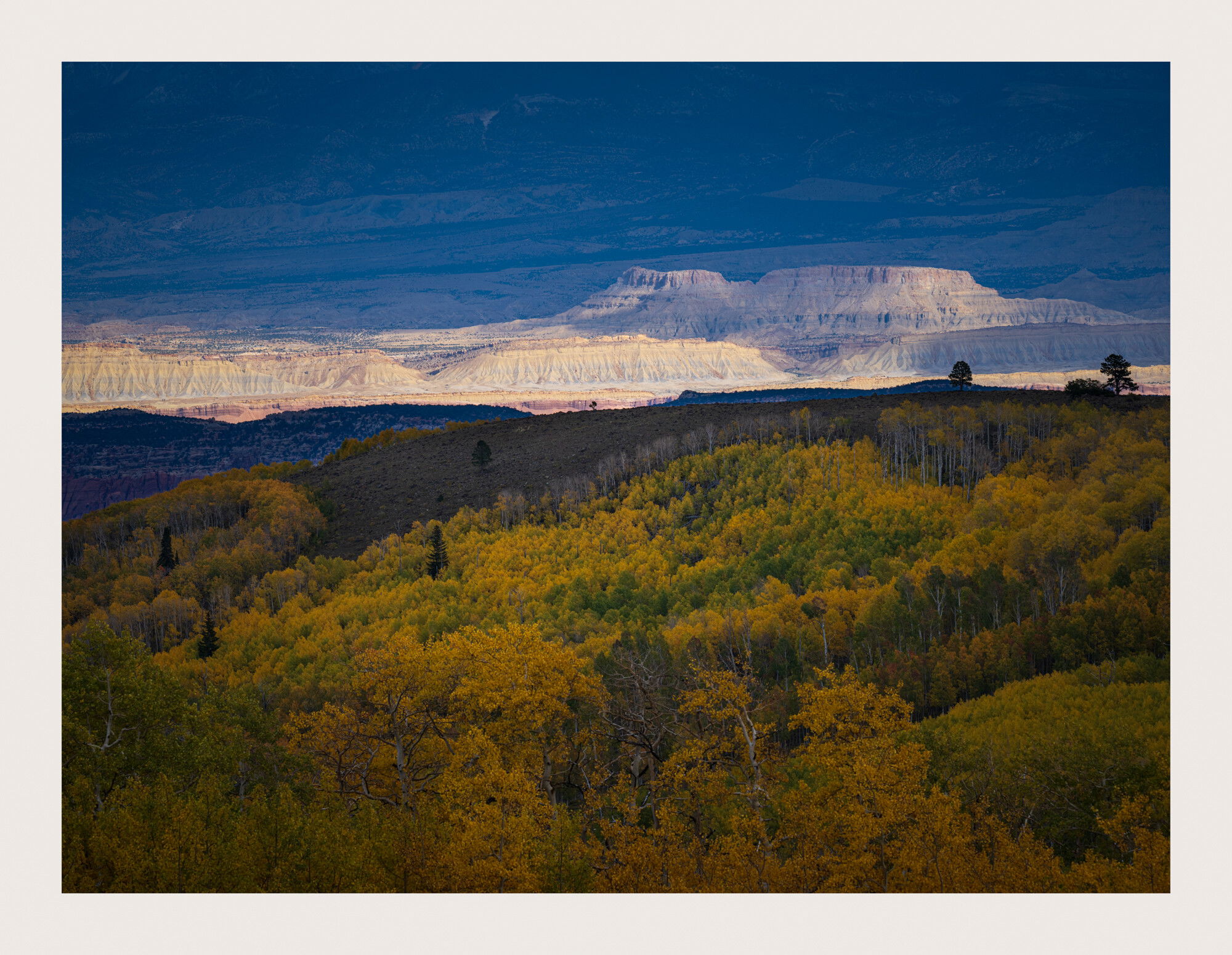
Thanks for your input @Phil_G. I knew when I posted this I was most likely going to rework it so I’m jumping right in here and posting a rework. I warmed the whole scene as I thought MAYBE there was too much blue in the background and I also dodged the aspens to make it look like the light was hitting some areas and not others. In truth, there was no light hitting the aspens and all of the light was hitting the background hills. I also added a tiny bit of hue to this. THoughts? Thanks again, Phil.
This is one of those scenes that you just can’t pass up as a photographer. I think your repost is a nice improvement. The color opposite contrast of the yellow/blue is always something that adds for me.
I think this is also one of those scenes that our eyes will see in real life better than what we can represent with a photograph. I still find myself being grabbed by the bright distant bluffs and then fighting that with the beautiful stand of aspens. I don’t have a viable solution that I think will look natural. I wish I did.
What an amazing scene! Thumbs up for the rework – nothing wrong with a little digital fill flash, in my estimation. I wonder about taking some off the top – maybe as much as halfway to the top of the bluff? I can’t say why, but it feels better balanced to me.
@Diane_Miller, @Matt_Payne, @Keith_Bauer, @Phil_G, thanks very much for trying to help me out with this challenging image. As I mentioned to Phil previously, I knew this one was going to get some pretty major tweaks to try and get it close to being right but I also think that Keith hit the nail on the head. This is one of those scenes that looks amazing in person that the camera just doesn’t quite get right. The butte was lit up and nothing else in the scene had any light on it. I was looking through the golden aspen and to the eye they are much brighter than the camera shows but the buttes were just lit up. It was quite a scene in person that just doesn’t quite measure up in camera. I’m not sure what else to do with this one but I sure appreciate your thoughts on it.
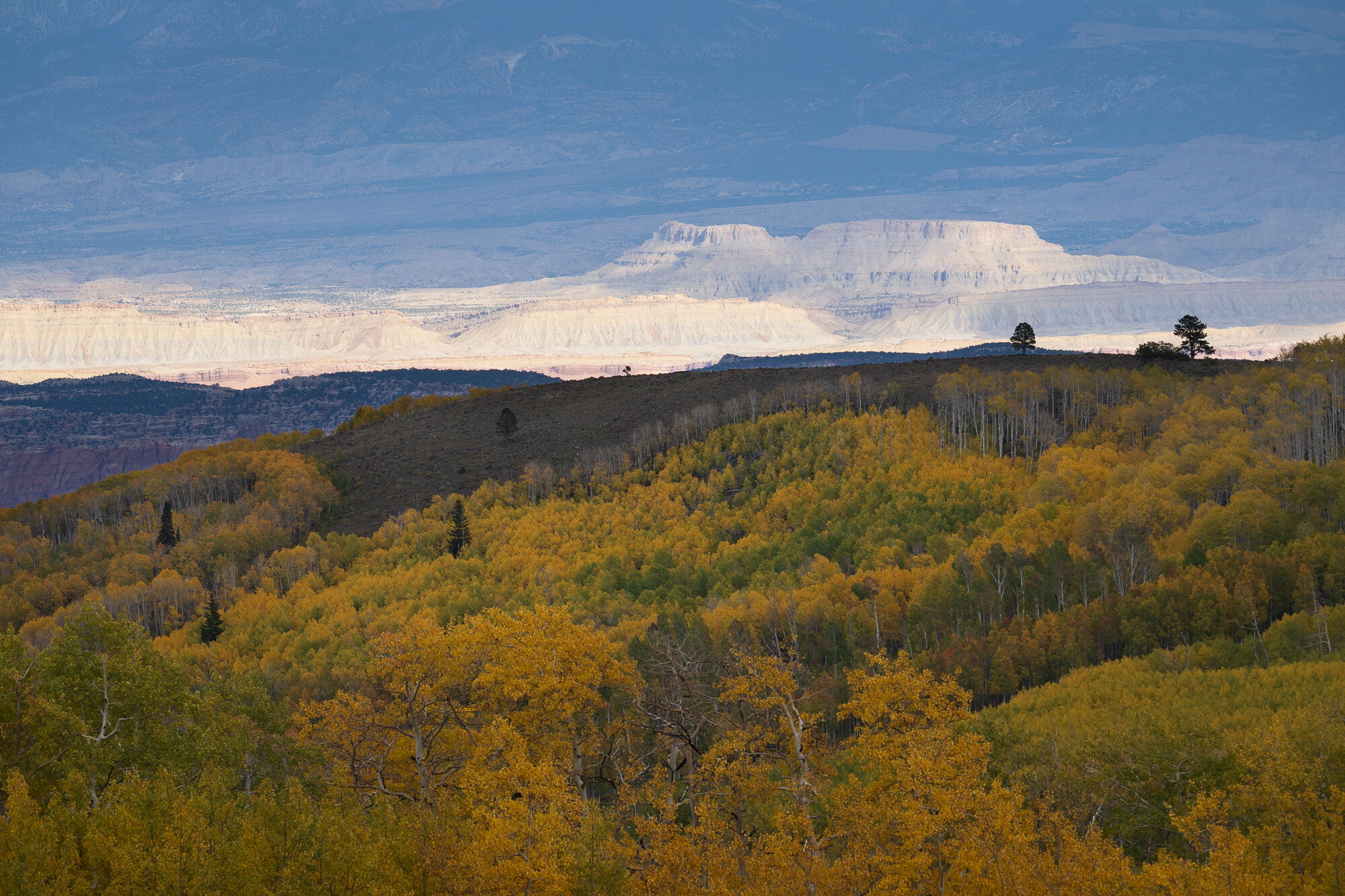
Thanks for chiming in here on this one @Dan_Kearl, @Matt_Payne. I understand where you’re coming from Dan. There is quite a bit of blue tone in the image but I really like the contrasting warm and blue tones in the final image. Thanks for taking the time to come up with an alternate vision. I’m attaching a copy of the original file so you can see what I started with and with a little dehaze and contrast this file goes warm and blue. Feel free to have a play with the original.
Matt, I’m glad you like this one as is. It’s given me fits trying to get it right and I may never get this one to where it was when I saw it in person, but I’m ok with that.
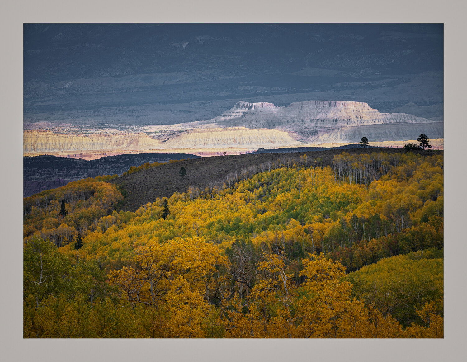
I always enjoy a good processing challenge. This is a very challenging image to process. Of course the final answer is up to interpretation. I messed with it this morning and came up with this interpretation. For me the key was getting more detail and contrast in the distant bluffs and bringing up the yellows in the foreground. I do like the blue/yellow contrasting colors and let that happen as I worked the luminosity values. Anyway… Yes, this is pushed a lot but mostly to see what was there.
edit: this was processed starting from the unprocessed image you added at the end. Certainly the RAW has more information to work with than the jpeg.
@Keith_Bauer, this is terrific. I love the foreground aspens now. I dodged them in my rework but I did it so it would look like thy were getting spot lit and it’s pretty uneven. This works much better. This crop also is what @Diane_Miller was suggesting and I like it. I am going to have to do a complete rework on this and target something close to this but maybe slightly less saturated. Otherwise, I think you nailed it. The original file was very flat and shot at 400mm so getting everything sharp front to rear was nearly impossible. Thanks very much for taking the time to rework this. I appreciate it very much!
Hi David! I like the reworked image, I don’t think the brighter trees outdo the background. I am impressed with how you are able to capture the grandness of the landscape.
Finally chiming in here. A most beautiful and a bit unique landscape to be sure; I mean how often does one get to juxtapose autumn aspens like this with the “badlands”. It’s like a composite between Colorado and Utah. Ok, duh, this is Utah and I think they have aspens there… but but hopefully you get the point. A unique combo of elements; Aspens groves combined with the Grand Canyon? anyway…
My first impression was that the aspens were quite dark and muddy. So I much prefer the first repost up top.
But then,
I agree with Keith and I’m betting this was much more awe-inspiring that one can depict here. I really like his edit, although personally, the top too blue, but I really like the direction he took this.
I think this was a great set up and a few tweaks and certainly print worth!