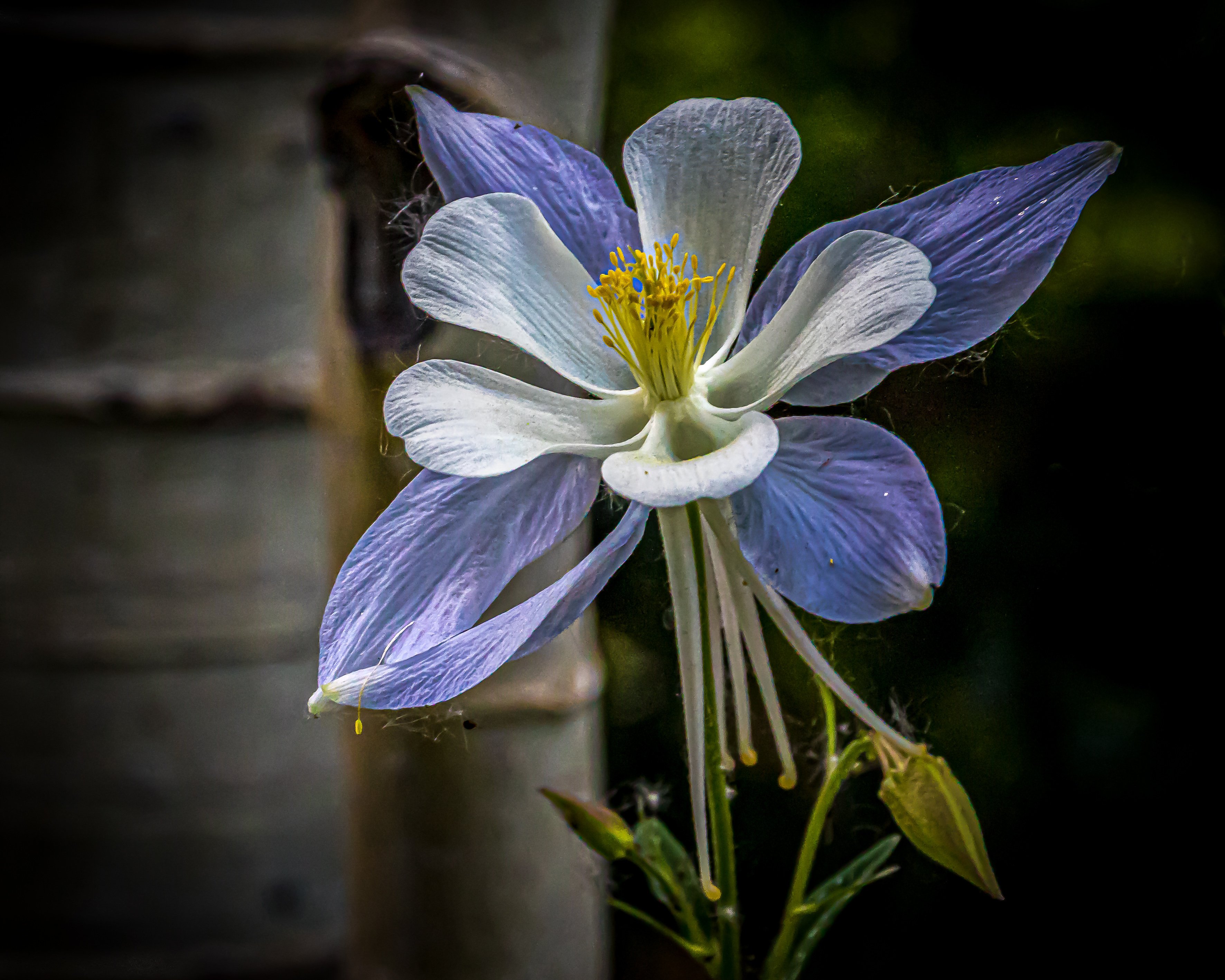
Last week in Crested Butte during the Wild Flower Festival. Fields of flowers were incredible. Mostly white and blue columbine but pretty incredible.
Canon 7D Markll, Tamron 18-270, Polarizing filter, 85 mm, 1/250 sec, f.9,ISO 2500.
Adjustments in LR.
All feed back is appreciated.
What technical feedback would you like if any?
What artistic feedback would you like if any?
Pertinent technical details or techniques:
(If the background has been replaced, etc. please be honest with your techniques to help others learn)
If you would like your image to be eligible for a feature on the NPN Instagram (@NaturePhotoNet), add the tag ‘ig’ and leave your Instagram username below.
Good detail and composition of the flower itself. Would suggest darkening the tree trunks(?) on the left as the dark/light background splits the image in half. Flower itself it great!
Charlie, you captured some nice detail in this beautiful flower. I’m thinking it would probably be best to darken. With the right side even darker, you would need to open it up some too, if you were to be brightening, and then you may introduce some noise that isn’t visible at the moment. Just my thoughts. Certainly worth trying both on your screen and seeing which you like the best. When opened up to the larger version, I am seeing a bit of green chromatic aberration. It isn’t noticeable in the smaller version. I love the angle of the bloom, and that you allowed just a bit more room on the left for it.
Charlie: I like this a lot. I’m OK with the BG tree trunks as they are. I would make the light areas in the dark BG on the right go away. I also like some of the natural imperfections on the flower. A lot of time I’ll make the webs and pollen spots go away in processing but they work for me here. Nicely done. >=))>
It depends on what goals you have for the image. If you want to tell a story of the flower in it’s environment, go lighter on the aspen. If you want a more artistic image that emphasizes the columbine portrait, go darker because a bright aspen in the background competes for attention with the flower.
If you were going for a story about the columbine in it’s environment, personally I would have shown a little more of the background aspens. As presented, this image is sort of in-between the two approaches I mentioned. The flower is large enough to be a portrait, but it has a competing background. not sure if this comment makes sense, but that’s my opinion.
Charlie_Chaffee:
I was torn between darker and lighter . Wondering if lightening would show more of the natural environment with the aspens in the background.
It depends on what goals you have for the image. If you want to tell a story of the flower in it’s environment, go lighter on the aspen. If you want a more artistic image that emphasizes the columbine portrait, go darker because a bright aspen in the background competes for attention with the flower.
If you were going for a story about the columbine in it’s environment, personally I would have shown a little more of the background aspens. As presented, this image is sort of in-between the two approaches I mentioned. The flower is large enough to be a portrait, but it has a competing background. not sure if this comment makes sense, but that’s my opinion.