Any and all comments, critiques welcome. My main feedback wanted is weather the clouds are eye magnets. Should I tone them down?
What technical feedback would you like if any?
What artistic feedback would you like if any?
Pertinent technical details or techniques:
(If this is a composite, etc. please be honest with your techniques to help others learn)
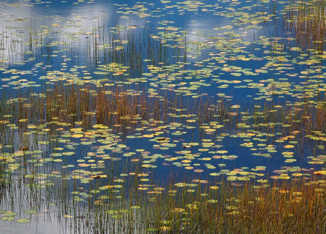
Acadia National Park, ME
If you would like your image to be eligible for a feature on the NPN Instagram (@NaturePhotoNet), add the tag ‘ig’ and leave your Instagram username below.
Nikon D800, 135mm, 1/15 @ f/16, ISO 100
You may only download this image to demonstrate post-processing techniques.
2 Likes
What a fabulous composition and color array! Very nice. I do find the clouds a bit of an eye magnet and if you can darken them and add a bit of blue that probably would help.
Michael,
Oh my, this is outstanding! I love this Michael! The layering provided by the reeds, the connection by the lily pads and the overall presence of the sky and clouds - fantastic. I love this image.
The presence of the sky and puffy cloud reflection are key to this - While I wouldn’t go as far as calling them an eye magnet, I would consider tweaking and burning down the corners a little to contain the bright clouds (including the LLC) Yes, burn down the LLC reflection, a little of the ULC area, but the rest of the clouds and sky I think are wonderful! A couple tweaks and this will sing - print big!
Lon
Beautiful painterly scene. I am in the burn the clouds a bit camp but otherwise, quite an excellent image.
Hi Michael - I am really enjoying the contrast of the sharp reeds and round lily pads. I agree with Lon’s suggest for burning down the ULC and LLC slightly. Excellent image overall.
I LOVE this and I think this is truly a good image. The only part that bothers me is the cloud on the lower left corner. If that’s darkened, I think this is golden.
Well spotted and beautifully presented. I think I would like to see the clouds at the top and bottom burned down a bit.
Exquisite image, Michael. This composition is beautifully balanced; the colors, shapes and textures are wonderful. This would make a great print. Another vote to burn down the cloud reflections.
The clouds do pull my eye, but in a good way! I like them and I think they add a lot to the composition. The provide contrast and they frame the center grasses nicely.
What a beautiful mix of elements! I agree with the others that this is very nice. I don’t think the clouds are a strong eye magnet, but my taste would be for the image to be slightly darker to bring out the colors a bit. If darkened though, then the clouds become more noticeable and a mild vignette on the left would be good.
That’s probably clear as mud, so here’s an example of what I mean. (As always, feel free to toss in the rubbish bin…)
1 Like
Love this image. These appear to be the same lilly pads I came across in Idaho this summer. The fall has given them a greater range of colors and that really adds a lot. The composition of these pads weaving in and out through the reeds really works well.
While the blue seems t add a lot I personally feel that the subject calls for less blue saturation and less exposure to the blue. When I did that then more subtle reflections appeared throughout and the reflections in the corners don’t appear as invasive as before. The water comes to life. In fact, I find the negative space in the llc to be important to the composition. Here is a rework that’s not quite as in your face. The oranges in the reeds make them too heavy still and need less saturation, particularly in lrc and center left… But I would do it while keeping the colors in the pads.
Thanks for taking the time on the rework @Igor_Doncov. In addition to John’s, I also like yours as an alternate take on this scene.

Beautiful work, Michael. I would take Lon’s suggestion of the burning of upper and lower corners. Outstanding anyway you cut it.
Just seeing the image, Michael. What a beauty…full of color and life. Beautifully composed, would not change a thing.The white cloud reflections are fine and add good highlights to a very compelling image. Your photo has a Walt Disney/childlike quality to it. Well done.
Michael, this is a beauty. The mix of floating leaves, emergent stems and reflections is outstanding. I’m thinking that some burning-in of the cloud reflections in the upper and lower left might work well.
I like how you were able to incorporate so much at this focal length. It feels like a much wider view. I like that the frame is filled with so many elements that still form an abstract patter. The light is handled very nicely.
Congratulations on the WP. Well deserved. This is unique and wall worthy!