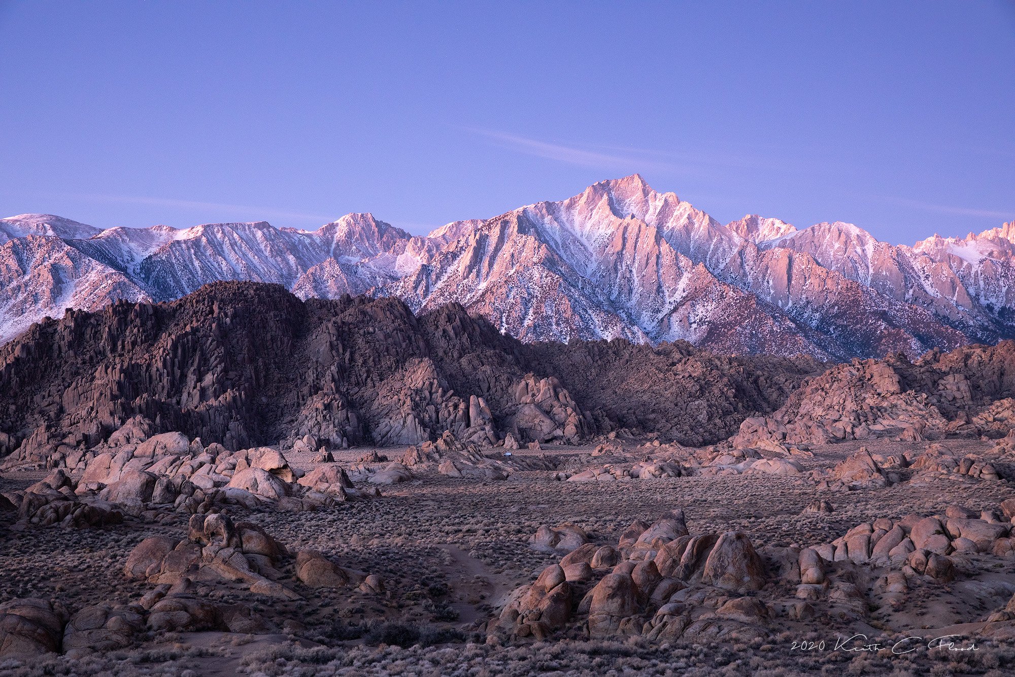
This is was taken about 30 minutes before sunrise and is just resized and sharpened for web. I am wondering if it comes across too dark or flat? I am just delving into “TK7 Panel” for Photoshop but did not do anything with this photo. I am just wondering if luminosity masks would help or overdue this image?
I was drawn to this composition by the subtle or not so subtle, suggestion of layers from the foreground to the background with the various rock formations but not sure if I am reading too much into this?
This is a converted raw file, daylight WB, 3.2sec, f/8, ISO 800 (I would have dropped the ISO to 200 but forgot from an earlier attempt at shooting the pre-dawn blue light.)
IMO it’s not too dark. As to your question “is it too flat”, the reality is pre dawn light in the Alabama Hills is flat. My experience in this spot at pre dawn is that if there are no clouds, the light is most interesting when the sky is pink/magenta, which usually occurs before it is blue. Were you there before 30 minutes when this photo was taken? It might have been pink then. So, my two cents worth is that it is a lovely composition, the photo accurately represents the flatness of the pre dawn light, and the subtle magenta cast is very lovely. We post processors aren’t magicians. I think if you fiddled you could make it appear less flat but it wouldn’t look very pleasing.
Thank you for the feedback so far! This is helpful! I was on site an hour early and scrambling in the dark to find a composition and hoping more clouds would appear. Honestly, I have been guilty of over processing images from time to time and I was pleasantly surprised at how much I like this image out of the camera. A good lesson I guess for maybe not every image needs/deserves hours of tweaking in post.
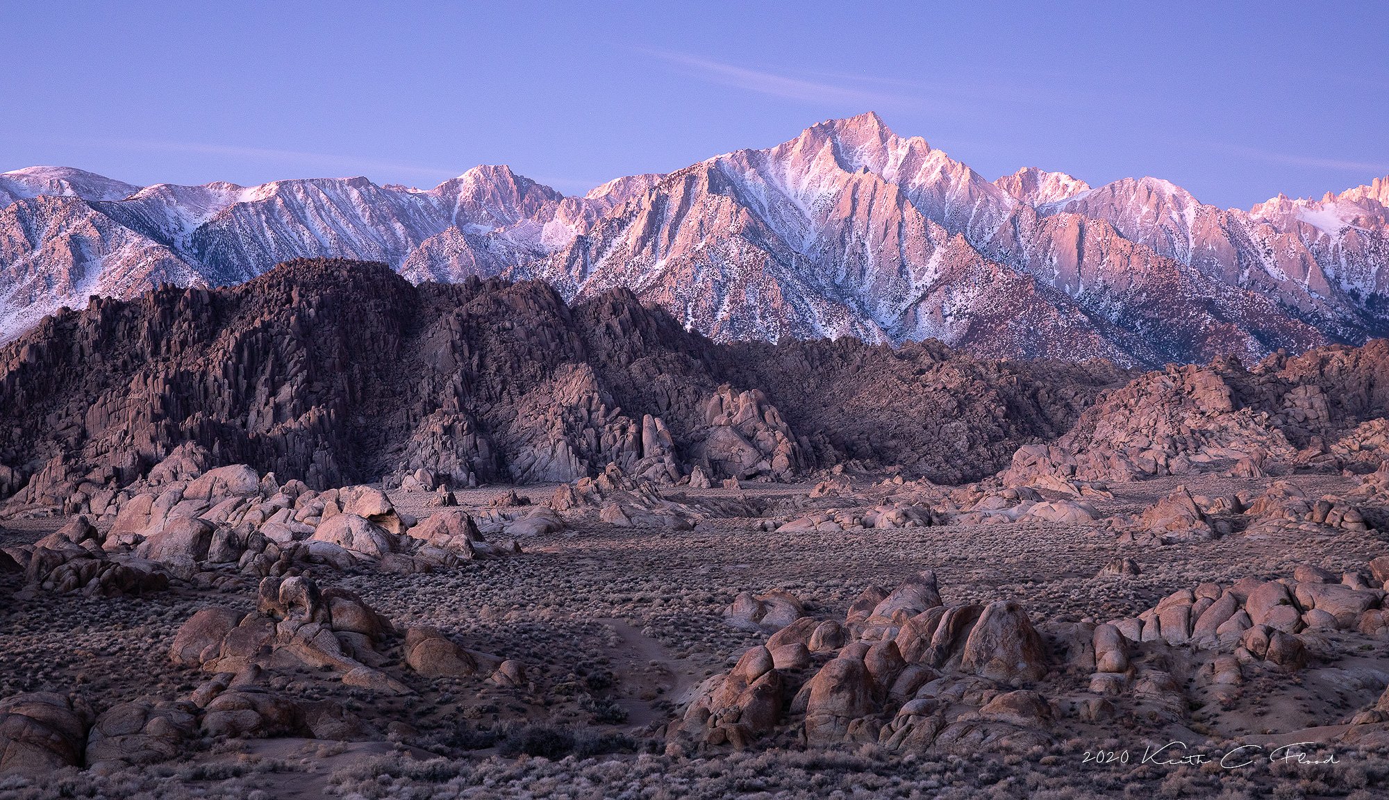
Keith, I agree with Igor that there is too much sky. Maybe crop half the distance down to the center cloud? The composition is quite nice with the many layers. I would clone out that vehicle that’s just below center of the image. It keeps pulling my eye.
Thanks Craig! I got a little chuckle when you noticed the vehicle. I saw the camper van that morning through the viewfinder and gave a tiny sigh. Yes, good point about clone the van out! Thank you.
Keith, I think @Tony_Siciliano comments nicely sum up my thoughts on the on the image. You have a blue hour shot, and you want the light to be “'flat” (I would prefer to call it even light instead), so that all the delicate pastel colors and textures can stand out. I am also in the camp of cropping some sky away. I love the colors and contrast as you have presented them here, i would not fiddle too much with further processing other than to crop the sky.
As an aside, I use TK LM’s extensively in my processing, but IMO it’s important to realize that that LM’s are simply tools to accomplish specific tasks and goals that you have for an image. They are not a magic bullet that makes amazing changes in a few clicks. Rather you need to evaluate an image, decide what types of changes would enhance the image, and then TK LM’s may be a good tool to help you accomplish what you want to do. I find them especially helpful for luminosity painting, ie dodging and burning through LM selections.
Wonderful glowy light! I prefer the final version with less sky, and no campervan (though it did give me a good sense of the scale of especially the foreground! ).
This is gorgeous, Keith. The final image with the crop and removal of the vehicle is the clear winner for me. The light is a little flat, but it is as you would expect it to be at this time of day. The added bonus is all the lovely pastels that the light is bringing out in this scene. I also like the layering here. Beautifully done.
For me, I live for this soft pastel light in the Sierra. Gorgeous rendition of this place. I could see this cropped a little from the right as well, Keith.
A bit late to the party, but had to chime in and give a thumbs up on the repost. Well, the original is quite outstanding to begin with. My only additional comment was going to be the minor clouds - almost like old contrails - but what works for me is that the clouds are repeated in smaller form on both sides, so I like the balance and the inclusion of the little clouds.

 ).
).