The photographer is looking for generalized feedback about the aesthetic and technical qualities of their image.
Description
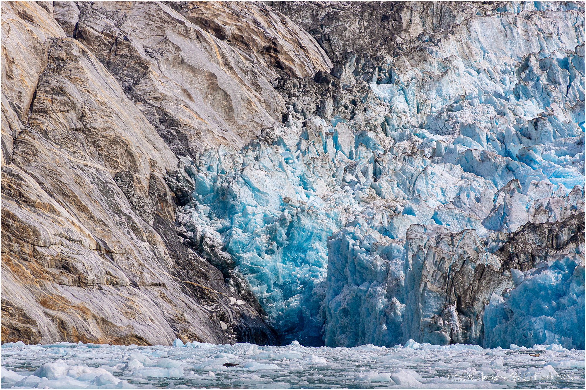
Chrissy and I indulged ourselves with a grand tour of much of Alaska in the late summer of 2017. Our last week was spent on a small 60 passenger cruise ship which allowed us to access many areas big boats could not enter. On our first day out of Juneau we went up into the Endicott Arm to the Dawes Glacier. We wanted to take a kayak to observe the glacier but there had been some large calving episodes and the crew thought it safer to explore with the ship’s zodiacs. In fact while we were out a fairly large iceberg did calve and we got quite the rollercoaster ride but the guides handled the surge expertly. We were barely novice kayakers so I’m really glad we passed on that chance. >=))>
Specific Feedback
I like the contrast of ice to land, cool to warm and the glacier face to the icy water below. Should there be more FG water or is this about right?
Technical Details
Sony A77
Sony DT 55-200 @ 140mm
ISO 400, 1/1600 @ f11
Hi Bill,
I love the subtle power struggle here between unrelenting slow grind of the glacier against unrelenting strength and hardness of the rock. I also like your use of diagonals in this scene. I could see just a touch more water at the bottom, but it certainly is not a deal breaker for me. When I opened the large version I enjoyed finding what appears to be two seals basking on the ice. My wife, my brother and I visited Alaska many years ago so this brings back fond memories. Very nicely done.
I really like the contrast between the cold blues of the glacier and the warmer rock tones. The different textures also keep the eye moving around the image well.
I wonder if slightly reducing some of the brighter highlights in the ice may help bring out a bit more colour and detail, which could strengthen the contrast even more.
I could also see a little more water in the foreground working nicely, although I’m unsure whether that would be better by adding more at the bottom or cropping slightly from the top.
I also like the thin white border around the image, I think it frames the photo nicely.
This is lovely, Bill. I like the title too. Two strong elements in a test of wills. Will the ice break the rock or the rock break the ice or climate change make the contest different altogether.
I don’t feel a need for more water at the bottom. It’s chunky ice anyway, and to me, there is just enough to give us a base but not enough to detract from the angles of rock above: the v from the top and the diagonals below.
I’m not 100% sure, but I think it needs a teensy weensy ccw rotation. It could be an illusion caused by the chunkier ice on the left. I’m not sure I would have noticed it if I were not looking at the water to decide if there should be more.