The photographer is looking for generalized feedback about the aesthetic and technical qualities of their image.
Description
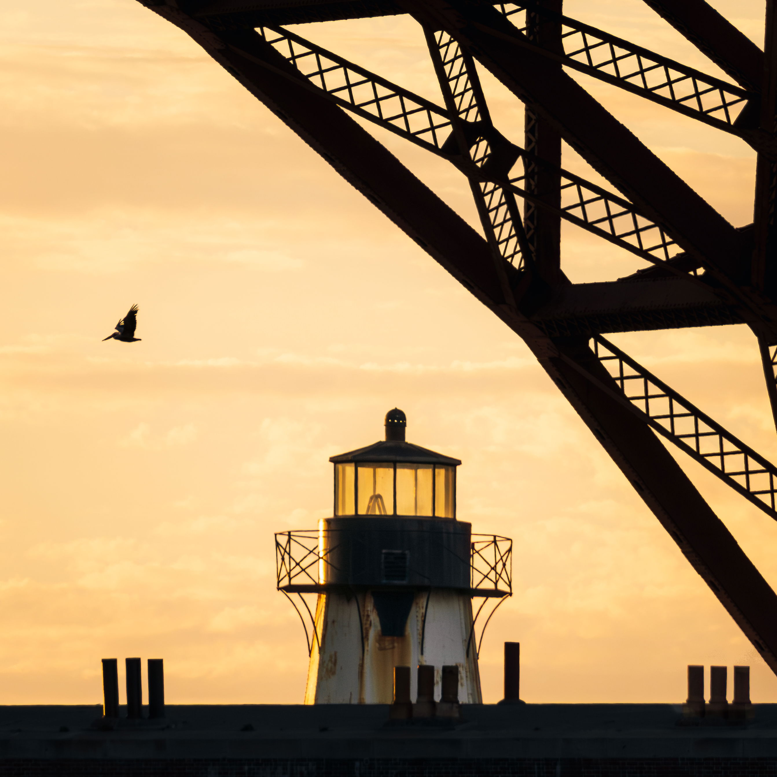
I have a thing for lighthouses, this is the nearest one to me so I checked it out at sunset tonight. Ended up sitting there for a good hour or two just shooting the lighthouse and waiting for birds to fly behind it.
Specific Feedback
Anything! In editing I darkened the foreground except the lighthouse, which was brightened a bit. I also reduced clarity/dehaze and added back in a bit of texture to the sky, and finally added a slight vignette. Also messed around with white balance, going for a light and golden feel. If any of this, or the colors, appears heavy-handed I definitely welcome that feedback.
Technical Details
Camera: Sony a6600
Settings: Single exposure 1/1000s, f/6.3, ISO 400
Lens: 324mm on Sony E 70-350mm f/4.5-6.3 G OSS
Critique Template
Use of the template is optional, but it can help spark ideas.
Welcome to the Everything Else Forum, Matthew. I really like the composition of this image with the foreground in silhouette yet enough light on the side of the lighthouse to show those lovely rust streaks. The pelican is in a really nice position , though I could see it maybe one bird length to the left if you have that frame or are into moving elements of the image. You asked about the sky-the luminosity feels really appropriate to me, but for that much brightness it does feel like the added structure went just a bit too far-it’s awfully easy to overdo clouds in an attempt to create an interesting sky.
Hey Dennis, thanks for the critique! I agree about the bird - this one stood out to me because of the wing position but I agree I would really have liked it to be a little more to the left and up. It was a burst so there are lots more to choose from. Thanks for pointing out the sky, I’ll play around with it some more. I’ve gone too far in the other direction of negative clarity/dehaze leading to excessive softness, so I’m trying to calibrate
What a great scene. Well spotted and executed, Matthew.
I feel that the empty sky on the left side is overpowering the image a bit too much. You have so many wonderful shapes and patterns in the right two-thirds of the frame, that the blank canvas just doesn’t gel with it. I understand that you likely left it in because of the third set of posts, but the post “symmetry” doesn’t do enough for the image, IMO, to leave that space in. So I’d suggest a crop from the left.
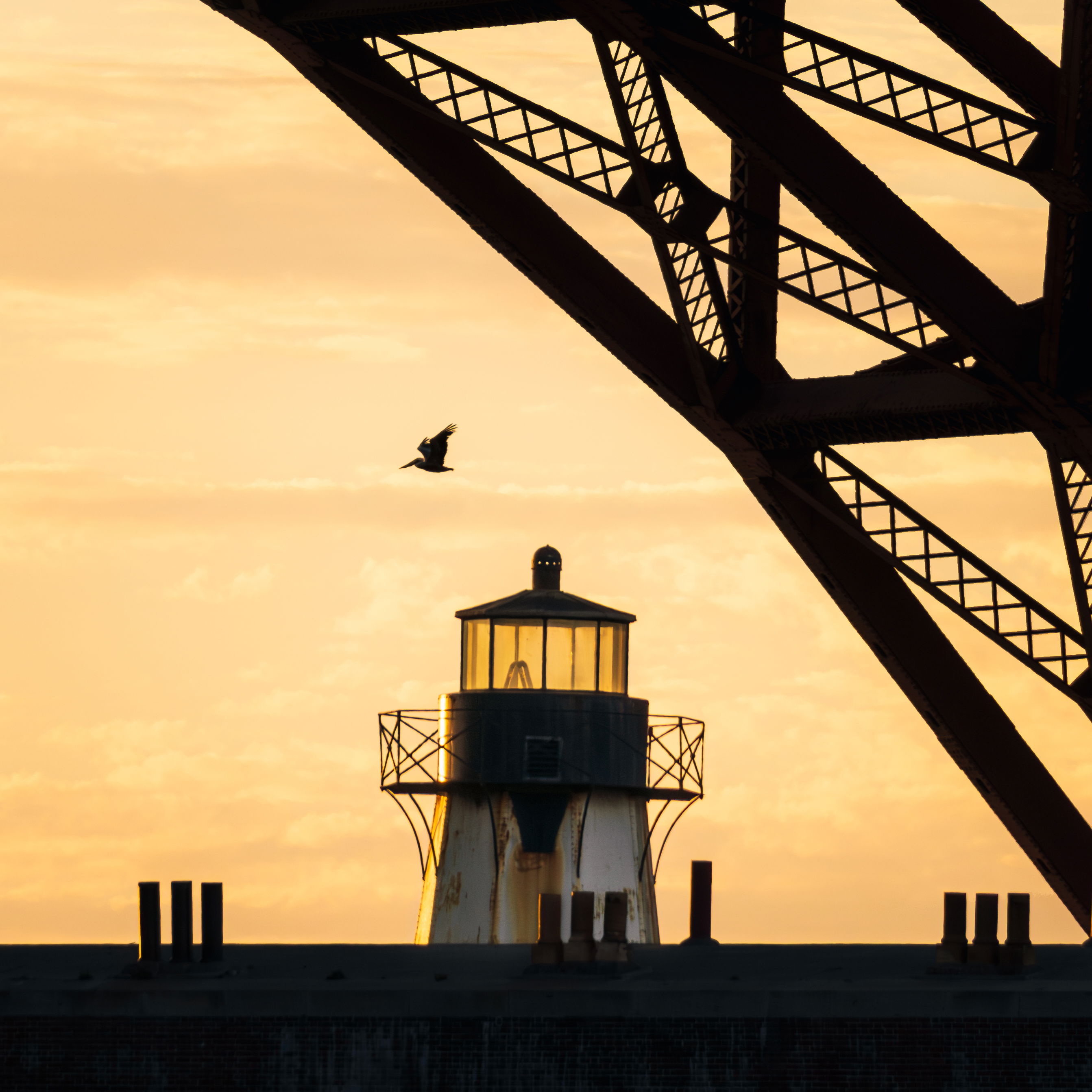
You guys talked about wanting the pelican “to the left” a bit… the crop accomplishes that. Plus, it makes the strong diagonal of the structure cut from top left to lower right, while having the pelican and lighthouse as a counterpoint to the bridge in the bottom half of the frame. To me, such a crop brings all the elements together more cohesively.
Matthew: I very much like the graphic nature of your capture. My only nit would be to burn the sky just a bit as it seems too bright for the very dark elements you’ve captured.
Thanks @Dennis_Plank@Sandy_Richards-Brown@Max_Waugh@Richard_Sandor for the feedback and critiques! I pulled back the texture and straightened up the lighthouse. I also found a better shot, but unfortunately the lighthouse is not quite sharp in this one. Much better bird position though. Maybe I can compose the first and second in PS to get a sharp lighthouse.