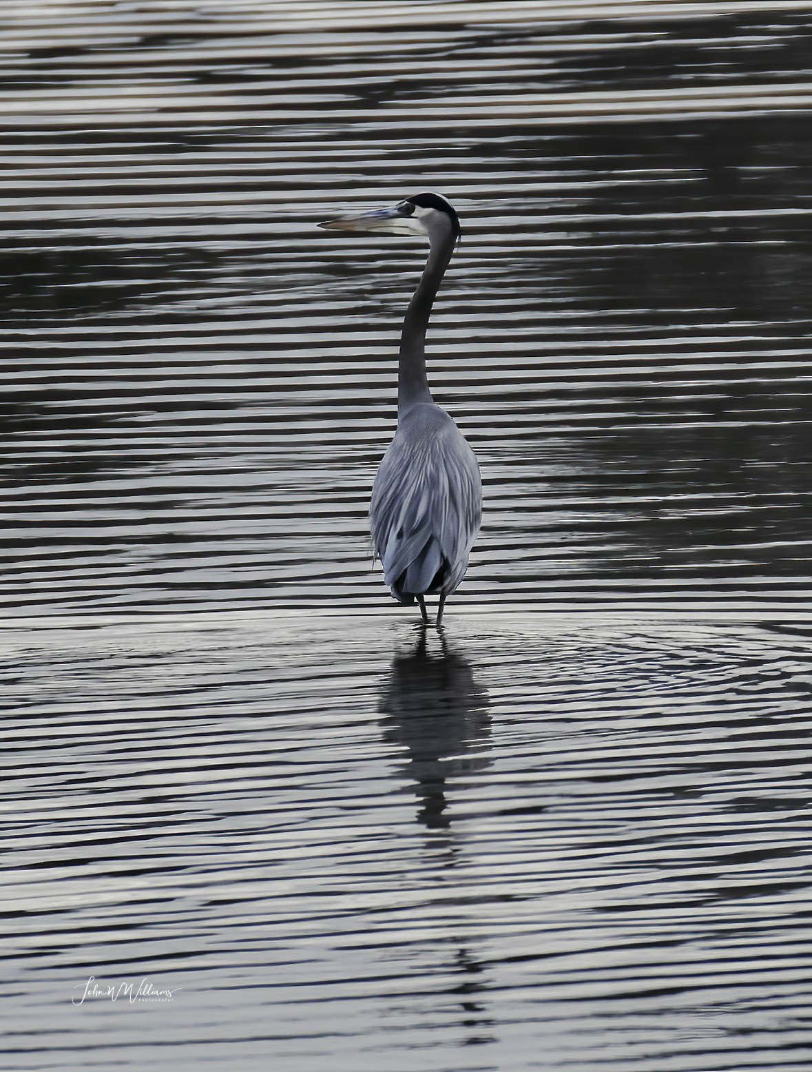
Really strong graphics from the ripples and the heron’s pose in this image, Wayne. To my eye, the ripples seem to overpower the heron a bit, so I’d be tempted to reduce the contrast on them somewhat, if possible. The blues in the heron look rather unnatural to me as well. While they’re called Great Blue Heron’s I never seem to see much blue in them.
This is different. I like it. I can see what Dennis is saying and i suppose you could play with it a bit. But the contrast in the ripples is part of the attraction so have to be careful. You could also lighten up the bird’s head a bit. .I would look at rotating it a bit clockwise, the shadows don’t quite line up. I would also look at a pano crop taking out more of the right side than left to lose some of the flat water. Neat idea and good eye. It looks like you were pretty close with a 14x70 lens.
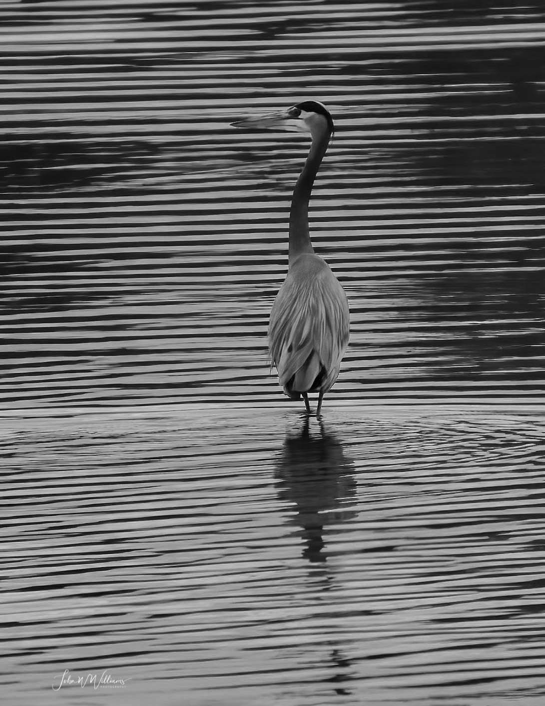
It almost looks as if you did go to black and white, Wayne. Actually, I think B&W would work except the darn bill seems to disappear in the ripples. You didn’t accidentally desaturate all the colors instead of just the blues did you?
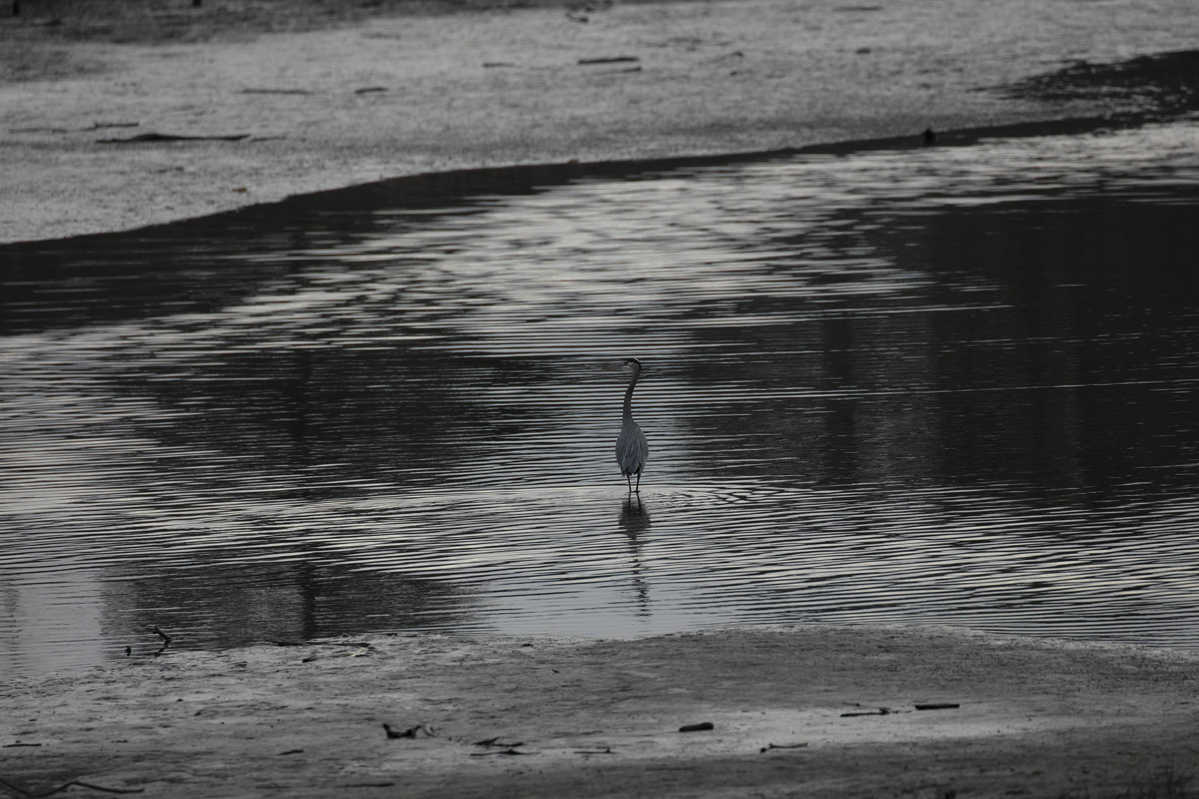
Wow! That was an amazingly monochrome scene, wasn’t it? Looking at your original scene, I think you might want to look at a looser composition with maybe even a hint of the near and far shores. That would give you more of the cool water and put less emphasis on the heron, which you’re really pushing to make large enough in your current crop.